I used to measure dropdowns with getBoundingClientRect(), glue them with position: fixed, and pray the user did not scroll. Tooltips needed a library. Context menus needed more JavaScript. Every “simple” overlay turned into a positioning bug report.
In 2026 that habit is optional for a lot of UI work. CSS anchor positioning lets you tether a floating element to another element in pure CSS. Pair it with the Popover API and you get light-dismiss, top-layer stacking, and a trigger that already knows its anchor – without a positioning library for many menus, tooltips, and teaching callouts.
This is the practical guide I wish I had when I first tried it: what anchor positioning actually does, how it differs from absolute offsets, real patterns for tooltips and dropdowns, overflow fallbacks with position-try-fallbacks, accessibility, progressive enhancement, and the mistakes that waste an afternoon. Distinct from scroll-driven animation tricks – this is about where UI lives relative to a trigger, not how it moves with the page scroll.
What CSS anchor positioning actually is
Absolute positioning places an element relative to a positioned ancestor. That ancestor is rarely the button the user just clicked. So we invent wrappers, portals, and JS math.
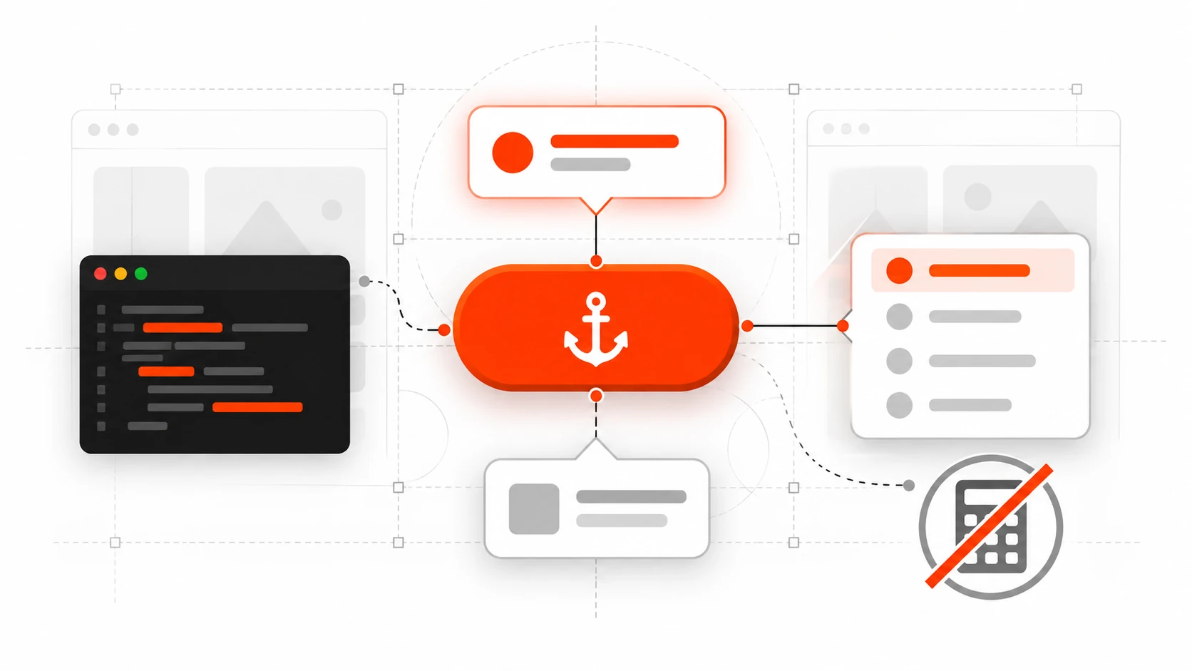
Anchor positioning adds a different relationship: an element can declare another element as its anchor, then place itself against that anchor’s edges. The browser keeps that tether as layout and scroll update (within the rules of the feature), which is exactly what tooltips and menus need.
At a high level you do three things:
- Name an anchor with
anchor-name: --something;(or rely on an implicit anchor from a popover trigger). - Take the floating UI out of normal flow with
position: absoluteorposition: fixed. - Point at the anchor with
position-anchorand place it withposition-areaand/or theanchor()function.
.trigger {
  anchor-name: --help-btn;
}

.tooltip {
  position: absolute;
  position-anchor: --help-btn;
  position-area: block-end;
  margin: 0;
}
That is the mental model. Everything else – fallbacks, sizing, scopes – builds on it.
Why this belongs in web development tutorials in 2026
Interop 2026 keeps anchor positioning and dialogs/popovers in the browser collaboration focus areas. That is a strong signal: vendors are still aligning edge cases, and developers keep ranking these APIs as high-priority. For shipping products, the useful question is not “is the blog post shiny?” but “can I use this as progressive enhancement this quarter?”
On current evergreen browsers, CSS anchor positioning is in a much healthier place than the early experimental demos. MDN now treats core anchor() usage as newly available Baseline in early 2026 on recent versions. Cross-browser polish continues (Interop tracks remaining tests), so I still wrap advanced fallbacks and treat unsupported browsers as “centered popover or static help text” rather than “hard dependency.”
The product win is boring and valuable:
- Fewer layout thrash loops from measuring on every scroll/resize.
- Less custom code fighting the visual viewport on mobile.
- Menus that flip when they would overflow, using browser-owned fallbacks instead of your own collision solver.
If your design system still depends on Floating UI / Popper for complex cases, keep it. Use native anchoring where the pattern is simple and the budget for JS is tight – marketing sites, docs UIs, admin panels with a handful of menus.
Popover API + implicit anchors (the pattern I ship first)
The Popover API gives you a top-layer overlay with light dismiss and focus behavior that is closer to platform norms than a random div with z-index: 9999. When you open a popover from a control with popovertarget (or showPopover({ source })), that popover already has an implicit anchor pointing at the trigger.
That means for many tooltips and menus you can skip inventing anchor-name at all:
<button type="button" popovertarget="acct-menu">Account</button>
<div id="acct-menu" popover>
  <a href="/profile">Profile</a>
  <a href="/billing">Billing</a>
  <button type="button" popovertarget="acct-menu" popovertargetaction="hide">Close</button>
</div>
#acct-menu {
  /* popovers are position: fixed by default */
  margin: 0;          /* critical: default margin:auto fights anchoring */
  inset: auto;        /* reset default inset centering */
  position-area: block-end span-inline-end;
  position-try-fallbacks: flip-block, flip-inline;
}
Two resets matter more than people expect. Default popover styles often center the panel with margin: auto and inset values. If your menu “ignores” position-area, check those first before blaming browser support.
popover=”hint” for nested tooltips
Interop 2026 calls out popover="hint" for subordinate overlays – the classic “tooltip attached to something inside an open auto popover” case. Hint popovers are designed so they do not dismiss the parent auto popover the way another auto popover might. If you have been writing awkward JS to keep a menu open while a tip appears, this attribute is the direction the platform is going. Feature-detect and progressive-enhance; do not assume every browser in your analytics matrix has identical hint behavior yet.
position-area vs the anchor() function
Start with position-area. It places the floating element on a conceptual grid around the anchor using keywords like block-end, inline-start, top, bottom span-all, and combinations such as block-end span-inline-end (a common dropdown placement).
Logical keywords respect writing mode. That matters for multilingual products and RTL layouts. Prefer block-* / inline-* in design-system tokens unless you truly need physical top/left.
Reach for anchor() when you need fine-grained insets, calculations, or different sides tied in custom ways:
.panel {
  position: absolute;
  position-anchor: --trigger;
  top: anchor(bottom);
  left: anchor(left);
  width: anchor-size(width);
  margin: 0;
}
anchor() returns a length usable in calc(), min(), and max(). anchor-size() lets the floating UI match the trigger’s width – perfect for select-like menus that should share the control’s footprint.
Remember: anchor() is valid on inset properties. Putting it on transform or random non-inset properties is a common footgun copied from older absolute-position recipes.
Overflow: position-try-fallbacks (stop writing collision JS)
The moment your menu sits near the bottom of the viewport, fixed “always below” placement fails. Native fallbacks handle the common flips:
.menu {
  position-area: block-end span-inline-end;
  position-try-fallbacks: flip-block, flip-inline, flip-block flip-inline;
}
Or name custom tries with @position-try when margins and alignment must change together:
@position-try --menu-above {
  position-area: block-start span-inline-end;
  margin-bottom: 0.5rem;
}

.menu {
  position-area: block-end span-inline-end;
  margin-top: 0.5rem;
  position-try-fallbacks: --menu-above, flip-inline;
}
You can also ask the browser to prefer the option with the most available space via position-try-order (for example most-block-size). I use that for dense dashboards where “most room” beats a fixed preference order.
When the anchor scrolls away, decide whether the floating UI should vanish. position-visibility: anchors-visible hides the positioned element when its anchor is not visible – useful for sticky-ish callouts that should not orphan themselves on the screen.
Reusable components: anchor-scope
If every card in a list uses anchor-name: --card-menu, which anchor wins? Without scoping, matching rules can surprise you (often the last laid-out match). Put anchor-scope on the component root so each instance only sees its own names:
.card {
  anchor-scope: --card-menu;
}

.card__btn {
  anchor-name: --card-menu;
}
This is the CSS equivalent of unique IDs without sprinkling generated IDs through markup. For design systems, treat anchor-scope as part of the component contract.
A complete tooltip pattern (progressive enhancement)
Here is a pattern I use on docs and settings screens:
<button type="button" class="info" popovertarget="tip-billing" aria-label="About billing cycle">?</button>
<div id="tip-billing" class="tip" popover="manual" role="tooltip">
  Invoices renew on the first of each month in your account timezone.
</div>
.tip {
  margin: 0;
  inset: auto;
  max-width: 18rem;
  padding: 0.75rem 1rem;
  border: 1px solid #d0d7de;
  border-radius: 0.5rem;
  background: #fff;
  box-shadow: 0 8px 24px rgb(0 0 0 / 12%);
  position-area: block-start;
  position-try-fallbacks: flip-block, flip-inline;
}

@supports not (anchor-name: --x) {
  .tip {
    /* fallback: browser default popover centering is acceptable for help text */
    max-width: 20rem;
  }
}

@media (prefers-reduced-motion: reduce) {
  .tip {
    transition: none;
  }
}
For hover/focus tooltips you may still wire a tiny bit of JS to show/hide a manual popover, or use CSS interest triggers where available. The positioning, though, stays in CSS. That split – behavior in a few lines of JS, geometry in CSS – is the architecture I want in 2026 components.
Dropdown menus without the usual bugs
Checklist I run before calling a menu “done”:
- Keyboard: open with Enter/Space on the trigger; Arrow keys move options; Escape closes; focus returns to the trigger.
- Light dismiss: click outside closes (auto popovers help here).
- Scroll containers: test the menu inside overflow panels, not only on the document root.
- RTL: verify
inline-start/inline-endplacements. - Long labels: force a very long trigger string and confirm fallbacks still keep content on-screen.
- Mobile: confirm the visual viewport and on-screen keyboard do not bury the menu; sometimes a full-screen sheet is better UX than a tiny anchored panel.
Native anchoring does not replace accessibility. It replaces a chunk of measurement code. You still own semantics (menu/menuitem patterns or disclosed navigation links), focus traps where appropriate, and clear labels.
When I still reach for a JavaScript positioning library
Be honest with the team:
- Multi-anchor choreography that the current CSS model cannot express cleanly.
- Virtualized lists where DOM nodes mount/unmount faster than you want to debug native edge cases.
- Legacy browser matrices that must look identical, not progressively enhanced.
- Canvas/WebGL overlays that are not CSS boxes.
Floating UI remains excellent. The goal is not dogma. The goal is deleting code when the platform already solved 80% of the problem.
Performance and Core Web Vitals notes
Measuring on every scroll to keep a menu glued to a button is a classic way to hurt responsiveness. Moving that responsibility to the browser reduces main-thread work during interaction – good for INP when overlays are common (admin UIs, dense data tables).
Still avoid animating expensive properties on the floating UI. Prefer opacity/transform for enter/exit. Keep popover content lean. Do not load a chart library inside every closed menu “just in case.”
Debugging tips that save hours
- If placement seems ignored on a popover, reset
marginandinset. - Confirm the positioned element uses
absoluteorfixed. - Check whether the anchor is laid out before the positioned element; ordering and layering matter for which anchor can be found.
- Duplicate
anchor-namevalues? Addanchor-scope. - Test with DevTools zoom and forced colors; overflow fallbacks interact with real viewport chrome.
- Feature-detect with
@supports (anchor-name: --x)or a small script checkingCSS.supportsbefore relying on advanced tries.
How this connects to Interop 2026 (without the hype)
Anchor positioning continuing in Interop means fewer “works in Chrome, weird in Safari” weekends over time. Dialog/popover work around closedby, :open, and popover="hint" aims at the same family of UI. If you are planning a design-system overhaul this year, aligning menu/tooltip primitives to these platform APIs is a reasonable bet – with progressive enhancement, not a hard cutover on day one.
Practical migration plan for an existing design system
- Inventory overlays: tooltip, dropdown, combobox, teach-spots, context menus.
- Pick the simplest two (usually tooltip + action menu) for a native pilot.
- Ship behind a flag or in an internal app first.
- Keep the JS library as fallback when
@supportsfails. - Document the resets (
margin/inset) in the component README so future you does not “fix” them back. - Add visual regression screenshots at viewport edges (top, bottom, RTL).
That plan beats a big-bang rewrite and gives you real data on support and UX.
Code Q&A: common questions I get in reviews
Q: Can I anchor to an element inside a different scroll container?
Often yes for tethering, but the positioned element typically tracks scrolling for its default anchor. Read the scrolling rules before promising parallax-like multi-scroller magic.
Q: Does this replace <dialog>?
No. Use <dialog> for modal flows that need inert background and stronger modal semantics. Use popover + anchor for non-modal overlays tied to a control.
Q: What about WordPress admin screens or legacy CSS?
You can use these APIs in modern themes and block editor experiments, but many admin UIs still need broad support. Progressive enhancement applies there too – this post is not a WordPress-only recipe.
Wrap-up
CSS anchor positioning plus the Popover API is one of the clearest “delete a dependency” opportunities in frontend UI right now. Name an anchor (or use the implicit popover tether), place with position-area or anchor(), add position-try-fallbacks for edges, scope names in reusable components, and keep accessibility in your court.
If you have been postponing a tooltip rewrite because Floating UI felt heavy for a docs site, try the native path on one component this week. Ship it as enhancement, measure the simplification, then decide what else can move.
I am Darshan Panchasara – I write about practical web development, web design details, and the platform features that actually change how I build. If this helped, share it with a teammate still measuring dropdowns by hand.
Leave a Reply