Author: darshan

  • Playwright Testing in 2026: Catch Broken User Flows Before Clients Do

    Playwright Testing in 2026: Catch Broken User Flows Before Clients Do

    I still get messages that start with a screenshot and a sinking feeling.

    The client clicked “Pay now.” The button spun. Nothing happened. Or worse: the order looked placed on their screen, then the confirmation email never arrived. Nobody broke the homepage. Nobody shipped a red console error on load. A real user path just failed in the quiet middle of the product.
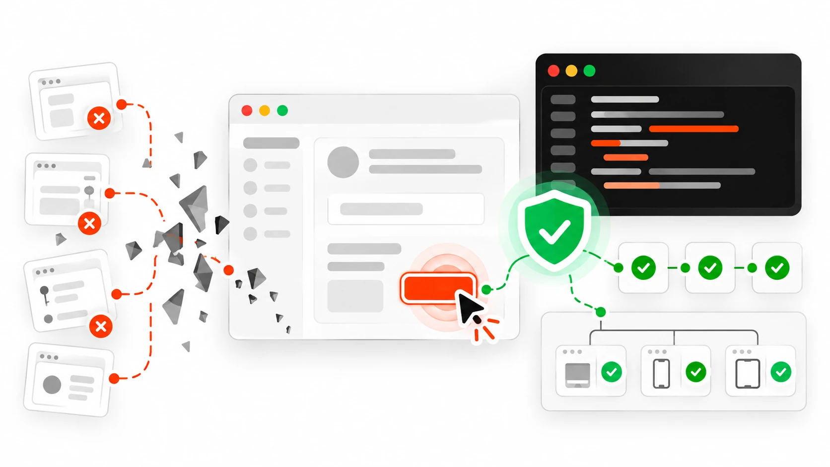
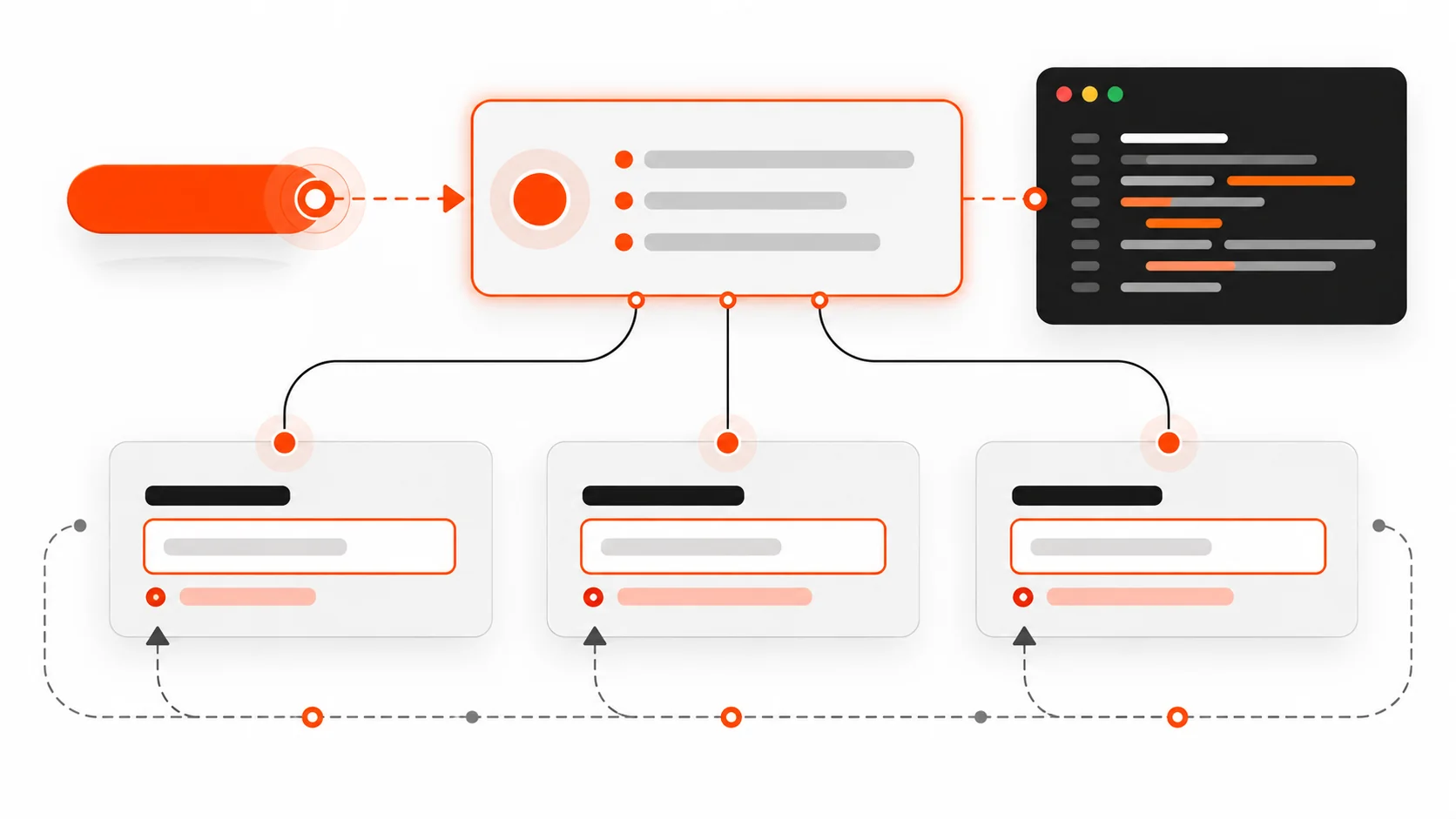
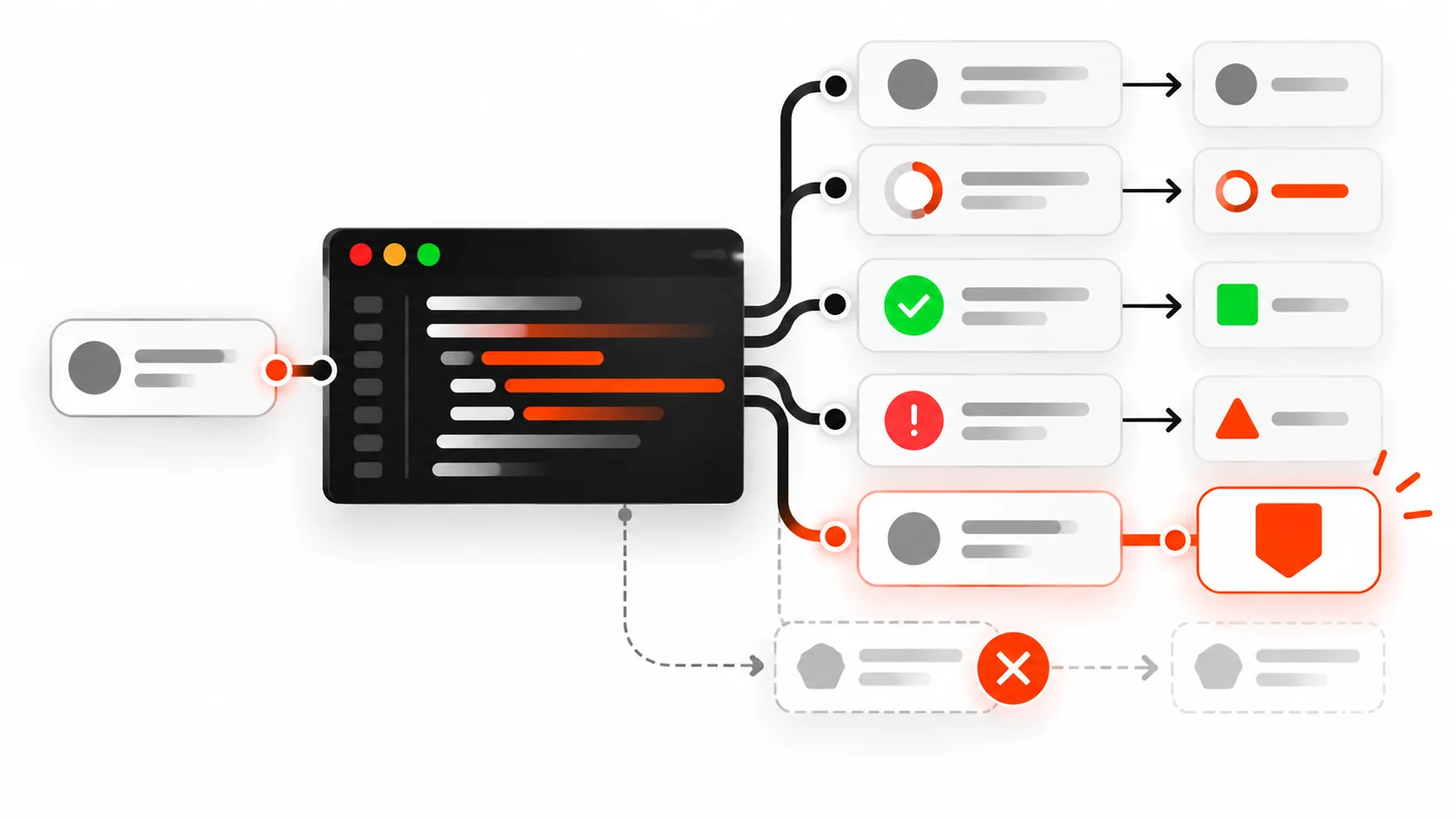
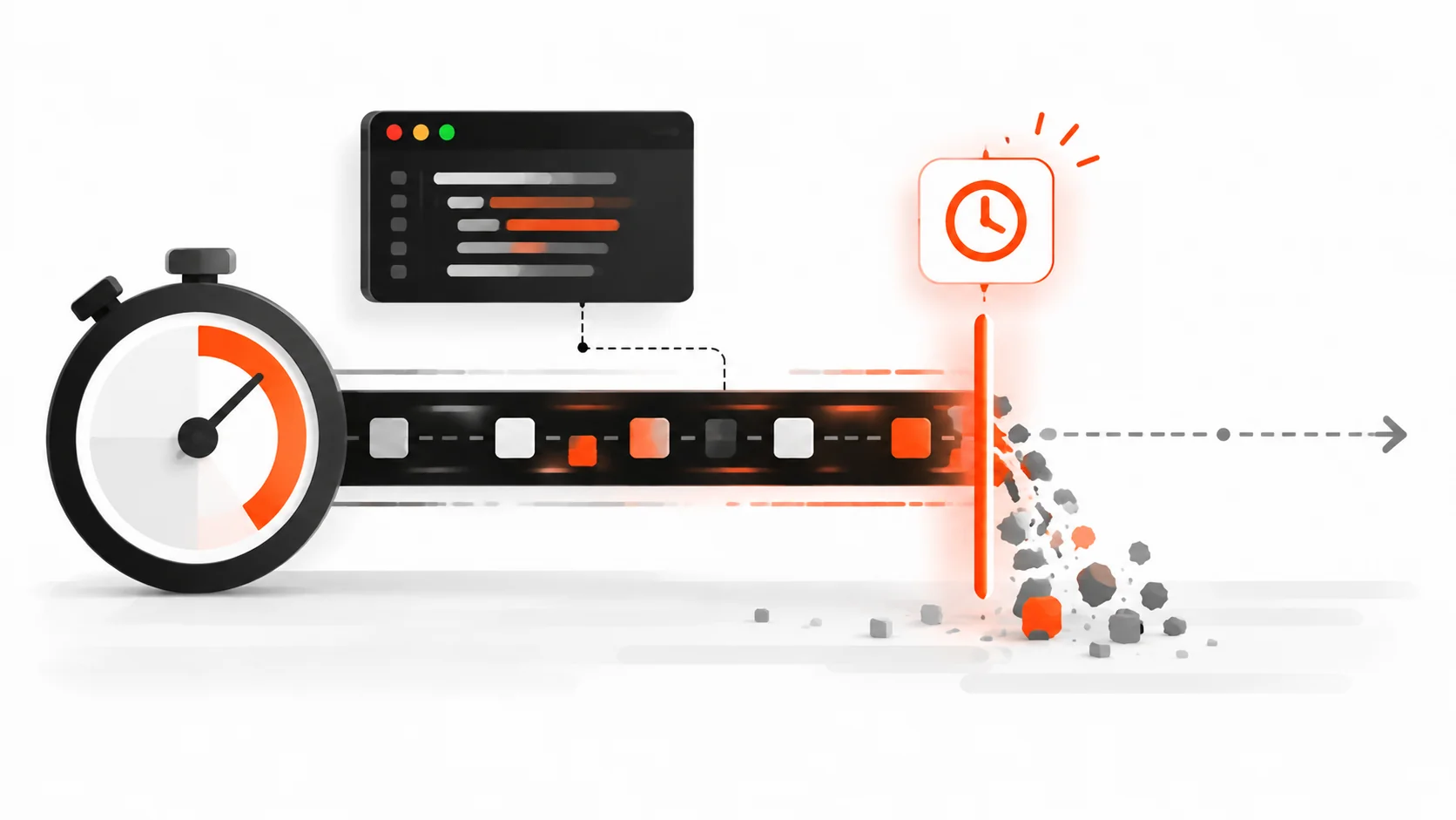
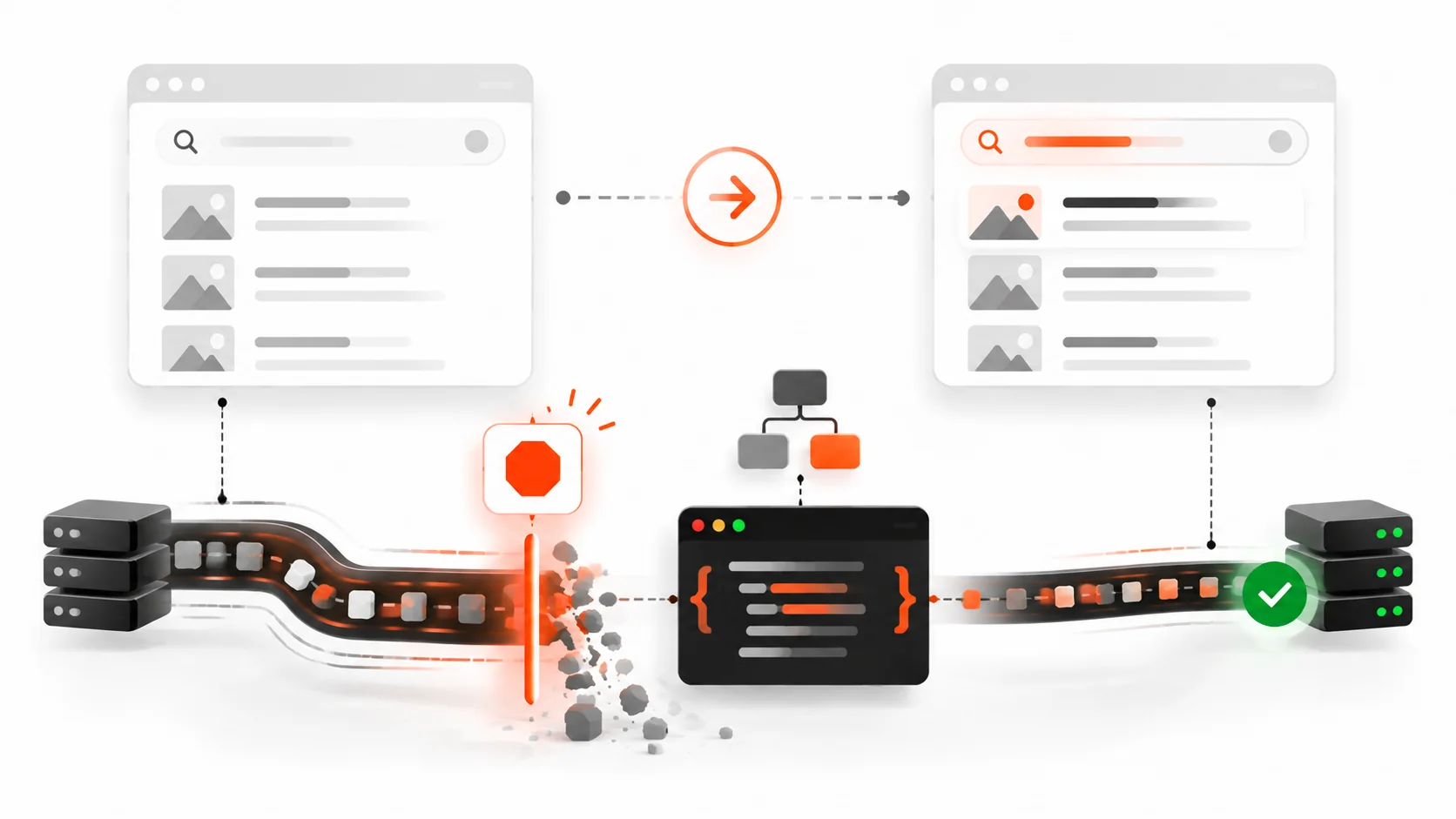
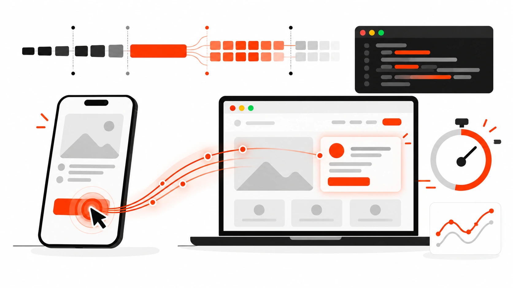
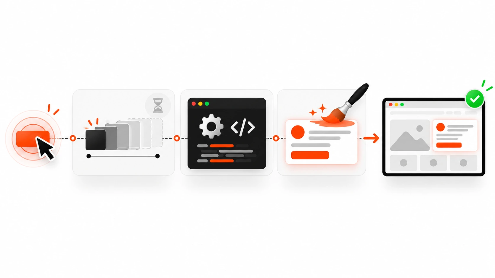
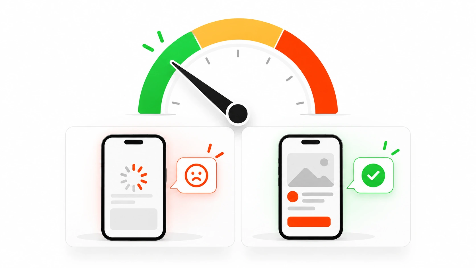
    Vector illustration of Playwright end-to-end testing catching a broken checkout flow before a client finds it
    Catch broken user flows in CI before clients record a Loom about them.

    That is the gap end-to-end tests are for.

    In 2026, Playwright is still the tool I reach for when a marketing site, a WordPress checkout, or a Next.js app needs proof that the flows people pay for still work. Not a pile of brittle CSS selectors. Not a CI job that flakes three times and gets muted. A small suite that behaves like a careful human: find the button by its name, wait for the page to settle the way Playwright already knows how, assert what the user can see, and leave a trace when something fails.

    This is the practical playbook I use on client projects and on my own work: how to structure a Playwright project that stays maintainable, how to pick locators that survive redesigns, how to use web-first assertions instead of sleep timers, how to share auth with storage state, how to seed data through the API, how to debug with the trace viewer, and how to run the suite on CI without burning an hour of minutes on every pull request.

    Why end-to-end still matters when you already have unit tests

    Unit tests are great at proving a function returns the right shape. They are terrible at proving that the submit button is covered by a sticky cookie banner, that the success toast never appears because the API returned 422, or that the mobile menu traps keyboard focus after login.

    Clients do not experience your reducer. They experience a path:

    1. Land on a page
    2. Find the thing they came for
    3. Fill a form or click a primary action
    4. See a clear result

    Playwright sits in that path. It drives a real browser. It sees the same DOM, the same network, the same layout quirks. When you assert on user-visible behavior, you catch the failures that never show up in a Jest green checkmark.

    I do not replace unit or component tests with Playwright. I reserve Playwright for the flows that hurt when they break: signup, login, checkout, contact forms that actually send, account settings that save, and the one admin action your client uses every Monday morning.

    Install a boring, modern baseline

    Start from the official runner. Keep the first commit boring on purpose.

    npm init -y
    npm install -D @playwright/test
    npx playwright install

    A minimal playwright.config.ts that has served me well:

    import { defineConfig, devices } from '@playwright/test';
    
    export default defineConfig({
      testDir: './e2e',
      fullyParallel: true,
      forbidOnly: !!process.env.CI,
      retries: process.env.CI ? 2 : 0,
      workers: process.env.CI ? 2 : undefined,
      reporter: [['list'], ['html', { open: 'never' }]],
      use: {
        baseURL: process.env.PLAYWRIGHT_BASE_URL || 'http://127.0.0.1:3000',
        trace: 'on-first-retry',
        screenshot: 'only-on-failure',
        video: 'retain-on-failure',
      },
      projects: [
        { name: 'chromium', use: { ...devices['Desktop Chrome'] } },
        { name: 'Mobile Chrome', use: { ...devices['Pixel 7'] } },
      ],
      webServer: {
        command: 'npm run start',
        url: 'http://127.0.0.1:3000',
        reuseExistingServer: !process.env.CI,
      },
    });

    A few opinions baked into that file:

    • Trace on first retry, not on every run. Traces are gold for debugging and expensive if you keep them always-on in CI.
    • Retries only in CI. Locally you want the flake to slap you in the face.
    • One desktop and one mobile project is enough for most marketing and product sites. Add Firefox and WebKit when the client actually has browser-specific bugs, not because a checklist told you to.
    • baseURL keeps every test free of hardcoded hosts so staging and preview URLs are just an env var away.

    Write the first test like a user, not like a CSS engineer
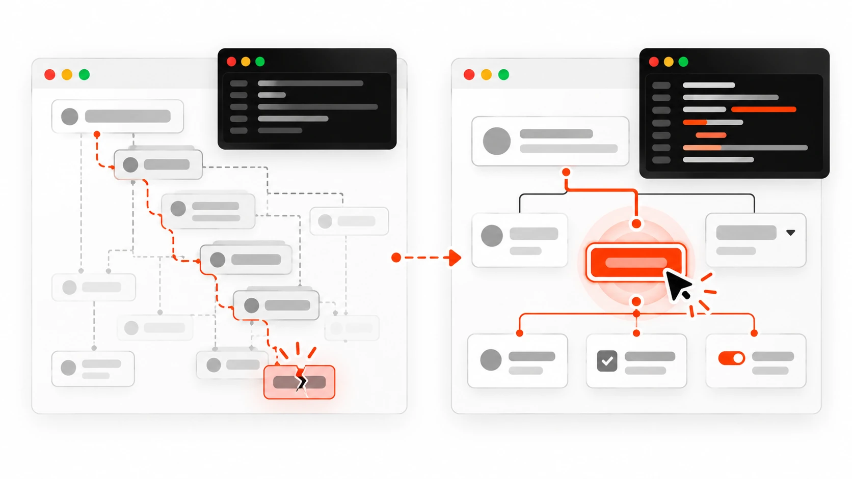
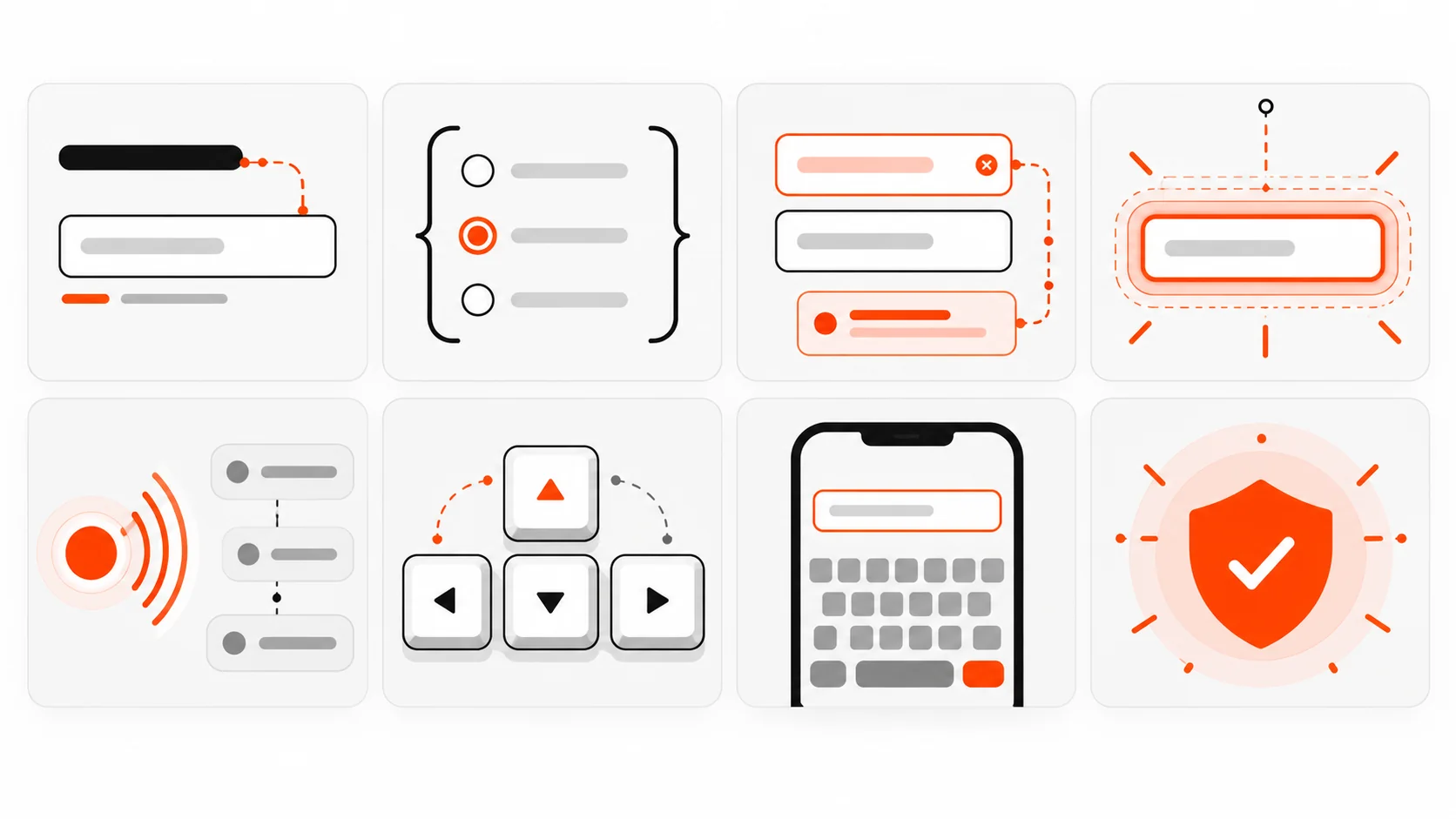
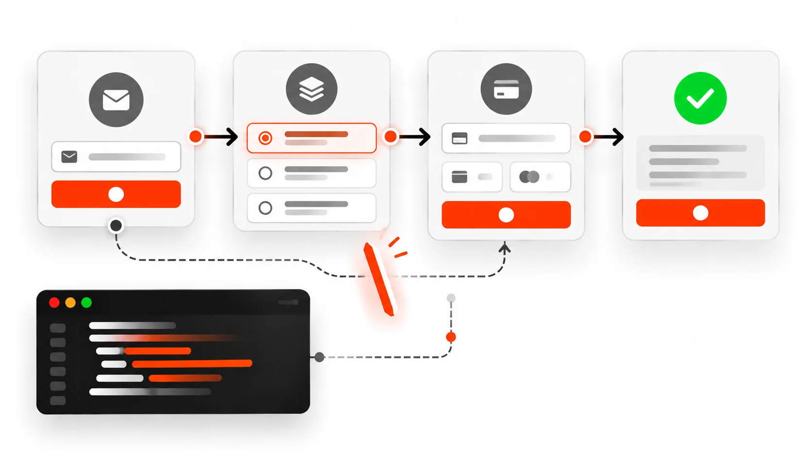
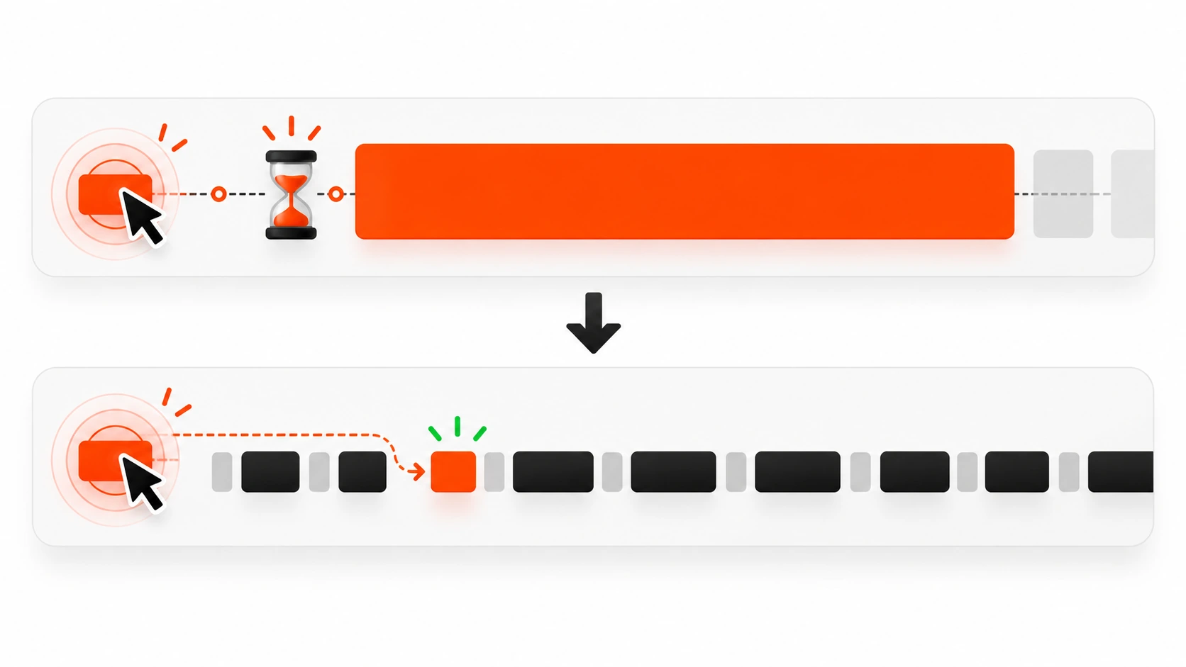
    Infographic comparing brittle CSS selectors with resilient role-based Playwright locators
    Prefer getByRole and getByLabel over brittle CSS chains.

    Here is the shape I want every new test to follow.

    import { test, expect } from '@playwright/test';
    
    test('contact form shows a success message after submit', async ({ page }) => {
      await page.goto('/contact');
    
      await page.getByLabel('Name').fill('Darshan Panchasara');
      await page.getByLabel('Email').fill('hello@example.com');
      await page.getByLabel('Message').fill('I need a fast brochure site for a launch next month.');
      await page.getByRole('button', { name: 'Send message' }).click();
    
      await expect(page.getByRole('status')).toContainText('Thanks');
      await expect(page).toHaveURL(/contact/);
    });

    Notice what is missing: no waitForTimeout. No .contact-form > div:nth-child(2) input. No screenshot diff of the entire page for a form submit. The test names the controls the way a person would, clicks the button by its accessible name, and asserts on a status region the UI already exposes for accessibility.

    That is not just nicer to read. It is more stable. When a designer changes a class name, getByRole and getByLabel keep working. When someone removes the accessible name, the test fails for a reason you should care about anyway.

    Locator priority that survives redesigns

    Playwright’s own guidance still holds in 2026. Prefer locators in this order:

    1. getByRole with accessible name
    2. getByLabel for form controls
    3. getByPlaceholder only when there is truly no label (and then fix the label)
    4. getByText for unique copy
    5. getByTestId as an explicit test contract when the UI has no stable accessible name

    Avoid:

    • Long CSS chains tied to layout
    • XPath that walks the DOM tree
    • Matching on random generated class hashes from CSS-in-JS

    When two buttons share a name, narrow with a parent locator instead of inventing a fragile selector:

    const dialog = page.getByRole('dialog', { name: 'Delete project' });
    await dialog.getByRole('button', { name: 'Delete' }).click();

    If you catch yourself writing page.locator('.btn.btn-primary.ml-2'), stop and ask whether the control has a role and a name. If it does not, that is a product bug wearing a test problem costume.

    Web-first assertions beat sleep every time
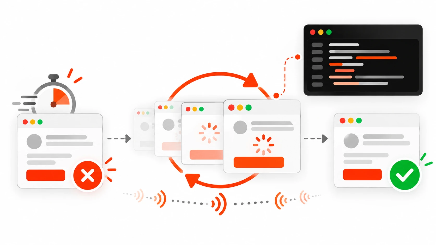
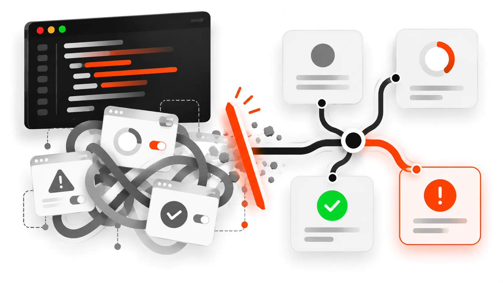
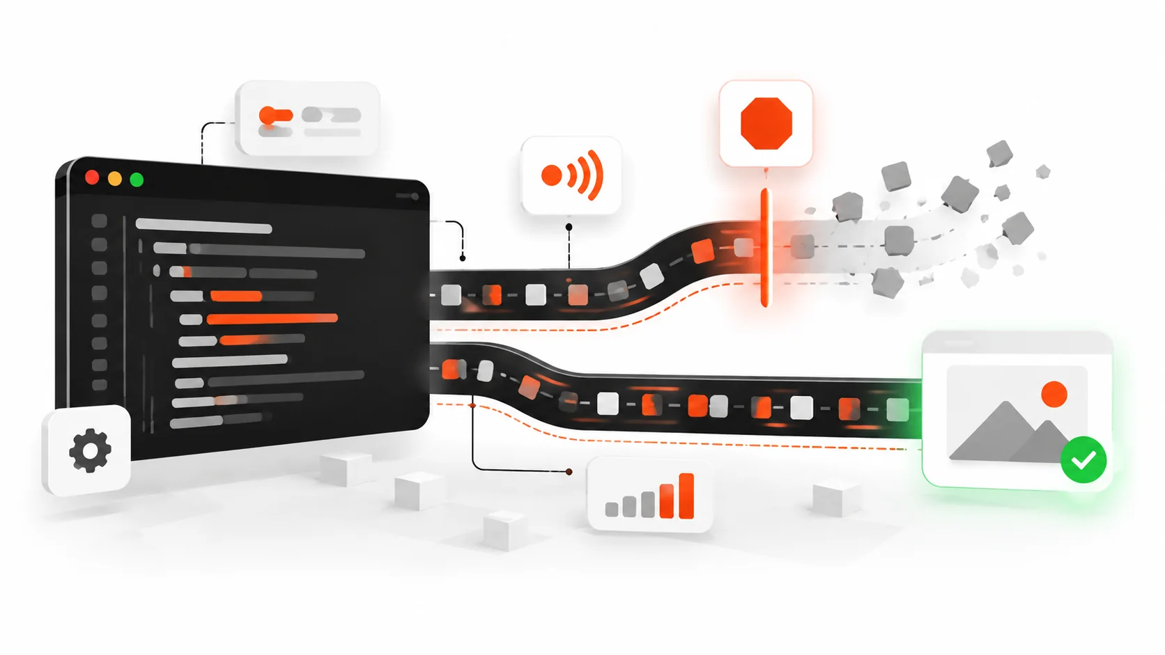
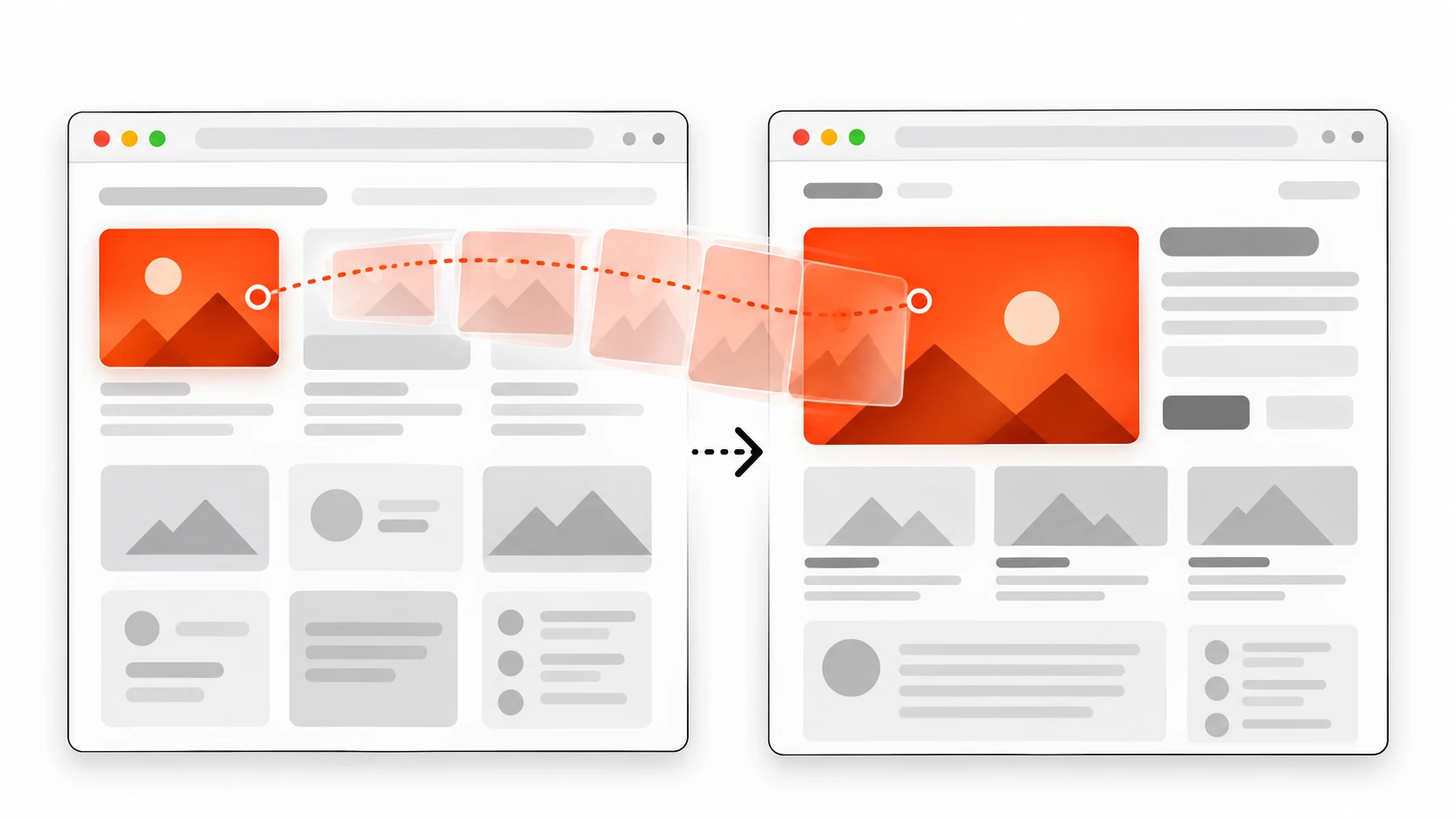
    Infographic of Playwright web-first assertions retrying until the UI settles versus a one-shot check that flakes
    Web-first assertions retry. One-shot checks race the UI.

    The single biggest source of flaky Playwright suites I inherit is manual waiting.

    // Fragile: checks once, races the UI
    expect(await page.getByText('Payment confirmed').isVisible()).toBe(true);
    
    // Stable: retries until true or timeout
    await expect(page.getByText('Payment confirmed')).toBeVisible();

    Playwright’s expect matchers for the page are asynchronous on purpose. They poll. They re-query the locator. They wait for the UI to catch up. That is the feature. Use it.

    Good assertions for real flows:

    await expect(page.getByRole('heading', { name: 'Dashboard' })).toBeVisible();
    await expect(page).toHaveURL(/\/dashboard/);
    await expect(page.getByLabel('Email')).toHaveValue('hello@example.com');
    await expect(page.getByRole('alert')).toContainText('Card declined');
    await expect(page.getByRole('button', { name: 'Pay now' })).toBeDisabled();

    Soft assertions exist when you want to collect several visual checks before failing. I use them sparingly on checklist-style pages. For a checkout path, I usually want the first failure to stop the test so the trace shows the real break.

    Stop sharing state between tests

    Playwright gives every test a fresh browser context by default. Keep that gift.

    Bad patterns I delete on sight:

    • Test A creates a user; test B logs in as that user
    • A beforeAll that mutates a shared database row every test depends on
    • Relying on sort order of a list that other parallel workers also write to

    Good patterns:

    • Each test creates its own data through an API helper
    • Each test cleans up after itself when the environment is shared
    • Auth is injected as storage state, not as a click path in every file

    Isolation is what lets you turn on fullyParallel without inventing a new flake every week.

    Auth the smart way: one login, many tests

    Logging in through the UI for every test is slow and noisy. Playwright supports saving authenticated storage and reusing it.

    // e2e/auth.setup.ts
    import { test as setup, expect } from '@playwright/test';
    
    const authFile = 'e2e/.auth/user.json';
    
    setup('authenticate', async ({ page }) => {
      await page.goto('/login');
      await page.getByLabel('Email').fill(process.env.E2E_EMAIL!);
      await page.getByLabel('Password').fill(process.env.E2E_PASSWORD!);
      await page.getByRole('button', { name: 'Sign in' }).click();
      await expect(page.getByRole('heading', { name: 'Dashboard' })).toBeVisible();
      await page.context().storageState({ path: authFile });
    });

    Wire a setup project in config, then point your logged-in projects at that file. Critical flows like “login itself” still get a dedicated UI test. Everything else starts already signed in.

    For WordPress admin or headless CMS dashboards, the same idea applies: capture cookies once, reuse them, and keep one pure login test so you still notice when the sign-in form breaks.

    Seed through the API, assert through the UI

    If your test spends two minutes clicking through a wizard only to reach the screen you care about, you are testing the wizard every time whether you meant to or not.

    Prefer this split:

    • Create fixtures with request (Playwright’s APIRequestContext) or a small Node helper against your staging API
    • Navigate straight to the URL under test
    • Assert the UI the human sees
    test('invoice detail shows the paid badge', async ({ page, request }) => {
      const created = await request.post('/api/test/invoices', {
        data: { status: 'paid', customer: 'Acme' },
      });
      expect(created.ok()).toBeTruthy();
      const { id } = await created.json();
    
      await page.goto(`/invoices/${id}`);
      await expect(page.getByText('Paid')).toBeVisible();
      await expect(page.getByRole('heading', { name: 'Acme' })).toBeVisible();
    });

    You still keep one or two full UI journeys for the wizard. You do not make every invoice assertion pay the wizard tax.

    Page objects and fixtures without ceremony

    I use page objects when a screen has several repeated actions. I do not build a museum of classes for a five-line test.

    // e2e/pages/checkout.ts
    import { type Page, expect } from '@playwright/test';
    
    export class CheckoutPage {
      constructor(private readonly page: Page) {}
    
      async goto() {
        await this.page.goto('/checkout');
      }
    
      async fillCard(details: { number: string; exp: string; cvc: string }) {
        await this.page.getByLabel('Card number').fill(details.number);
        await this.page.getByLabel('Expiry').fill(details.exp);
        await this.page.getByLabel('CVC').fill(details.cvc);
      }
    
      async pay() {
        await this.page.getByRole('button', { name: 'Pay now' }).click();
      }
    
      async expectSuccess() {
        await expect(this.page.getByRole('heading', { name: 'Payment confirmed' })).toBeVisible();
      }
    }

    Then a fixture can hand you a ready page:

    import { test as base } from '@playwright/test';
    import { CheckoutPage } from './pages/checkout';
    
    export const test = base.extend<{ checkout: CheckoutPage }>({
      checkout: async ({ page }, use) => {
        await use(new CheckoutPage(page));
      },
    });

    Fixtures shine for auth, seeded data, and page objects. They are overkill for a single visit-and-assert smoke test. Use judgment.

    Network control when third parties are flaky

    Do not assert against a live payment provider, a random weather API, or a cookie-consent CDN you do not own. Stub the responses you need.

    await page.route('**/api/pay', async (route) => {
      await route.fulfill({
        status: 200,
        contentType: 'application/json',
        body: JSON.stringify({ ok: true, id: 'pay_test_123' }),
      });
    });

    Or abort analytics so they cannot flake your suite:

    await page.route('**/collect**', (route) => route.abort());

    I keep third-party stubs next to the tests that need them. The goal is determinism, not a full mock of the internet.

    Debugging: the trace viewer is the product

    When a CI job fails, screenshots help a little. The Playwright trace helps a lot.

    Open a trace from the HTML report or directly:

    npx playwright show-trace trace.zip

    You get a timeline, DOM snapshots before and after each action, console logs, and network details. Most “it failed on CI only” mysteries die here: a slower API, a different redirect, a hydration mismatch, a button that was covered for 200ms.

    Locally I still use UI Mode when I am authoring:

    npx playwright test --ui

    And codegen when I am exploring a messy admin screen:

    npx playwright codegen https://staging.example.com/admin

    Codegen is a starting point, not a style guide. Replace the brittle bits with roles and labels before you commit.

    CI that finishes before people lose interest

    A suite that takes forty minutes will get skipped. Keep the default pull-request run focused.

    Practical defaults I ship:

    • Chromium on every PR
    • Full browser matrix nightly or on main
    • Shard when the suite grows past a few minutes: npx playwright test --shard=1/3
    • Install only the browsers you run: npx playwright install chromium --with-deps
    • Fail the build on test.only with forbidOnly in CI
    • Upload the HTML report and traces as artifacts

    GitHub Actions is fine. So is any Linux runner. Linux is cheaper than macOS agents for the same Chromium coverage. Developers can use whatever OS they like locally.

    Also set a real PLAYWRIGHT_BASE_URL for preview deploys so you test the branch the PR actually built, not last week’s staging.

    What to test (and what to leave alone)

    High value:

    • Authentication and session expiry
    • Checkout and billing changes
    • Lead forms that create CRM rows or send email
    • Critical WordPress template paths on a headless front end
    • Permissions: a user must not see another team’s data
    • The “happy path” plus one meaningful failure path (declined card, invalid coupon)

    Low value or harmful:

    • Asserting pixel-perfect marketing animations on every commit
    • Crawling every footer link to third-party sites
    • Duplicating every unit case at the browser layer
    • Visual regression of entire dashboards without stable fixtures

    If a test cannot name the user pain it prevents, cut it.

    A client-ready checklist before you call coverage “done”
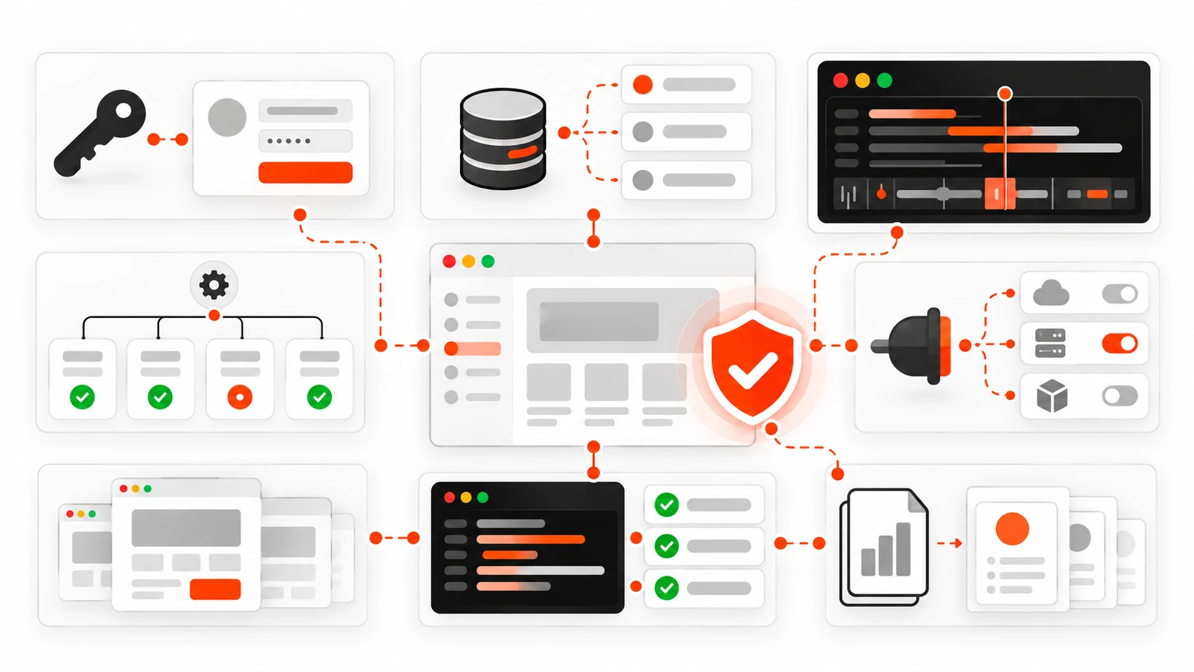
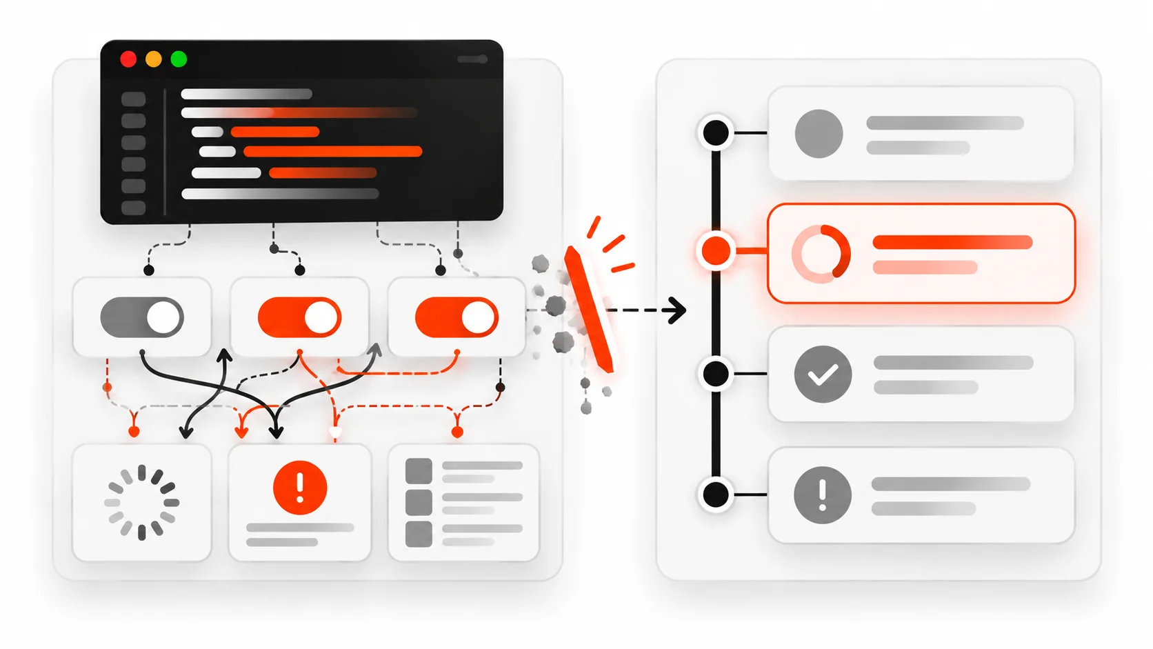
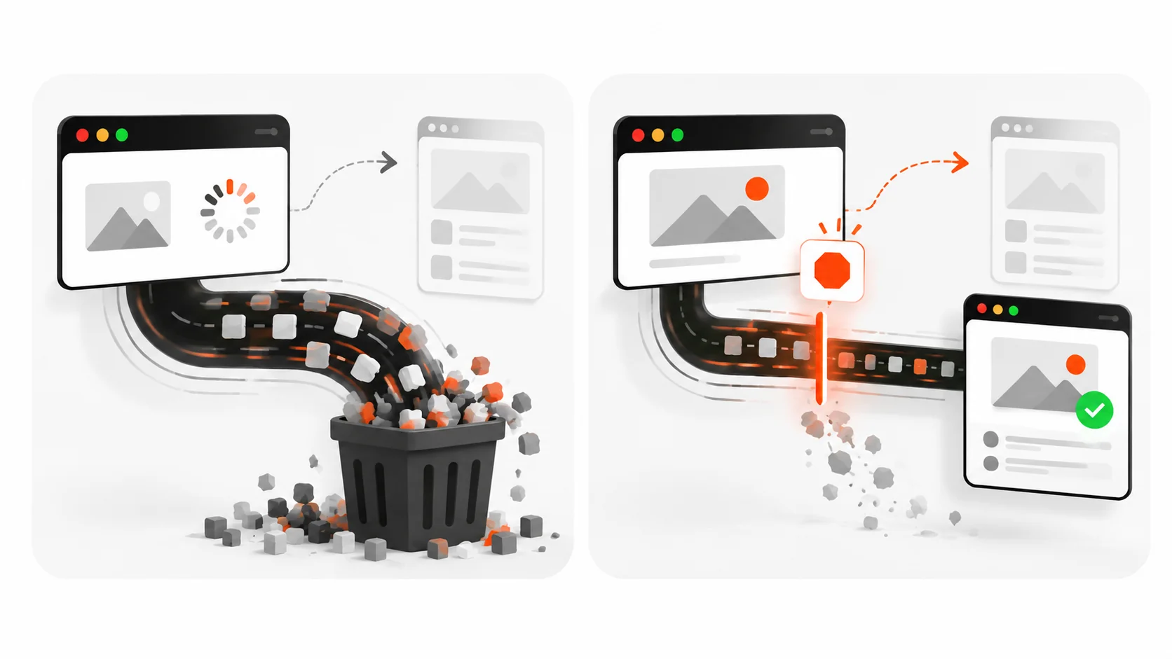
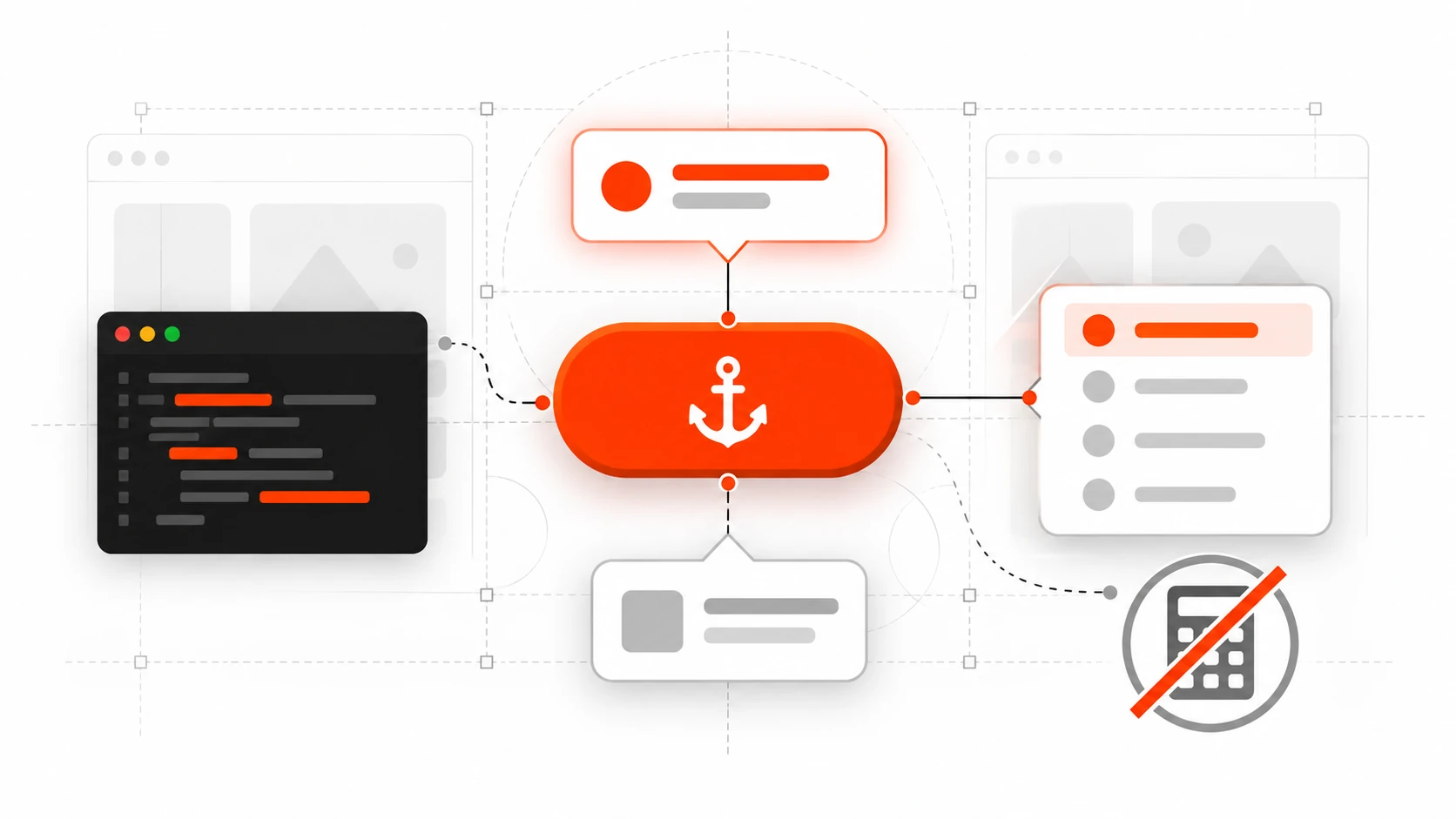
    Infographic checklist for a client-ready Playwright suite including auth storage state, API seeding, traces, and CI sharding
    A client-ready suite: auth state, API seeding, traces on retry, focused CI.

    When I hand a Playwright suite to a client or keep one running for my own site, I want these boxes checked:

    1. Smoke tests for the top three revenue or lead paths
    2. Locators based on roles and labels, not CSS trivia
    3. Web-first assertions everywhere that touches the page
    4. Isolated data per test, API seeding where possible
    5. Auth via storage state, plus one dedicated login UI test
    6. Traces on retry, HTML report uploaded in CI
    7. Chromium on PRs, broader matrix on a schedule
    8. Secrets in CI variables, never in the repo
    9. A README with npm run test:e2e, env vars, and how to open a trace
    10. Owners: someone gets paged (even softly) when main is red

    That list is not academic. It is the difference between a suite that protects launches and a suite that becomes folklore.

    Common failure modes I still see in 2026

    Flakes from hard waits. Replace waitForTimeout with assertions and locator auto-waiting.

    Tests coupled to animation timing. Prefer asserting on the final accessible state, or disable animations in test CSS when the product allows it.

    Shared email inboxes. Use unique addresses per run (user+${Date.now()}@example.com) or an API that marks users verified without mail.

    Staging data someone else deleted. Seed what you need. Do not assume yesterday’s demo account still exists.

    Over-mocking the app under test. Stub third parties. Do not stub away the feature you claim to verify.

    Ignoring accessibility in locators. If getByRole cannot find the button, users who rely on assistive tech may struggle too. Fix the UI.

    A compact example: login, create, verify

    Putting the pieces together for a tiny project-management flow:

    import { test, expect } from '@playwright/test';
    
    test.describe('projects', () => {
      test.use({ storageState: 'e2e/.auth/user.json' });
    
      test('user can create a project and see it in the list', async ({ page, request }) => {
        const name = `Launch site ${Date.now()}`;
    
        await page.goto('/projects');
        await page.getByRole('button', { name: 'New project' }).click();
        await page.getByLabel('Project name').fill(name);
        await page.getByRole('button', { name: 'Create project' }).click();
    
        await expect(page.getByRole('heading', { name })).toBeVisible();
        await page.goto('/projects');
        await expect(page.getByRole('link', { name })).toBeVisible();
    
        // optional API cleanup
        const list = await request.get('/api/projects');
        const projects = await list.json();
        const row = projects.find((p: { name: string }) => p.name === name);
        if (row) {
          await request.delete(`/api/projects/${row.id}`);
        }
      });
    });

    Short. Readable. Isolated. Asserts what a client would notice if it broke.

    How I introduce Playwright on an existing client site

    Most retainers do not start from a greenfield repo. They start from a live WordPress site, a Next.js app with uneven tests, or a Webflow-to-custom rebuild.

    My rollout looks like this:

    1. Pick three flows that would embarrass us if they failed on a Friday
    2. Add Playwright with Chromium only
    3. Get those three tests green on CI against staging
    4. Add auth storage state once login is stable
    5. Expand only when a real bug escapes or a new revenue path ships

    I would rather have three trustworthy tests than thirty that everyone ignores. Coverage theater helps nobody when the checkout is broken.

    For headless WordPress setups like the one behind darshanpanchasara.com, Playwright is also how I confirm that a published post renders the intended sections on the public front end after the admin API says “publish.” The CMS can be green while the front end cache or the headless query is wrong. An e2e check closes that loop.

    Performance and cost notes that actually matter

    Browsers are heavy. A few habits keep bills and minutes down:

    • Run fewer projects on pull requests
    • Share auth state
    • Seed via API
    • Avoid full-page screenshot comparison as your primary signal
    • Keep tests short and parallel
    • Fail fast on test.only and obvious setup errors

    If a suite is slow, profile the waits before you buy more CI shards. Slow usually means UI setup you should replace with API seeding, or assertions that wait the full timeout because the locator is wrong.

    What “done” looks like for a 2026 Playwright suite

    Done is not “we installed Playwright.” Done looks like this:

    • A developer can clone, set two env vars, and run the smoke suite locally
    • CI runs on every PR and finishes quickly enough that people wait for it
    • Failures include a trace someone can open without guessing
    • The suite failed once in the last month for a real bug, and that felt useful
    • The client or your future self can tell which user flows are protected

    That is the bar I write toward.

    Closing

    Playwright will not replace careful engineering. It will catch the broken user flow before your client records a Loom about it.

    Start small. Prefer role-based locators. Assert with web-first expectations. Isolate data. Save auth. Stub the third parties you do not own. Keep traces for the failures. Run Chromium on every pull request and grow the matrix only when it pays rent.

    If you ship websites and web apps for a living, a focused Playwright suite is one of the cheapest ways to protect trust. The goal is not a wall of green checks. The goal is never having to say, “It worked on my machine,” after a customer already tried to pay.

    When you are ready to harden the flows that make you money, write the first three tests this week. Your future Friday afternoon will thank you.
  • Accessible Forms in 2026: Labels, Errors, and Focus That Screen Readers Trust

    Accessible Forms in 2026: Labels, Errors, and Focus That Screen Readers Trust

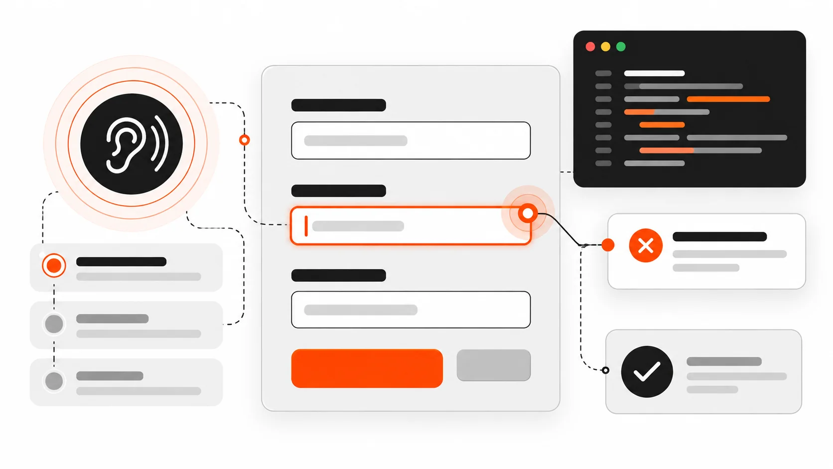
    Vector illustration of an accessible form layout with label lines, focus ring, and error callout in orange-red accent

    I still review forms that look polished and fail the first keyboard pass.

    The submit button is a beautiful orange pill. The inputs have soft shadows. Then a screen reader user tabs in and hears “edit text” with no name. An error toast flashes at the top of the page while focus stays on the button that just failed. Required fields are marked with a red asterisk that never gets announced. On mobile, the email field opens a full keyboard instead of the @-friendly one.

    None of that is a design-system problem. It is an accessibility contract problem.

    In 2026, accessible forms are still built on the same foundations: native labels, honest error identification, predictable focus, and live regions that speak when something changes asynchronously. Frameworks and WordPress builders make it easier to ship a form in an afternoon. They also make it easier to ship one that assistive technology cannot trust.

    This is the practical playbook I use on client sites and my own work: how to associate labels the browser way, how to wire errors with aria-describedby and aria-invalid, how to move focus after submit, how to announce async failures, how to mark required fields clearly, how to use autocomplete and input types for real people on real phones, and how to test with a keyboard and a screen reader before you call it done.

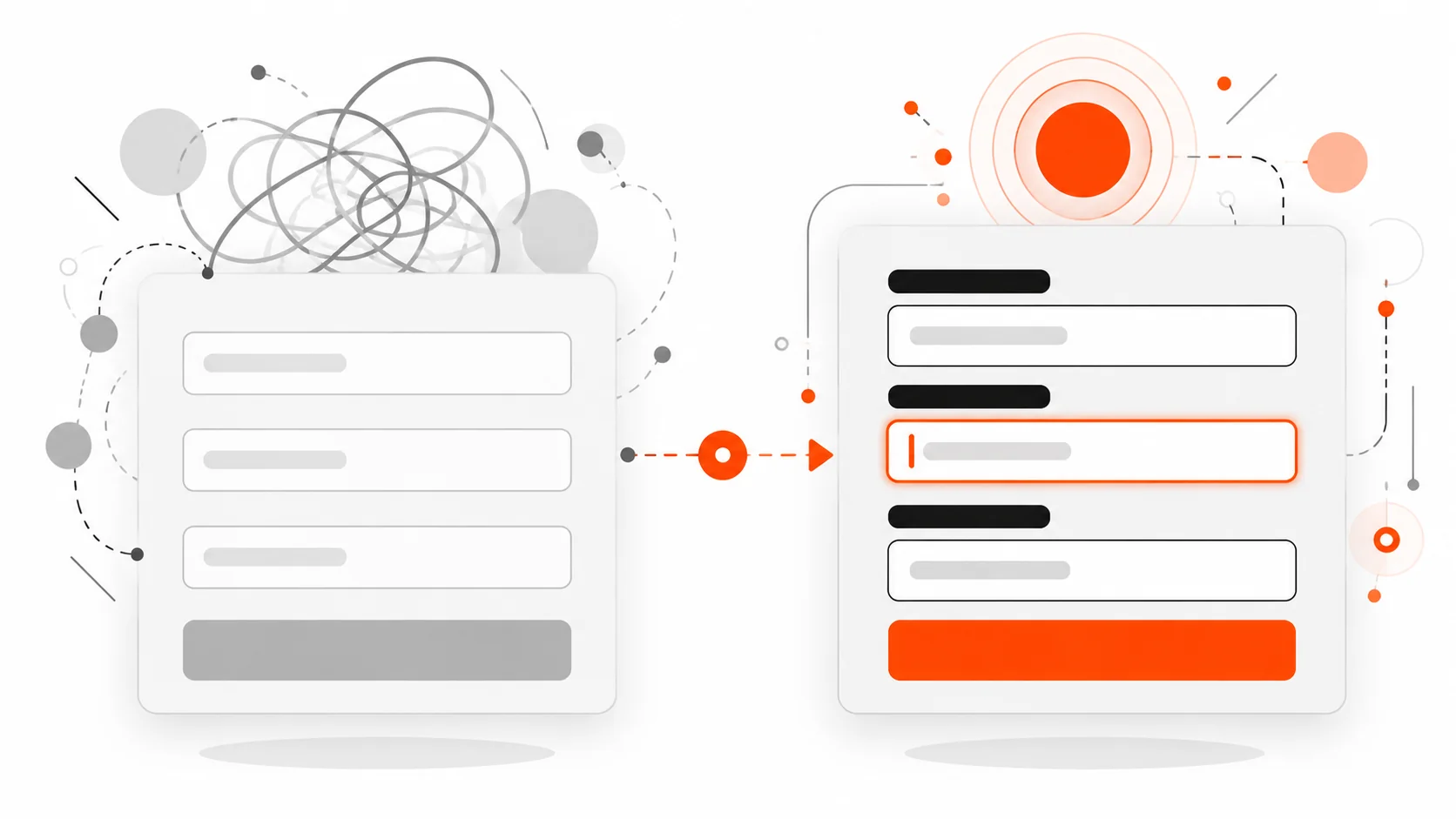
    Infographic comparing placeholder-only fields with properly labeled inputs and a focus ring
    Placeholders vanish on input. A real label stays associated with the control for sighted users and assistive technology.

    Start with a real label, not a placeholder

    Placeholders disappear when someone types. They are not labels. They are hints at best, and they often fail contrast guidelines when they try to be both.

    The reliable pattern is a visible <label> associated with the control:

    <label for="email">Email</label>
    <input id="email" name="email" type="email" autocomplete="email" />

    The for attribute on the label must match the id on the control. That is the native association browsers and assistive tech already understand. Clicking the label focuses the field. The accessible name becomes “Email”.

    You can also wrap the control:

    <label>
      Email
      <input name="email" type="email" autocomplete="email" />
    </label>

    Both are valid. I prefer explicit for/id in larger forms because the DOM gets rearranged by design systems and React fragments, and wrapping is easier to break accidentally.

    What I avoid:

    • Using only aria-label when a visible label exists (now you have two names to keep in sync)
    • Relying on placeholder as the only name
    • Putting the label in a sibling <div> with no programmatic link
    • Icon-only buttons next to fields with no accessible name

    If the visual design wants a floating label, keep a real <label> in the DOM and style it. Do not replace it with a decorative <span>.

    Group related controls with fieldset and legend

    Radio groups and checkbox clusters need a group name. fieldset and legend are still the right tools in 2026.

    <fieldset>
      <legend>Shipping method</legend>
      <label><input type="radio" name="ship" value="standard" /> Standard (3-5 days)</label>
      <label><input type="radio" name="ship" value="express" /> Express (1-2 days)</label>
    </fieldset>

    A screen reader announces the legend with each option so “Express” is not floating without context. Role-based recreations (role="group" + aria-labelledby) can work when you cannot use fieldset, but native elements survive CSS resets and component library upgrades more reliably.

    Use fieldset for:

    • Payment method radios
    • “How should we contact you?” checkbox groups
    • Address type (billing vs shipping) when both are on one screen

    Do not wrap the entire 20-field checkout in one giant fieldset with a vague legend. Group by meaning.

    Required and optional: say it in text, not only in color

    A red asterisk that is not in the accessible name helps sighted users and leaves everyone else guessing. WCAG does not ban asterisks. It bans information that is conveyed by color or shape alone.

    Patterns that work:

    <label for="company">Company <span class="optional">(optional)</span></label>
    <input id="company" name="company" autocomplete="organization" />
    
    <label for="phone">Phone <span aria-hidden="true">*</span><span class="visually-hidden">(required)</span></label>
    <input id="phone" name="phone" type="tel" autocomplete="tel" required aria-required="true" />

    Notes I follow:

    • Prefer marking optional fields in long forms where most fields are required, or mark required fields when most are optional. Pick one convention per form and stick to it.
    • The HTML required attribute enables built-in validation. aria-required="true" exposes the state to AT even when you use custom validation.
    • Do not rely on placeholder text like “Required” — it vanishes on input.

    Infographic of form error summary linked to fields with aria-describedby and focus target
    After a failed submit, focus an error summary with links to each invalid field. Tie messages with aria-describedby and aria-invalid.

    Error identification that screen readers can find

    A red border is not an error message. Users need text that names the field and describes how to fix it, and that text must be programmatically tied to the control.

    The pattern I ship:

    <label for="email">Email</label>
    <input
      id="email"
      name="email"
      type="email"
      autocomplete="email"
      aria-invalid="true"
      aria-describedby="email-hint email-error"
    />
    <p id="email-hint">We will send your receipt here.</p>
    <p id="email-error" class="error">Enter an email like name@example.com.</p>

    Why each piece matters:

    • aria-invalid="true" marks the field as invalid after validation fails. Do not set it on first paint for empty required fields.
    • aria-describedby points at hint and error ids. Multiple ids are space-separated. Order matters for announcement — put the error last if you want it heard after the hint, or first if the error is the priority after submit.
    • The error text should include the field purpose when the message might be read out of visual context (“Enter an email…” beats “Invalid format”).

    On submit failure, also provide a summary:

    <div tabindex="-1" id="form-errors" role="alert">
      <p>We found 2 problems:</p>
      <ul>
        <li><a href="#email">Email: Enter an email like name@example.com.</a></li>
        <li><a href="#phone">Phone: Enter a phone number with country code.</a></li>
      </ul>
    </div>

    Then move focus to #form-errors. Keyboard and screen reader users land on the summary instead of wondering why the page did not change. Each link jumps to the field so fixing is a straight path.

    Focus management after submit (the part teams skip)

    Focus is where the user’s attention is. After a failed submit, leaving focus on the submit button while an error appears above the fold is a common failure. Sighted mouse users may notice the red text. Keyboard and AT users often do not.

    Rules I use:

    1. Client-side validation fails: focus the error summary, or if there is only one error, focus that field.
    2. Server returns field errors: same pattern after the DOM updates.
    3. Success replaces the form with a confirmation: focus the confirmation heading (tabindex="-1" on the heading, then .focus()).
    4. Success navigates to a new page: the new page’s <h1> or main landmark should be first in the reading order; avoid autofocusing a random marketing modal.
    function showErrors(summaryEl) {
      summaryEl.hidden = false;
      summaryEl.focus();
    }

    Avoid autofocus on the first field of a multi-step form when an error summary needs priority. Autofocus can yank screen reader users past instructions.

    Live regions for async errors and saving states

    Modern forms save drafts, validate emails against an API, and submit with fetch. Visual spinners are not enough. Use live regions so status changes get announced without moving focus.

    <div id="form-status" class="visually-hidden" aria-live="polite" aria-atomic="true"></div>
    function setStatus(message) {
      const el = document.getElementById("form-status");
      el.textContent = "";
      // Some AT ignore identical updates; clear then set on next frame.
      requestAnimationFrame(() => {
        el.textContent = message;
      });
    }
    
    setStatus("Saving draft…");
    // later
    setStatus("Draft saved.");

    Guidance:

    • aria-live="polite" for non-urgent status (saved, checking availability).
    • role="alert" or aria-live="assertive" for errors that need immediate attention — use sparingly so you do not interrupt every keystroke.
    • Do not put aria-live on a region that updates on every character typed.
    • When an inline field error appears asynchronously, update the error node’s text and keep aria-describedby pointed at it. Changing aria-invalid to true at the same time helps.

    Autocomplete tokens that actually help

    Browsers and password managers need real autocomplete tokens, not autocomplete="off" sprayed on everything. For address and account forms, tokens reduce typos and reduce cognitive load.

    Common tokens I use:

    • name, given-name, family-name
    • email
    • tel, tel-national, tel-country-code
    • street-address, address-line1, address-line2, address-level2 (city), address-level1 (state), postal-code, country
    • organization
    • username, new-password, current-password
    • cc-name, cc-number, cc-csc, cc-exp

    Example:

    <label for="given-name">First name</label>
    <input id="given-name" name="given-name" autocomplete="given-name" />
    
    <label for="family-name">Last name</label>
    <input id="family-name" name="family-name" autocomplete="family-name" />
    
    <label for="addr1">Address</label>
    <input id="addr1" name="addr1" autocomplete="address-line1" />

    Turning off autocomplete to “force cleaner data” usually creates worse data and locked-out users. If a one-time code field must avoid password managers filling the wrong value, use a specific token like one-time-code where supported, not a blanket off switch on the whole form.

    Input types and mobile keyboards

    type="email", type="tel", type="url", type="number" (carefully), and inputmode change the keyboard on phones. That is accessibility and conversion.

    <input type="email" inputmode="email" autocomplete="email" />
    <input type="tel" inputmode="tel" autocomplete="tel" />
    <input inputmode="numeric" pattern="[0-9]*" autocomplete="one-time-code" />

    Caveats:

    • type="number" is often wrong for OTP, postal codes, and credit cards because of spinner UI and localization. Prefer inputmode="numeric" with a text input when you need digits without number semantics.
    • Do not block paste on password or OTP fields. Paste is an accessibility feature for password managers and people who use external authenticators.
    • maxlength can help, but announce constraints in the visible hint when truncation would confuse.

    Keyboard operability checklist for every form

    Before I open a screen reader, I do this with only the keyboard:

    1. Tab order follows visual order. No traps inside custom selects.
    2. Every control shows a visible focus style (do not remove outline without a stronger replacement).
    3. Custom dropdowns open with Enter/Space, move with arrows, close with Escape, and return focus to the trigger.
    4. Date pickers are usable as plain text inputs with a clear format hint, not calendar-only widgets.
    5. File inputs have a named label and keyboard-reachable trigger.
    6. Disabled submit buttons either are not used (prefer allowing click + error summary) or are explained with nearby text. A disabled button that never explains why is a dead end.

    Native controls get you most of this for free. Custom components are where budgets go to die — budget time for keyboard behavior when you replace a select.

    Screen reader smoke test (short, real, repeatable)

    You do not need a full audit every PR. You need a smoke test that catches the failures users hit first.

    With VoiceOver (macOS/iOS), NVDA or JAWS (Windows), or TalkBack (Android):

    1. Land on the form. Is there a heading or clear form purpose?
    2. Tab through fields. Does each announce a name, role, and value?
    3. Required fields: is required state announced?
    4. Submit empty. Is the error summary focused? Are errors listed with links?
    5. Fix one field. Does its invalid state clear without lying?
    6. Trigger an async error (offline, 422). Is the status announced?
    7. Successful submit: is the confirmation announced or focused?

    If your team only tests in Chrome with a mouse, you will ship the pretty failure mode forever.

    React form pitfalls I keep seeing

    React does not make forms inaccessible. Patterns around it do.

    Missing htmlFor. Using <label> without htmlFor and with an input as sibling, not child, breaks the name.

    Clickable divs as inputs. Rebuilding checkboxes with div + onClick loses space-to-toggle, roles, and form participation unless you reimplement everything. Prefer native <input type="checkbox"> styled with CSS.

    Conditional fields unmounted without explanation. Showing “Company name” only after “Business” is selected is fine — use a clear radio group and move focus into the new field when it appears if the flow is a wizard step. For simple progressive disclosure, ensure the new fields are after the triggering control in DOM order.

    Errors in state but not in the accessibility tree. Rendering {error && <span>{error}</span>} next to the field without aria-describedby tying it to the input means sighted users see it and AT users may not when focused on the field.

    Client routers swallowing focus. After client-side navigation to a success route, focus often stays on the body or the old button. Explicitly focus the success heading.

    Library defaults. Some form libraries set aria-invalid on mount or generate ids that change every render, breaking label association. Stabilize ids with useId() (React 18+) and only flip aria-invalid after a submit attempt or blur validation, depending on your UX rules.

    Example sketch:

    const emailId = useId();
    const errorId = useId();
    const showError = submitted && !isValidEmail(email);
    
    return (
      <>
        <label htmlFor={emailId}>Email</label>
        <input
          id={emailId}
          name="email"
          type="email"
          autoComplete="email"
          aria-invalid={showError || undefined}
          aria-describedby={showError ? errorId : undefined}
          value={email}
          onChange={(e) => setEmail(e.target.value)}
        />
        {showError ? (
          <p id={errorId} role="alert">
            Enter an email like name@example.com.
          </p>
        ) : null}
      </>
    );

    WordPress form pitfalls

    Contact Form 7, Gravity Forms, WPForms, and custom ACF front-end forms can all be fine — or not — depending on theme markup.

    Watch for:

    • Themes that hide labels with display: none (removed from accessibility tree) instead of a visually-hidden class that stays available to AT
    • AJAX submit that injects a response message without a live region or focus move
    • reCAPTCHA challenges with no keyboard alternative or no warning before submit
    • Multi-column layouts that reorder fields visually with CSS grid so tab order jumps around — fix with DOM order, not tabindex soup
    • Placeholder-only fields in page-builder kits

    When I ship a WordPress form theme override, I keep labels visible, ensure the validation container has tabindex="-1" and receives focus on error, and test the AJAX path with NVDA or VoiceOver once before handoff.

    A concrete accessible contact form skeleton

    Putting the pieces together:

    <form id="contact" novalidate>
      <div id="form-errors" class="error-summary" tabindex="-1" hidden></div>
      <div id="form-status" class="visually-hidden" aria-live="polite"></div>
    
      <p>
        <label for="full-name">Full name</label>
        <input id="full-name" name="name" autocomplete="name" required aria-required="true" />
      </p>
    
      <p>
        <label for="email">Email</label>
        <input
          id="email"
          name="email"
          type="email"
          autocomplete="email"
          required
          aria-required="true"
          aria-describedby="email-hint"
        />
        <span id="email-hint">We reply within one business day.</span>
      </p>
    
      <fieldset>
        <legend>Topic</legend>
        <label><input type="radio" name="topic" value="project" required /> New project</label>
        <label><input type="radio" name="topic" value="support" /> Support</label>
      </fieldset>
    
      <p>
        <label for="message">Message</label>
        <textarea id="message" name="message" required aria-required="true"></textarea>
      </p>
    
      <button type="submit">Send message</button>
    </form>

    On failed validation, unhide #form-errors, fill the list of links, and focus it. On success, either navigate to a thank-you page with a clear <h1> or replace the form contents and focus the confirmation heading.

    Testing matrix I actually write into QA notes

    Check How
    Label association Inspect: label for matches control id, or wrapping label
    Name, Role, Value Browser accessibility pane on each control
    Keyboard only Tab, Shift+Tab, Enter, Escape, arrows in custom widgets
    Error text tied aria-describedby targets exist; aria-invalid toggles after submit
    Focus after submit Failed: summary/field; Success: confirmation heading
    Live status Mute speakers, watch AT speech viewer while saving
    Mobile keyboard Real phone: email/tel/numeric keyboards appear
    Autocomplete Password manager fills name/email/address correctly
    Zoom 200% Fields still usable; no clipped error text
    Reduced motion If you animate errors, respect prefers-reduced-motion

    Infographic checklist for keyboard and screen reader form testing with live region status
    Ship checklist: labels, grouped controls, associated errors, focus after submit, live status, autocomplete, and a real keyboard plus screen reader pass.

    Checklist: ship / no-ship for forms

    Ship only if you can tick these:

    1. Every control has a visible, programmatically associated label (or a legitimate exception with an accessible name).
    2. Related radios/checkboxes are in a fieldset with a legend (or equivalent group name).
    3. Required/optional is clear in text, not color alone.
    4. Errors are text, associated via aria-describedby, and fields use aria-invalid when invalid.
    5. Failed submit moves focus to an error summary or first error.
    6. Async status uses a polite live region; critical errors are announced without trapping focus.
    7. autocomplete tokens match the data you ask for.
    8. Input types / inputmode match mobile keyboards.
    9. Custom widgets are keyboard operable with visible focus.
    10. Keyboard + one screen reader smoke test passed on the staging URL.

    If item 4 or 5 fails, it is a no-ship for me even when the visual design is approved. Pretty forms that strand users are still broken forms.

    Why this still matters in 2026

    Design systems got better. Component libraries ship accessible primitives. AI tools generate form markup in seconds. And yet production sites still strip labels, announce nothing on AJAX failure, and bury errors in toast libraries that never receive focus.

    Accessible forms are not a separate premium tier. They are how you know the form works for people who do not use a mouse, cannot see the red border, or complete the flow on a bus with a screen reader and a foldable keyboard.

    Ship labels that name things. Ship errors that explain things. Ship focus that follows the work. Screen readers do not need a different product. They need the same product built with the attributes and native elements that were documented for this exact job.

    If you want a deeper performance angle after you fix the form semantics, look at how validation scripts and third-party captchas affect Interaction to Next Paint — but fix the accessibility contract first. A fast form that cannot be completed is still a dead end.

  • TypeScript Discriminated Unions in 2026: Make Impossible UI States Unrepresentable

    TypeScript Discriminated Unions in 2026: Make Impossible UI States Unrepresentable

    Vector illustration of exclusive UI state branches splitting from one status tag, representing TypeScript discriminated unions

    I used to ship UI state like this:

    type BadUiState = {
      loading: boolean;
      error: string | null;
      data: Item[] | null;
    };

    It looks harmless. It compiles. Product managers approve the mock. Then a real user hits a screen that is somehow loading, showing yesterday's list, and flashing an error toast at the same time.

    That is not a React bug. That is a type design bug.

    Three independent fields create eight combinations. Most of them are nonsense. TypeScript will happily let you render every nonsense combination unless you stop modeling state as a bag of booleans.

    Discriminated unions are how I stop that in 2026. One tag. One payload shape per tag. Impossible states become unrepresentable — not "hopefully avoided in a code review," but rejected by tsc before the PR lands.

    This guide is the practical playbook: what a discriminated union is, how to model async UI, how narrowing and exhaustiveness checks work, how satisfies and never keep you honest, and the traps that make teams abandon the pattern too early.

    What a discriminated union actually is

    A union type is "this value is one of these shapes." A *discriminated* union adds a shared literal field — the discriminant — so TypeScript can tell the shapes apart.

    type Idle = { status: "idle" };
    type Loading = { status: "loading" };
    type Success = { status: "success"; data: Item[] };
    type Failure = { status: "error"; error: string };
    
    type UiState = Idle | Loading | Success | Failure;

    status is the discriminant. Every member has it. Each member uses a different string literal. Once you check state.status === "success", TypeScript narrows state to Success and you get data for free. On "error", you get error. On "loading", there is no data field to accidentally read.

    That last part is the whole point. You cannot write state.data without narrowing. The type system deletes the footgun.

    Compare that to the boolean soup version: data can be non-null while loading is true and error is a string. The type says that is fine. Your UI says that is a bug.

    Why this matters more for UI in 2026

    Frontend state got denser. Streaming responses, optimistic updates, server components with client islands, multi-step checkout, and "save as draft / publish / schedule" flows all multiply the number of real states a screen can be in.

    If you model those with independent flags, bugs show up as flicker, double toasts, empty tables during "success," and spinners that never die. Users do not file tickets titled "non-exclusive boolean state." They say the app feels broken.

    Discriminated unions push the hard thinking to type design time:

    1. List the states that are actually possible.
    2. Give each state only the fields it needs.
    3. Force every render and reducer path to handle every state.

    You still need good runtime logic. Types do not fetch data for you. They just stop you from describing a world where loading and error and success are all true.

    Infographic comparing boolean soup UI state with a clean discriminated union of idle loading success and error
    Left: independent loading, error, and data flags create impossible combinations. Right: one status tag, one payload shape per state.

    The async fetch state machine I actually ship

    Here is the pattern I use for a list page, a detail drawer, or any "load something when the query changes" view.

    type Item = { id: string; title: string };
    
    type FetchState =
      | { status: "idle" }
      | { status: "loading"; previous?: Item[] }
      | { status: "success"; data: Item[] }
      | { status: "error"; error: string; previous?: Item[] };
    
    async function loadItems(
      query: string,
      previous: Item[] | undefined,
      signal: AbortSignal
    ): Promise<FetchState> {
      try {
        const res = await fetch(`/api/items?q=${encodeURIComponent(query)}`, {
          signal,
          headers: { Accept: "application/json" },
        });
    
        if (!res.ok) {
          return {
            status: "error",
            error: `Request failed (${res.status})`,
            previous,
          };
        }
    
        const data = (await res.json()) as Item[];
        return { status: "success", data };
      } catch (err) {
        if (err instanceof DOMException && err.name === "AbortError") {
          // Caller already moved on; do not invent a failure UI.
          return { status: "idle" };
        }
        return {
          status: "error",
          error: err instanceof Error ? err.message : "Unknown error",
          previous,
        };
      }
    }

    Notice previous lives only on loading and error. That is intentional. Soft refresh can keep the old list visible under a subtle loading affordance. Hard first load has no previous data, so the loading branch renders a skeleton. Success never carries an error string. Error never pretends to be success with empty data.

    That is make-impossible-states-unrepresentable in one screenshot of a type.

    Narrowing with switch (and why if-chains get messy)

    You can narrow with if, but switch on the discriminant scales better and pairs cleanly with exhaustiveness checks.

    function renderList(state: FetchState) {
      switch (state.status) {
        case "idle":
          return "Type to search.";
        case "loading":
          return state.previous?.length
            ? `Updating… showing ${state.previous.length} cached items`
            : "Loading…";
        case "success":
          return state.data.length
            ? state.data.map((item) => item.title).join(", ")
            : "No items matched.";
        case "error":
          return `Something broke: ${state.error}`;
        default: {
          const _exhaustive: never = state;
          return _exhaustive;
        }
      }
    }

    The default branch with never is the seatbelt. If a teammate adds { status: "stale"; ... } to FetchState and forgets to update renderList, TypeScript errors on the assignment to never. That is the exhaustiveness check people mean when they say "the compiler keeps the switch honest."

    Without it, a new status silently falls through and you ship a blank panel.

    Infographic of a switch on status with a never exhaustiveness check catching a missing union member
    Switch on the discriminant, then assign the leftover state to never so new variants fail at compile time.

    Exhaustiveness via never in reducers too

    The same trick belongs in reducers and event handlers.

    type Event =
      | { type: "QUERY_CHANGED"; query: string }
      | { type: "LOADED"; data: Item[] }
      | { type: "FAILED"; error: string }
      | { type: "RESET" };
    
    function reduce(state: FetchState, event: Event): FetchState {
      switch (event.type) {
        case "QUERY_CHANGED":
          return {
            status: "loading",
            previous: state.status === "success" ? state.data : undefined,
          };
        case "LOADED":
          return { status: "success", data: event.data };
        case "FAILED":
          return {
            status: "error",
            error: event.error,
            previous: state.status === "success" ? state.data : undefined,
          };
        case "RESET":
          return { status: "idle" };
        default: {
          const _exhaustive: never = event;
          return _exhaustive;
        }
      }
    }

    Events are a second discriminated union. State is the first. Together they form a tiny typed state machine without pulling in a library. For many screens, that is enough.

    Infographic of a multi-step wizard modeled as tagged union steps with only legal fields on each step
    Each wizard step is a variant with only the fields that step is allowed to hold — illegal jumps become type errors.

    Forms, modals, and wizards: where unions shine

    Boolean soup is especially painful in multi-step UI.

    // Painful
    type BadWizard = {
      step: number;
      email?: string;
      planId?: string;
      paymentMethodId?: string;
      submitting: boolean;
      submitError?: string;
    };

    step is a number, so step 1 can somehow have a paymentMethodId. Submitting can be true on the email step. The type will not stop you.

    A union per step will:

    type Wizard =
      | { step: "email"; email: string }
      | { step: "plan"; email: string; planId: string }
      | {
          step: "pay";
          email: string;
          planId: string;
          paymentMethodId: string;
        }
      | {
          step: "submitting";
          email: string;
          planId: string;
          paymentMethodId: string;
        }
      | {
          step: "done";
          email: string;
          planId: string;
          receiptId: string;
        }
      | {
          step: "failed";
          email: string;
          planId: string;
          paymentMethodId: string;
          error: string;
        };

    Now "go to pay" must carry planId. "done" must carry receiptId. "failed" must carry error. Your transition functions become the API of the wizard, and illegal jumps become type errors.

    I use this for checkout, onboarding, and any modal that is secretly a state machine with a pretty face.

    Discriminants that are not strings

    String literals are the common case. Numbers and booleans can work, but booleans are a trap when you only have two states that later grow. Prefer string tags once a feature might gain a third mode.

    Symbols are rarely worth it for UI state. Stick to string literals your team can read in Redux DevTools, logs, and React Query style dumps.

    You can also discriminate on a shared field that is already domain data:

    type Result =
      | { ok: true; value: Item[] }
      | { ok: false; error: string };

    ok is a boolean discriminant. Fine for Result types. For screens with four or five modes, I still prefer status: "…".

    satisfies keeps config objects aligned without widening

    In 2026, satisfies is part of how I keep maps of handlers typed without losing literal inference.

    const handlers = {
      idle: () => "Start a search",
      loading: (s: Extract<FetchState, { status: "loading" }>) =>
        s.previous ? "Refreshing…" : "Loading…",
      success: (s: Extract<FetchState, { status: "success" }>) =>
        `${s.data.length} items`,
      error: (s: Extract<FetchState, { status: "error" }>) => s.error,
    } satisfies {
      [K in FetchState["status"]]: (
        state: Extract<FetchState, { status: K }>
      ) => string;
    };

    If you add a status to FetchState and forget a handler key, satisfies fails. If a handler's parameter shape drifts, it fails. You get a keyed exhaustiveness check without a giant switch — useful for component maps and route tables.

    Pattern matching libraries vs native switch

    Libraries like ts-pattern are nice when nested matching gets deep. For most UI state, native switch plus never is enough, zero dependency, and easy for juniors to read in review.

    My rule: if a single discriminant switch is hard to follow, the state model is probably too wide. Split the union. Nested matching often means you stuffed two machines into one type.

    React wiring without fighting the type checker

    A minimal React sketch:

    import { useEffect, useState } from "react";
    
    export function ItemSearch({ query }: { query: string }) {
      const [state, setState] = useState<FetchState>({ status: "idle" });
    
      useEffect(() => {
        if (!query) {
          setState({ status: "idle" });
          return;
        }
    
        const controller = new AbortController();
        const previous =
          state.status === "success" ? state.data : undefined;
    
        setState({ status: "loading", previous });
    
        loadItems(query, previous, controller.signal).then((next) => {
          if (!controller.signal.aborted) {
            setState(next);
          }
        });
    
        return () => controller.abort();
        // eslint-disable-next-line react-hooks/exhaustive-deps -- intentional: only re-run on query
      }, [query]);
    
      switch (state.status) {
        case "idle":
          return <p>Search for items.</p>;
        case "loading":
          return (
            <div>
              <p>Loading…</p>
              {state.previous ? <ItemList items={state.previous} dimmed /> : null}
            </div>
          );
        case "success":
          return <ItemList items={state.data} />;
        case "error":
          return (
            <div role="alert">
              <p>{state.error}</p>
              {state.previous ? <ItemList items={state.previous} dimmed /> : null}
            </div>
          );
        default: {
          const _exhaustive: never = state;
          return _exhaustive;
        }
      }
    }

    The render switch cannot forget a branch. The loading UI can use previous only because that field exists on that member. AbortController still cancels the fetch; the union still models the screen.

    Common mistakes that make unions feel "too heavy"

    1. Union-washing every prop. Not every boolean needs a tagged union. isOpen on a presentational modal is fine. Use discriminated unions where combinations explode or where fields only exist in some modes.

    2. Optional fields on every member. If data?: Item[] appears on all variants, you reintroduced boolean soup inside a costume. Put data only on success (and maybe previous on loading/error if you truly need soft refresh).

    3. Stringly status without literals. status: string destroys discrimination. Use "loading" as const or type the field as the literal union.

    4. Narrowing with truthiness instead of the tag. Prefer state.status === "success" over if (state.data). Truthiness checks do not teach TypeScript which variant you are in as reliably as the discriminant.

    5. Forgetting serialization boundaries. JSON from an API is unknown until you validate. A Zod schema (or similar) that outputs your discriminated union is how runtime reality meets compile-time hope. Types alone do not parse network payloads.

    Zod (or any parser) as the bridge from API to union

    import { z } from "zod";
    
    const ItemSchema = z.object({
      id: z.string(),
      title: z.string(),
    });
    
    const ApiSuccessSchema = z.object({
      status: z.literal("success"),
      data: z.array(ItemSchema),
    });
    
    const ApiErrorSchema = z.object({
      status: z.literal("error"),
      error: z.string(),
    });
    
    const ApiStateSchema = z.discriminatedUnion("status", [
      ApiSuccessSchema,
      ApiErrorSchema,
    ]);
    
    type ApiState = z.infer<typeof ApiStateSchema>;

    z.discriminatedUnion mirrors the TypeScript idea at runtime. Invalid payloads fail loudly at the boundary instead of poisoning your UI state machine.

    When a library state machine is worth it

    XState and friends earn their keep for long-lived, multi-actor flows with parallel regions, delayed transitions, and visualizer needs. For a search page, a settings form, or a three-step onboarding, a discriminated union plus a reducer is usually clearer and easier to delete later.

    Start with the union. Graduate to a library when the transition table no longer fits in your head or your PR description.

    A quick refactor checklist

    When you smell boolean soup:

    1. Write down every UI screenshot that should be possible.
    2. Name each screenshot as a status literal.
    3. Attach only the data that screenshot needs.
    4. Replace flag updates with events that return a whole new state object.
    5. Render with switch + never.
    6. Parse API input into the union at the boundary.
    7. Delete the old booleans in the same PR so nobody keeps writing to them.

    Do that on one painful screen. The next screen goes faster because the team has a pattern to copy.

    Performance and bundle size: not the blocker

    Discriminated unions are a type-level tool. They erase at compile time. Your bundle does not grow because you modeled state correctly. Runtime cost is the same object shapes you would have built anyway — usually smaller, because you stop storing contradictory fields.

    What *can* cost you is over-normalized deep cloning in reducers. Return new objects only for the branches that change. That is normal React advice, not a union tax.

    How this pairs with the rest of a 2026 TypeScript stack

    • React Server Components: keep server props narrow; use unions on the client islands that own interactive state.
    • Next.js app router: search params and route state still deserve typed unions when they drive exclusive UI modes.
    • tRPC / typed REST: generate or share the success/error union so client and server agree on the discriminant.
    • Testing: assert on status first. Snapshotting a whole soup object hides illegal combinations. Testing a union branch is obvious.

    The mindset shift

    Stop asking "what flags do I need?" Start asking "what situations can this UI actually be in?"

    Flags describe knobs. Unions describe moments. Users experience moments. Types should too.

    When a designer adds a "partial success with warnings" mock, that is a new variant — not a new boolean piled onto success. Name it. Give it fields. Update the switch. Let never find the call sites you missed.

    That is the whole craft: make illegal screens untypable, then sleep better.

    Wrap-up

    TypeScript discriminated unions are not academic. They are how you stop shipping loading-plus-error-plus-stale-data screens in 2026.

    Model exclusive UI modes as tagged variants. Narrow on the tag. Prove exhaustiveness with never. Parse at the boundary. Keep optional fields from leaking into every member. Use satisfies when you want keyed handler maps. Reach for heavier state machines only when the flow outgrows a clean union.

    If your types can represent a nonsense screen, eventually a user will see that screen. Delete the nonsense from the type, and a whole class of bugs loses its oxygen.

    Next time you reach for loading, error, and data as siblings, pause. Write the union instead. Your future self — and your QA board — will notice.

  • AbortController in 2026: Cancel Fetch Requests Before They Waste Bandwidth

    AbortController in 2026: Cancel Fetch Requests Before They Waste Bandwidth

    Vector illustration of a network request being canceled mid-flight while a fresh request continues, representing AbortController and fetch cancellation

    If you have ever typed into a search box, changed routes mid-load, or closed a modal while a spinner was still spinning, you have already met the problem AbortController solves.

    The UI moved on. The network did not.

    In 2026, that gap is no longer a cute edge case. Mobile data still costs money. Battery still matters. Stale responses still overwrite fresher UI state. And Core Web Vitals care about how responsive your page feels after each interaction. Leaving orphan fetches alive is how “fast on paper” apps feel laggy in real hands.

    This guide is the practical AbortController playbook I wish every codebase shipped with: how the API works, how to cancel fetch, how AbortSignal.timeout() and AbortSignal.any() change the patterns, how to wire React cleanup without drama, and the mistakes that make abort look broken when it is not.

    What AbortController actually is

    AbortController is a small browser built-in with one job: create a signal you can flip from “keep going” to “stop.”

    const controller = new AbortController();
    const { signal } = controller;
    
    // later, when the work should die:
    controller.abort();
    // optional reason in modern browsers:
    // controller.abort(new Error("User left the page"));

    Anything that accepts an AbortSignal can listen for that flip. The big one is fetch:

    const controller = new AbortController();
    
    const response = await fetch("/api/search?q=hooks", {
      signal: controller.signal,
    });

    When you call controller.abort(), the browser rejects the fetch promise with a DOMException named AbortError (or, if you passed a custom reason, that reason may surface depending on the browser and call site). Your job is to treat that rejection as an expected exit, not a toast-worthy failure.

    That is the whole mental model:

    1. Create a controller when a unit of work starts.
    2. Pass signal into every async API that supports it.
    3. Call abort() when the result no longer matters.
    4. Catch AbortError and stay quiet.

    Why canceling fetch matters more in 2026

    Three forces make this a default skill, not an advanced trick.

    1. UI is more interruptible. Soft navigations, typeahead, infinite scroll, optimistic UI, and streaming responses mean users constantly invalidate in-flight work.

    2. Bandwidth is not free. A 2 MB JSON payload for a search the user already abandoned is not “harmless.” On flaky networks it also queues behind real requests.

    3. Correctness races are ugly. Request A starts. Request B starts. A finishes last and paints yesterday’s data over today’s screen. Aborting A when B starts is the boring, correct fix.

    If your product has search, filters, tabs, or route changes, you need abort (or an equivalent cancellation token) somewhere in the stack.

    Infographic comparing an abandoned fetch that still downloads with a canceled fetch stopped by AbortController
    Left: the UI moved on but the old request keeps downloading. Right: AbortController stops the stale request so only the work you still need continues.

    The minimal cancelable fetch

    Here is the pattern I use in plain JavaScript when a user action should kill the previous request:

    let activeController = null;
    
    async function search(query) {
      if (activeController) {
        activeController.abort();
      }
    
      const controller = new AbortController();
      activeController = controller;
    
      try {
        const res = await fetch(`/api/search?q=${encodeURIComponent(query)}`, {
          signal: controller.signal,
          headers: { Accept: "application/json" },
        });
    
        if (!res.ok) {
          throw new Error(`Search failed: ${res.status}`);
        }
    
        const data = await res.json();
    
        // Only apply if this controller is still the latest one.
        if (activeController !== controller) return;
        renderResults(data);
      } catch (err) {
        if (err?.name === "AbortError") {
          return; // expected
        }
        showError(err);
      }
    }

    Key details:

    • Abort the previous controller before starting a new one.
    • Still guard with “am I still the latest controller?” after await, because abort is cooperative around your own post-processing.
    • Swallow only AbortError. Real network failures should still surface.

    AbortSignal.timeout(): deadlines without duct tape

    For years we all wrote the same fragile timeout helper: setTimeout plus abort() plus cleanup. In modern browsers you can skip that.

    const res = await fetch("/api/report", {
      signal: AbortSignal.timeout(8_000),
    });

    AbortSignal.timeout(8000) returns a signal that aborts automatically after 8 seconds. The rejection is still an abort-style error (commonly TimeoutError in timeout cases — check err.name in your catch and handle both AbortError and TimeoutError if you care about messaging).

    Use timeouts when an API is known to hang under load, when you would rather fail fast and let the user retry than leave a spinner forever, or when you are calling a third-party endpoint you do not control. Do not use absurdly short timeouts on large downloads. Canceling a legitimate slow response is still a cancellation.

    Infographic of AbortSignal.timeout cutting off a hanging request at a deadline
    AbortSignal.timeout gives a request a deadline. When the clock hits the limit, the signal aborts and your code can stop waiting.

    AbortSignal.any(): user cancel OR timeout

    Sometimes you want either a manual cancel or a deadline to win. AbortSignal.any() combines signals:

    const controller = new AbortController();
    
    const signal = AbortSignal.any([
      controller.signal,
      AbortSignal.timeout(10_000),
    ]);
    
    button.addEventListener("click", () => controller.abort());
    
    try {
      const res = await fetch("/api/export", { signal });
      // ...
    } catch (err) {
      if (err?.name === "AbortError" || err?.name === "TimeoutError") {
        // user canceled or deadline hit
        return;
      }
      throw err;
    }

    This is cleaner than nesting controllers or sharing mutable timeout IDs across helpers.

    React: cancel on unmount (and on dependency change)

    React Strict Mode double-invokes effects in development. That used to make people scared of abort. The right response is not “skip abort.” It is “treat AbortError as normal.”

    import { useEffect, useState } from "react";
    
    export function UserProfile({ userId }) {
      const [user, setUser] = useState(null);
      const [error, setError] = useState(null);
    
      useEffect(() => {
        const controller = new AbortController();
    
        async function load() {
          try {
            setError(null);
            const res = await fetch(`/api/users/${userId}`, {
              signal: controller.signal,
            });
            if (!res.ok) throw new Error("Failed to load user");
            const json = await res.json();
            setUser(json);
          } catch (err) {
            if (err?.name === "AbortError") return;
            setError(err);
          }
        }
    
        load();
        return () => controller.abort();
      }, [userId]);
    
      if (error) return <p>Could not load profile.</p>;
      if (!user) return <p>Loading…</p>;
      return <h1>{user.name}</h1>;
    }

    When userId changes, React runs cleanup for the previous effect, which aborts the old fetch, then starts a new one. That is exactly what you want.

    Typeahead with debounce + abort

    Debounce reduces how often you fire. Abort makes sure an older fire cannot win.

    import { useEffect, useState } from "react";
    
    export function SearchBox() {
      const [query, setQuery] = useState("");
      const [results, setResults] = useState([]);
    
      useEffect(() => {
        if (!query.trim()) {
          setResults([]);
          return;
        }
    
        const controller = new AbortController();
        const handle = setTimeout(async () => {
          try {
            const res = await fetch(`/api/search?q=${encodeURIComponent(query)}`, {
              signal: controller.signal,
            });
            const data = await res.json();
            setResults(data.items ?? []);
          } catch (err) {
            if (err?.name === "AbortError") return;
            console.error(err);
          }
        }, 250);
    
        return () => {
          clearTimeout(handle);
          controller.abort();
        };
      }, [query]);
    
      return (
        <>
          <input value={query} onChange={(e) => setQuery(e.target.value)} />
          <ul>
            {results.map((item) => (
              <li key={item.id}>{item.title}</li>
            ))}
          </ul>
        </>
      );
    }

    Cleanup clears the pending debounce timer and aborts an in-flight request. Fast typists stop creating a pile of zombie network calls.

    Infographic of React effect cleanup aborting a fetch when the user changes route or search query
    In React, effect cleanup should abort the in-flight fetch when the dependency changes or the component unmounts, so stale responses never update state.

    Next.js / App Router notes

    Server Components can still benefit from cancellation when you pass a signal into fetch during a request that may be aborted by the platform, but the everyday product win is on the client: route transitions, client components, and interactive widgets.

    If you wrap data fetching in a client hook (SWR, React Query / TanStack Query, or your own), prefer libraries that already accept or create abort signals. TanStack Query aborts outgoing queries when they become obsolete. If you roll your own loader in a Client Component, use the useEffect cleanup pattern above.

    On the server, prefer short timeouts for upstream calls you control with AbortSignal.timeout, and fail loudly in logs when upstreams hang. Do not confuse “server took 12 seconds” with “browser should keep a spinner forever.”

    Aborting more than fetch

    fetch is the headline feature, but signals show up elsewhere:

    • addEventListener supports an options object with signal so the listener auto-removes on abort.
    • Streams and readers can be canceled; pair them with the same user intent that aborted the fetch.
    • Your own async functions can check signal.aborted or listen to signal.addEventListener("abort", ...).

    Example: a long client-side job that should stop when the user navigates away.

    async function processChunks(chunks, signal) {
      for (const chunk of chunks) {
        if (signal.aborted) {
          throw new DOMException("Aborted", "AbortError");
        }
        await heavyWork(chunk);
      }
    }

    Once you start passing signals through your async stack, cancellation becomes a design feature instead of a pile of boolean flags named isCancelled.

    What happens on the wire

    People ask: “Does abort really stop the download?”

    Practically:

    • Your JavaScript stops waiting. You will not parse the body into JSON after an abort you handled correctly.
    • Browsers generally cancel the HTTP request. You may still see a canceled request in DevTools Network.
    • Proxies, HTTP/2 multiplexing, and already-buffered bytes mean you should think of abort as best-effort network savings plus hard client-side correctness — not a guarantee that zero bytes left the server.

    That is still enough reason to do it. Correctness alone pays for the pattern.

    Axios, ky, and friends

    Native fetch takes { signal }. So do most modern wrappers.

    ky

    import ky from "ky";
    
    await ky.get("/api/items", { signal: controller.signal }).json();

    axios (modern)

    await axios.get("/api/items", { signal: controller.signal });

    Older axios code used CancelToken. If you maintain a legacy app, migrate toward signal so one AbortController can cancel fetch and axios the same way.

    Testing cancellation

    You do not need a flaky integration test to prove abort works. A focused unit test is enough:

    1. Start a fetch against a delayed mock (Mock Service Worker, undici MockAgent, or a local handler that waits).
    2. Abort the controller.
    3. Assert the promise rejects with AbortError.
    4. Assert your UI store did not apply the late payload.

    In Playwright or Cypress, assert that rapid typing does not leave the results list on an older query. That UI-level check catches missing abort faster than reading source.

    Common mistakes (and how to spot them)

    1. Creating a controller but never passing signal. Aborting does nothing if nobody is listening. Grep for new AbortController and confirm each one reaches fetch or equivalent.

    2. Catching all errors and showing a toast. Users should not see “Something went wrong” because they typed another character. Branch on err.name === "AbortError".

    3. Aborting in the wrong place. If you abort inside the success path, or share one global controller for unrelated requests, you will cancel work you still need. Scope controllers to one logical operation.

    4. Forgetting to abort on dependency change. Unmount-only cleanup is incomplete for search boxes and filters. Cleanup must run whenever the effect re-runs.

    5. Assuming abort replaces request IDs. Abort helps, but after await res.json() you may still want a generation counter or “is this controller still current?” check before writing to state.

    6. Using timeouts that are shorter than your p95 latency. You will manufacture failures. Measure first.

    7. Trying to abort completed work. Calling abort() after the promise settled is a no-op for that request. Harmless, but it will not roll back state you already applied — that is your responsibility.

    A production checklist

    Before you merge a feature that fires network requests from the client, ask:

    • Can the user invalidate this request before it finishes?
    • Do we abort the previous request when a newer one starts?
    • Do we ignore AbortError in UI error reporting?
    • Do lists/search/filters debounce and abort?
    • Do route transitions cancel in-flight loaders?
    • Do long upstream calls on the server use AbortSignal.timeout?
    • Do DevTools show canceled requests when we navigate away mid-flight?

    If you can answer yes to the ones that apply, you are ahead of most apps I audit.

    Copy-paste utility I keep around

    export function createCancellableFetch(baseFetch = fetch) {
      let controller = null;
    
      return {
        abort() {
          controller?.abort();
          controller = null;
        },
        async fetch(input, init = {}) {
          controller?.abort();
          controller = new AbortController();
    
          const userSignal = init.signal;
          const signal = userSignal
            ? AbortSignal.any([controller.signal, userSignal])
            : controller.signal;
    
          return await baseFetch(input, { ...init, signal });
        },
      };
    }

    Wire that into a search module or a small data client and you stop re-implementing the same eight lines in every feature.

    When you should not obsess over abort

    Not every GET of a 2 KB config file on first paint needs a ceremony. Focus abort where invalidation is common: search, filters, live polling you replace with newer polls, tabbed panels, and navigations. For fire-and-forget analytics pings, cancellation may not be worth the noise — though you still should not let analytics block UI.

    Also remember: abort is not an authorization boundary. Never assume “we aborted, so the server did not process it.” Mutations need idempotency keys and honest server semantics.

    Wrap-up

    AbortController is not exotic anymore. It is how you keep client-side async honest.

    • Create a controller per logical operation.
    • Pass signal into fetch (and anything else that accepts it).
    • Abort when the user or the UI moves on.
    • Use AbortSignal.timeout() for deadlines and AbortSignal.any() to combine reasons.
    • In React, abort in effect cleanup and treat AbortError as success-path silence.
    • Guard state updates so a late response cannot win a race.

    Ship those habits and you will waste less bandwidth, see fewer “wrong results flashed on screen” bugs, and make interactions feel as snappy as your Lighthouse scores claim they are.

    If you want the deeper performance angle after you clean up request races, pair this with solid INP work: less main-thread contention plus fewer late network completions is how responsive UIs actually feel in 2026.

  • Interaction to Next Paint in 2026: Fix Slow Clicks Before They Cost Rankings

    Interaction to Next Paint in 2026: Fix Slow Clicks Before They Cost Rankings

    Vector illustration of a tap on a phone triggering an instant interface update on a laptop, representing Interaction to Next Paint

    If your site looks fast but feels sticky when people tap a button, Google already knows. Interaction to Next Paint (INP) is the Core Web Vital that measures how quickly your page responds after a click, tap, or keypress. In 2026 it is still one of the clearest signals that separates a polished product from a page that quietly loses trust, conversions, and search visibility.

    I spend a lot of time shipping React, WordPress, and hybrid stacks for clients. The pattern I see over and over is the same: teams obsess over Largest Contentful Paint, ship a prettier hero, then ignore the lag when someone opens a menu, submits a form, or filters a product grid. That lag is INP. This guide is the practical playbook I use to find it, fix it, and keep it from coming back.

    What INP Actually Measures

    INP looks at the delay between a user interaction and the next visual update the browser paints. It is not a single lab number from one perfect test run. Chrome collects interaction timings during a real session and reports a high percentile of those events. In practice, that means your worst regular interactions matter more than your best demo click.

    A good mental model is three phases:

    1. Input delay: waiting for the main thread to even start your event handler.
    2. Processing time: running your JavaScript, React state updates, DOM work, or WordPress scripts.
    3. Presentation delay: style, layout, and paint before the user sees a change.

    INP is the sum of those phases for an interaction. If any one of them balloons, the metric suffers. That is why a tiny click handler that triggers a giant re-render can feel just as bad as a page blocked by a huge third-party script.

    Google’s guidance still treats roughly 200 ms or less as good, 200 to 500 ms as needs improvement, and above 500 ms as poor. Those thresholds are not academic. Users feel the difference long before a Lighthouse score turns red.

    Infographic of the three phases of an interaction: input delay, processing, and presentation
    Every interaction has three phases: input delay while the main thread is busy, processing while your event handlers run, and presentation while the browser paints the next frame.

    Why INP Matters More Than a Pretty Score

    Search teams care because Core Web Vitals remain part of page experience signals. Product teams should care for a simpler reason: slow interactions destroy confidence. A checkout button that takes half a second to acknowledge a tap feels broken even when the network is fine. A filter that freezes the page for a second teaches people not to explore.

    I have watched clients celebrate a green LCP while their mobile INP sat in the red because a mega-menu, a chat widget, or a client-side filter was doing too much work on every click. Ranking conversations get easier when the site also feels responsive. Conversion conversations get easier even faster.

    INP also exposes architecture debt. If every button click waits on a global store update, a synchronous analytics flush, or a theme script that walks the whole DOM, you will see it here. Fixing INP often improves maintainability, not just metrics.

    How to Measure INP Without Fooling Yourself

    Lab tools are useful, but they are incomplete. Use them to reproduce, not to declare victory.

    • Chrome DevTools Performance panel: record a click path, look for long tasks around the interaction, and inspect scripting vs rendering time.
    • Lighthouse and PageSpeed Insights: good for spotting likely offenders and field data from the Chrome UX Report when available.
    • Web Vitals JavaScript library: send INP attributions from real users to your analytics so you know which selectors and pages hurt most.
    • Search Console Core Web Vitals report: the production truth for URL groups Google cares about.

    When I debug a client site, I always ask for a real user path: open mobile nav, apply two filters, add to cart, open a modal, type in search. Synthetic homepage loads miss the painful interactions.

    Also watch device reality. A MacBook Pro can hide main-thread problems that a mid-range Android phone makes obvious. If your audience is mobile-heavy in India or other markets with mixed device quality, test on those constraints. Throttle CPU in DevTools when you need a quick local stress test.

    Infographic of a responsiveness gauge comparing a slow page response with a fast one
    Google rates INP as good at 200 ms or less, needs improvement up to 500 ms, and poor above 500 ms, measured at the 75th percentile of real visits.

    The Usual Suspects Behind Bad INP

    Most INP fires I see fall into a short list.

    Heavy event handlers on the main thread

    Click handlers that sort big arrays, rewrite large DOM trees, or call expensive libraries synchronously are classic. React setState that re-renders a huge tree on every keystroke is another. WordPress themes that attach jQuery animations to every menu item still show up in 2026 audits more often than people admit.

    Third-party scripts that steal the thread

    Chat widgets, A/B tools, tag managers with messy containers, heatmaps, and old marketing pixels love to run timers and mutation observers. One slow third party can push an otherwise healthy app into poor INP.

    Layout thrash after interaction

    If your handler reads layout, writes styles, reads again, and forces reflow in a loop, presentation delay explodes. Animated accordions, sticky headers recalculating on every toggle, and carousels that measure every slide on click are frequent offenders.

    Hydration and client islands that wake up late

    On React and Next.js sites, a click that lands while hydration is still busy can feel dead. Large client bundles delay the moment your interactive components are ready. Server Components help the first paint, but any client island that mounts a giant dependency graph still owns the interaction cost.

    Input delay from long tasks before the click

    Sometimes the handler itself is fine. The page is just busy with ads, image decoding work scheduled poorly, or a React concurrent render that never yields. The click waits in line, and INP counts that wait.

    A Practical Fix Order That Works on Real Sites

    I do not start by rewriting the whole frontend. I start with the highest leverage cuts.

    1. Find the exact interaction and element

    Use web-vitals attribution or DevTools to name the page, the element, and the event type. “Homepage is slow” is not a bug report. “Mobile product archive, filter chip click, 780 ms INP, main thread blocked 520 ms by FilterDrawer” is a bug report.

    2. Show immediate visual feedback

    Before the expensive work finishes, update something the user can see: a pressed state, a spinner in the button, an optimistic checkbox, a skeleton in the panel. INP cares about the next paint. A cheap style change that acknowledges the tap can dramatically improve perceived responsiveness even while data is still loading. Just do not fake completion. Acknowledge first, complete second.

    3. Break up long tasks

    If a handler needs more than roughly 50 ms, yield to the browser. In modern browsers, scheduler.yield() (with a setTimeout fallback) or smaller chunks of work help. In React 18+, startTransition marks non-urgent updates so urgent input can paint sooner. For plain JavaScript, split array work, defer non-critical analytics, and move pure computation to a worker when it is truly heavy.

    Infographic comparing one long main-thread task blocking a click with smaller tasks that let the click through
    One long task makes a click wait its turn. Splitting the same work into smaller chunks gives the browser gaps to respond and paint.

    4. Reduce what re-renders or reflows

    In React, memoize expensive lists, push state down, and avoid putting rapidly changing values in a top-level context. In WordPress or vanilla DOM land, update the smallest node you can. Replace whole-table innerHTML rewrites with targeted row updates. Cache DOM queries. Avoid reading layout properties unless you need them.

    5. Defer or remove third parties

    If a widget is not needed for the first interaction on a page, load it after idle or after the user opens the feature. I have fixed more INP issues by delaying a chat script until the chat button is clicked than by micro-optimizing application code. Audit your tag manager. One unused tag with a fat bundle is still a tax on every click.

    6. Prefetch wisely, hydrate selectively

    For Next.js and similar stacks, keep interactive islands small. Lazy-load editors, maps, carousels, and dashboards. Do not hydrate the whole page just because one button needs state. Partial hydration patterns and Server Components exist so your click handlers are not buried under unused client JS.

    React and Next.js Patterns I Reach For

    When the stack is React, these patterns repeatedly help INP:

    • Use startTransition for filter and sort updates that can wait a frame.
    • Keep controlled inputs light; debounce server fetches, not the character paint itself when possible.
    • Virtualize long lists so a click does not reconcile hundreds of nodes.
    • Move analytics to requestIdleCallback or a queue after paint.
    • Avoid giant useEffect chains that run on every interaction-driven prop change.
    • Prefer concurrent-friendly libraries; some date pickers and rich text editors are still expensive on open.

    For Next.js App Router apps, Server Components reduce the default client surface, which is good for INP, but only if you stay disciplined. A “use client” boundary around a whole page brings the old problem back. Put client state at the leaf: the menu, the filter, the modal, the form.

    WordPress-Specific INP Cleanup

    WordPress sites often fail INP for theme and plugin reasons rather than content reasons.

    • Disable unused plugin scripts on templates that do not need them.
    • Replace jQuery UI animations with CSS transitions where a simple open and close is enough.
    • Load mega-menu logic only on header interaction, not on every page load as a blocking suite.
    • Beware page builders that inject large frontend runtimes for a single accordion.
    • Turn off chat, popup, and social proof widgets on checkout and other high-intent templates if they are not essential.
    • Use a performance plugin carefully: caching helps TTFB and LCP more than INP, while deferring scripts can help INP if you do not break needed interactivity.

    I still see themes enqueueing slider scripts sitewide. If the homepage slider is the only consumer, the blog post page should not pay for it when someone clicks a TOC link.

    Accessibility and INP Are Allies

    Keyboard users trigger INP too. Focus changes, Enter and Space on buttons, and Escape to close dialogs are interactions. If your focus trap or modal library does expensive querySelectorAll work on every keydown, both accessibility and INP suffer.

    Build the interaction to be correct first: visible focus, sane tab order, immediate open and close feedback. Then optimize the path. An accessible control that paints a state change quickly is usually good INP as well.

    A Field Checklist You Can Run This Week

    Use this on any site you maintain.

    1. Pull CrUX or Search Console data for INP by template type.
    2. Pick the worst mobile URL group with traffic.
    3. Record three real interactions on a mid-tier phone profile.
    4. Note the longest task and the script URL responsible.
    5. Ship one fix: delay a third party, split a handler, or add optimistic UI.
    6. Re-measure field data over several days, not only one Lighthouse run.
    7. Add a regression guard: performance budget on JS for interactive routes, plus a synthetic click path in CI if you have the maturity for it.

    You do not need a perfect observability stack to start. You need one painful interaction, one owner, and one deploy that makes the next paint sooner.

    Common Mistakes That Waste a Sprint

    • Chasing Lighthouse green while field INP stays red.
    • Optimizing images again when the click path never waited on images.
    • Wrapping everything in memo without measuring, which can add overhead.
    • Moving work to setTimeout(0) chaos instead of structured yielding and prioritization.
    • Removing a feature users need just to win a metric. Cut waste, not value.
    • Declaring victory from a desktop-only test.

    INP is a product quality metric dressed as a search metric. Treat it that way and the SEO benefit becomes a side effect of a better site.

    What Good Looks Like in 2026

    On a healthy marketing site, opening the mobile nav, toggling an FAQ, and submitting the newsletter form should feel instant. On an ecommerce template, filter chips and add-to-cart should acknowledge immediately, with heavier catalog work streamed afterward. On a SaaS dashboard, table sorting can be slightly heavier, but typing and button presses should still stay responsive.

    Teams that win here usually share habits: small client bundles, strict third-party reviews, interaction profiling in code review for UI-heavy PRs, and field monitoring tied to specific components.

    Final Takeaway

    If you only improve one performance habit this quarter, make it this: every important click should paint feedback fast. Measure INP from the field, attribute it to a real element, then remove main-thread work or defer it until after that paint. Whether you ship Next.js, WordPress, or a mixed stack, the browser does not care about your framework loyalty. It cares whether the next frame arrives while the user still trusts your UI.

    Fix the sticky clicks. Rankings, conversions, and your own product pride tend to follow.

  • Next.js Server Components in 2026: Fetch Less on the Client, Ship Faster Pages

    Next.js Server Components in 2026: Fetch Less on the Client, Ship Faster Pages

    If you are still shipping a big client JavaScript bundle just to load a product page, a blog index, or a dashboard shell, 2026 is a good year to rethink the default. Next.js App Router treats Server Components as the normal path. That means you fetch closer to your data, keep secrets on the server, and send less JavaScript to the browser – without giving up the interactive bits users still need.

    Server rendering React components and sending lightweight UI to the browser while heavy JavaScript bundles are filtered out
    Server Components move fetching off the client so pages ship leaner.

    I have rebuilt enough client-heavy React apps to know the pattern: everything starts as a Client Component “just in case,” then useEffect fetch chains pile up, loading spinners multiply, and Core Web Vitals quietly slip. Server Components reverse that habit. You render on the server by default, stream HTML early, and only mark the interactive leaves with 'use client'.

    This guide is practical. We will cover how React Server Components (RSC) fit the App Router, how to fetch and cache without guessing, when Client Components are actually required, how Suspense streaming improves perceived speed, and the mistakes I still see in production code reviews.

    What Server Components Actually Are (And Are Not)

    In the App Router, files under app/ are Server Components by default. A Server Component can be async, talk to a database or internal API, read environment secrets that are not prefixed with NEXT_PUBLIC_, and return UI. Its source does not ship as a client bundle. The browser receives HTML plus a compact RSC payload that tells React where Client Component islands belong.

    That is different from “SSR of a Client Component.” Client Components still render on the server for the first paint, then hydrate in the browser. Server Components never hydrate as themselves. They resolve on the server (or at build time / cache time), and the client only reconciles the resulting tree.

    Use Server Components when you need to:

    • Fetch data near the source (DB, CMS, internal services)
    • Keep API keys and tokens off the client
    • Cut JavaScript weight for mostly-static or read-heavy UI
    • Improve First Contentful Paint and stream progressive HTML

    Use Client Components when you need:

    • State and event handlers (useState, onClick, onChange)
    • Lifecycle logic (useEffect, subscriptions)
    • Browser APIs (window, localStorage, geolocation)
    • Custom hooks that depend on the above

    A Minimal Server Component Page

    Here is the mental model I want every teammate to internalize: the page stays a Server Component. Interactive UI is a small child with 'use client'.

    // app/products/[id]/page.tsx
    import LikeButton from '@/app/ui/like-button'
    import { getProduct } from '@/lib/data'
    
    export default async function ProductPage({
      params,
    }: {
      params: Promise<{ id: string }>
    }) {
      const { id } = await params
      const product = await getProduct(id)
    
      return (
        <main>
          <h1>{product.title}</h1>
          <p>{product.description}</p>
          <LikeButton initialLikes={product.likes} productId={product.id} />
        </main>
      )
    }
    // app/ui/like-button.tsx
    'use client'
    
    import { useState } from 'react'
    
    export default function LikeButton({
      initialLikes,
      productId,
    }: {
      initialLikes: number
      productId: string
    }) {
      const [likes, setLikes] = useState(initialLikes)
    
      return (
        <button
          type="button"
          onClick={async () => {
            setLikes((n) => n + 1)
            await fetch(`/api/products/${productId}/like`, { method: 'POST' })
          }}
        >
          {likes} likes
        </button>
      )
    }

    Notice what did not happen: no useEffect to load the product, no client-side loading spinner for the title, no public API key dangling in the browser. The expensive read stays on the server. The button is the only hydrated island.

    Fetching Data in 2026: Defaults Matter

    Caching behavior in Next.js has shifted across versions, so do not copy old blog posts blindly. Rough timeline for App Router mental models:

    • Next.js 13/14 era: fetch in Server Components often cached aggressively by default.
    • Next.js 15: fetch defaults moved toward no-store in many server contexts – fresher by default, cache when you opt in.
    • Next.js 16 Cache Components: caching becomes more explicit with 'use cache', cacheLife, and cacheTag, replacing a lot of route-segment revalidate / dynamic config when the flag is enabled.

    In client projects I ship today, I treat caching as a deliberate decision at the data layer, not something magically correct because “it is Next.”

    Pattern A: Always-fresh server read

    export async function getCart(userId: string) {
      const res = await fetch(`https://api.example.com/carts/${userId}`, {
        cache: 'no-store',
        headers: { Authorization: `Bearer ${process.env.API_TOKEN}` },
      })
      if (!res.ok) throw new Error('Failed to load cart')
      return res.json()
    }

    Pattern B: Time-based revalidation (ISR-style)

    export async function getPublishedPosts() {
      const res = await fetch('https://cms.example.com/posts', {
        next: { revalidate: 300, tags: ['posts'] },
      })
      return res.json()
    }

    That says: serve from cache for up to five minutes, then regenerate in the background. Pair it with on-demand invalidation when editors publish.

    Pattern C: Tag-based revalidation from a Server Action

    'use server'
    
    import { revalidateTag } from 'next/cache'
    
    export async function publishPost(formData: FormData) {
      // ... write to CMS / DB ...
      // Next 16+ often wants a cacheLife profile as the second arg for SWR-style refresh
      revalidateTag('posts')
    }

    If you are on Next.js 16 with Cache Components enabled, prefer the documented 'use cache' + cacheLife('hours') + cacheTag('posts') style, and use revalidateTag('posts', 'max') or updateTag('posts') depending on whether you need stale-while-revalidate or read-your-own-writes. Check your exact version docs before copying a snippet into production.

    Pattern D: Explicit Cache Components (Next 16 mental model)

    import { cacheLife, cacheTag } from 'next/cache'
    
    async function getCatalog() {
      'use cache'
      cacheLife('hours')
      cacheTag('catalog')
    
      const res = await fetch('https://api.example.com/catalog')
      return res.json()
    }

    The important product lesson: caching is no longer “hope the framework guesses right.” You mark what is safe to cache, how long it lives, and how it gets invalidated.

    When to Reach for ‘use client’

    The most expensive mistake is putting 'use client' at the top of layout.tsx or page.tsx. That pulls the whole subtree into the client module graph. Push the directive to the smallest interactive leaf.

    Good split:

    • Server: page shell, data fetch, markdown rendering, SEO metadata
    • Client: search input, tabs, like button, chart that needs resize observers

    You can still compose them. Pass serializable props from Server to Client. Pass Server-rendered children into a Client wrapper when you need a modal shell or client-only visibility toggle around server content.

    // Client wrapper
    'use client'
    
    export default function Modal({ children }: { children: React.ReactNode }) {
      // open/close state lives here
      return <div className="modal">{children}</div>
    }
    
    // Server page
    import Modal from './modal'
    import Cart from './cart' // Server Component
    
    export default function Page() {
      return (
        <Modal>
          <Cart />
        </Modal>
      )
    }

    Client Components cannot import Server Components directly. The dependency arrow runs Server -> Client. If a client island needs data, lift the fetch to a parent Server Component (or pass a Promise and unwrap with React use).

    Streaming With Suspense (This Is Where Pages Feel Fast)

    Awaiting every query at the top of a page turns streaming off. The user stares at nothing until the slowest dependency finishes. Suspense boundaries fix that.

    import { Suspense } from 'react'
    import { ProductHeader } from './product-header'
    import { Reviews } from './reviews'
    import { RelatedProducts } from './related'
    
    export default function Page() {
      return (
        <>
          <ProductHeader />
          <Suspense fallback={<ReviewsSkeleton />}>
            <Reviews />
          </Suspense>
          <Suspense fallback={<RelatedSkeleton />}>
            <RelatedProducts />
          </Suspense>
        </>
      )
    }

    Route-level loading.tsx is fine for a coarse shell. Prefer nested Suspense for independent sections so one slow widget does not block the rest.

    Pass a Promise, unwrap with use()

    Start the fetch on the server, pass the unresolved Promise into a Client Component, and read it with React’s use API inside a Suspense boundary. That avoids a client useEffect waterfalls:

    // Server
    export default function Page() {
      const posts = getPosts() // do not await
      return (
        <Suspense fallback={<p>Loading posts...</p>}>
          <PostsList posts={posts} />
        </Suspense>
      )
    }
    
    // Client
    'use client'
    import { use } from 'react'
    
    export function PostsList({ posts }: { posts: Promise<Post[]> }) {
      const data = use(posts)
      return (
        <ul>
          {data.map((p) => (
            <li key={p.id}>{p.title}</li>
          ))}
        </ul>
      )
    }

    Parallel Fetching Without Blocking Yourself

    Inside a single Server Component, kick off independent work together:

    export default async function Dashboard() {
      const userPromise = getUser()
      const metricsPromise = getMetrics()
      const [user, metrics] = await Promise.all([userPromise, metricsPromise])
    
      return (
        <section>
          <h1>Hello {user.name}</h1>
          <MetricsPanel data={metrics} />
        </section>
      )
    }

    If the sections should appear independently, do not await them together at the page root. Put each async child behind its own Suspense boundary instead. That is usually the better UX for marketing pages and large dashboards.

    Protecting Server-Only Code

    Shared modules can accidentally get imported into Client Components. For anything that touches secrets, mark it server-only:

    import 'server-only'
    
    export async function getBillingCustomer(id: string) {
      const res = await fetch(`https://api.stripe.example/customers/${id}`, {
        headers: { Authorization: `Bearer ${process.env.STRIPE_SECRET}` },
      })
      return res.json()
    }

    If a Client Component imports that file, the build fails loudly. That is the failure mode you want.

    Common Mistakes I Still See in 2026

    1. ‘use client’ on the page “to be safe”

    You just opted a whole route into the client bundle. Move interactivity down. Keep the page server-first.

    2. Fetching in useEffect for data the server already has

    Client waterfalls hurt TTFB perception and create duplicate loading states. Prefer server fetches, then hydrate only the interactive layer.

    3. Passing non-serializable props across the boundary

    Functions, class instances, and Dates (depending on setup) are easy footguns. Pass plain data. If you need a handler, define it inside the Client Component or use a Server Action.

    4. Awaiting everything before any HTML streams

    One slow review query should not block the product title and buy box. Split with Suspense.

    5. Treating cache defaults as gospel across versions

    Pin your Next.js major, read that major’s caching docs, and make cache policy explicit in code reviews. Silent default changes between 14, 15, and 16 have burned teams.

    6. Shipping third-party widgets without a client wrapper

    If a library needs state or DOM APIs and has no 'use client' entry, wrap it in your own Client Component so Server pages can import it safely.

    A Practical Checklist for Your Next Route

    1. Start with a Server Component page and layout.
    2. Fetch on the server; decide no-store, revalidate, tags, or 'use cache' on purpose.
    3. Extract interactive UI into leaf Client Components.
    4. Add Suspense around slow, independent regions.
    5. Keep secrets behind server-only modules and Server Actions.
    6. Measure JS transferred and LCP before/after – do not trust vibes alone.

    How This Changes Architecture Conversations

    Server Components do not kill SPAs. They change the default composition. Marketing sites, content sites, ecommerce product pages, and many dashboards become “server document + client islands.” Fully client-routed apps still make sense for highly interactive canvases, offline-first tools, and dense editors. The win is choosing deliberately instead of defaulting every file to the browser.

    For freelancers and product teams shipping on a budget, that choice shows up as hosting cost, SEO, and bounce rate. Less client JS usually means faster phones, happier crawlers, and fewer “why is this spinner here” support tickets.

    Migration Tips From a Client-Heavy App

    Do not rewrite the world in one PR. I usually migrate like this:

    • Move data fetching up from leaf useEffect hooks into Server Components for one route.
    • Leave the interactive widgets as Client Components; pass props down.
    • Delete leftover client loaders once the server path is stable.
    • Add Suspense where the old spinner walls used to be.
    • Only then tune caching and revalidation.

    Teams that try to invent a perfect cache policy before fixing the server/client split usually stall. Composition first. Cache second.

    SEO and Performance Notes

    Server-rendered HTML helps crawlers and humans. Pair RSC pages with solid metadata in generateMetadata, stable heading structure, and images that do not block LCP. Streaming helps perceived performance, but your hero image and fonts still matter. RSC is not a substitute for image discipline.

    Also watch third-party scripts. It is easy to celebrate a smaller React bundle, then undo the win with four marketing tags in the root layout. Keep analytics and chat widgets intentional.

    When Server Components Are the Wrong Tool

    Be honest about fit. Highly collaborative canvases, realtime drawing tools, and apps that are basically “a fat client with a thin API” may stay Client Component heavy – and that is fine. The App Router still helps with auth boundaries, Server Actions, and selective server rendering around the edges.

    If every pixel is interactive and state lives entirely in the browser, forcing Server Components everywhere creates awkward boundaries and serializable-prop churn. Use the model where it pays rent.

    Final Take

    Next.js Server Components in 2026 are not a novelty API. They are the default way to ship faster pages: fetch on the server, stream HTML, hydrate less, cache on purpose. Keep 'use client' at the edges, put Suspense around slow sections, and make cache policy visible in the code review checklist.

    If you only change one habit this week, change this one: stop starting new routes as Client Components. Start them as Server Components, then add interactivity where the user actually clicks.

  • Cross-Document View Transitions in 2026: Smooth Page Changes Without an SPA

    Cross-Document View Transitions in 2026: Smooth Page Changes Without an SPA

    An image card smoothly morphing from one web page to another during a cross-document view transition

    For years the pitch was simple: if you want smooth page changes, build an SPA. Ship a router, keep the shell mounted, animate the outlet, and accept the JavaScript tax that comes with it. Multi-page apps (MPAs) were “old school” – full document navigations, white flashes, and no shared element morphs.

    In 2026 that trade-off is outdated for a lot of sites. Cross-document view transitions let same-origin navigations between real HTML documents animate like a polished client router – without rewriting your stack into React Router or a framework shell. You opt in with CSS, name the elements that should morph, and optionally customize the lifecycle with pageswap and pagereveal.

    This is a practical tutorial for shipping that on an MPA: the opt-in rule, view-transition-name, custom animations, dynamic names for list-to-detail flows, the gotchas that silently kill transitions (timeout, aspect-ratio warping, BFCache cleanup), progressive enhancement, and when I still reach for an SPA router instead.


    What cross-document view transitions actually are

    Same-document view transitions (the SPA flavor) start when you call document.startViewTransition(). The browser snapshots named elements, runs your DOM update, then animates old-to-new snapshots with CSS.

    Cross-document view transitions reuse that same machinery across two documents. You do not call startViewTransition. The trigger is a normal same-origin navigation – typically a link click – as long as both the outgoing and incoming pages have opted in.

    Mentally:

    1. User activates a same-origin navigation (push/replace/traverse under the rules of navigation: auto).
    2. Browser fires pageswap on the old page, takes old snapshots.
    3. New document loads and initializes; pagereveal fires before first paint.
    4. Browser takes new snapshots and runs the CSS view-transition animations.

    If either page skipped the opt-in, or the navigation is cross-origin, or it took too long, you get a normal navigation. That progressive-enhancement story is why I like this API on marketing sites, docs, blogs, and classic server-rendered product catalogs.


    Browser support in 2026 (ship as enhancement)

    Cross-document view transitions landed in Chromium from Chrome 126 and in Safari from 18.2. Firefox has been catching up on the View Transition family; treat matrix support as “evergreen Chromium + Safari first, everyone else gets instant navigation.”

    Do not make your information architecture depend on the animation. Make the animation a delight on capable browsers. Feature detection can be as simple as CSS:

    @supports (view-transition-name: none) {
      /* progressive enhancement hooks */
    }
    

    Or in JS, check for the events / CSSOM pieces you rely on before attaching fancy pageswap logic.


    The one CSS rule every page needs

    Both documents must opt in. Put this in your global stylesheet so listing pages, detail pages, and secondary pages all participate:

    @view-transition {
      navigation: auto;
    }
    

    That is the whole opt-in. Older experimental docs mentioned a meta tag. Ignore that path – the CSS at-rule is the current contract.

    navigation: auto covers common same-origin navigations such as push/replace (when not initiated purely through browser chrome like typing a URL) and traverse (back/forward). Address-bar navigations, bookmarks, and reloads are excluded from auto for good reason – users did not ask for a theatrical transition when they paste a URL.

    Important: both ends matter. If page A opts in and page B does not, there is no cross-document transition between them.


    Default experience: cross-fade the whole page

    With only the opt-in rule, participating navigations get a default root cross-fade. For many content sites that alone feels dramatically better than a hard cut – especially when pages share a header and similar layout.

    You can customize the root animation with the view-transition pseudo-elements:

    ::view-transition-old(root) {
      animation: fade-out 220ms ease-out both;
    }
    
    ::view-transition-new(root) {
      animation: fade-in 220ms ease-in both;
    }
    
    @keyframes fade-out {
      to { opacity: 0; }
    }
    
    @keyframes fade-in {
      from { opacity: 0; }
    }
    

    Keep durations short. View transitions should feel like spatial continuity, not a loading screen cosplay.


    Shared elements with view-transition-name

    The magic people expect from SPA demos is shared-element morphing: a card thumbnail grows into the hero, a title slides into the article heading. That requires the same view-transition-name on the corresponding elements in both documents.

    /* Listing card image */
    .card[data-id="42"] img {
      view-transition-name: product-hero-42;
    }
    
    /* Detail page hero */
    .product-hero {
      view-transition-name: product-hero-42;
    }
    

    Names must be unique among captured elements on a given page at snapshot time. Duplicate names cause the transition to skip. That is why painting every list item with a permanent unique name can get awkward on large grids – and why dynamic assignment in pageswap / pagereveal exists.

    Also name stable chrome when it helps:

    .site-header {
      view-transition-name: site-header;
    }
    
    .site-footer {
      view-transition-name: site-footer;
    }
    

    If the header is identical across pages, morphing it (or excluding it from the root fade) reduces the “whole page dissolves” feeling.


    Custom morph animations (old and new snapshots)

    Each named transition creates a pair of snapshots you can style:

    ::view-transition-old(product-hero-42),
    ::view-transition-new(product-hero-42) {
      animation-duration: 320ms;
      animation-timing-function: cubic-bezier(0.22, 1, 0.36, 1);
      /* Help aspect-ratio changes feel less stretchy */
      object-fit: cover;
      overflow: clip;
    }
    

    You can also hide the root animation when a named hero should carry the visual story:

    ::view-transition-old(root),
    ::view-transition-new(root) {
      animation: none;
      mix-blend-mode: normal;
    }
    

    Use that sparingly. Turning off root can look great for list-to-detail and terrible for unrelated page jumps.


    pageswap and pagereveal: dynamic control

    Hard-coding names for every card does not scale. The HTML lifecycle events let you assign names just-in-time.

    • pageswap – fires on the outgoing page before the last frame / old snapshots.
    • pagereveal – fires on the incoming page after init/reactivation, before first render opportunity.

    Both expose event.viewTransition when a transition is about to happen (guard with if (!event.viewTransition) return;). On pageswap you also get navigation activation info via event.activation so you can read the destination URL.

    window.addEventListener("pageswap", async (e) => {
      if (!e.viewTransition) return;
    
      const toURL = new URL(e.activation.entry.url);
      const id = toURL.pathname.match(/\/products\/([^/]+)/)?.[1];
      if (!id) return;
    
      const img = document.querySelector(`.card[data-id="${CSS.escape(id)}"] img`);
      if (!img) return;
    
      img.style.viewTransitionName = `product-hero-${id}`;
    
      // Cleanup for BFCache - do not leave names stuck on restored pages
      try {
        await e.viewTransition.finished;
      } catch (_) {
        /* aborted transitions (e.g. some bfcache paths) */
      }
      img.style.viewTransitionName = "none";
    });
    

    On the detail page, the hero can keep a stable CSS name, or you can mirror the same temporary assignment in pagereveal and clear it after e.viewTransition.ready.

    Critical: register pagereveal early

    pagereveal must run before the first rendering opportunity. Register it in a classic, parser-blocking script in <head> – not a deferred module that wakes up too late. If you must load asynchronously, mark the script render-blocking with blocking="render" where supported.

    <head>
      <script src="/js/view-transitions.js"></script>
      <!-- classic, no type=module, no defer/async unless blocking=render -->
    </head>
    

    View transition types for directional motion

    Pagination and stack navigators feel better with direction: forwards slides one way, backwards the other. Cross-document transitions support types.

    Declare defaults in CSS:

    @view-transition {
      navigation: auto;
      types: slide, forwards;
    }
    

    Or set them in events:

    window.addEventListener("pagereveal", (e) => {
      if (!e.viewTransition) return;
      const type = determineTransitionType(
        navigation.activation.from,
        navigation.activation.entry
      );
      e.viewTransition.types.add(type);
    });
    

    Then style with :active-view-transition-type():

    html:active-view-transition-type(forwards) {
      &::view-transition-old(content) {
        animation-name: slide-out-to-left;
      }
      &::view-transition-new(content) {
        animation-name: slide-in-from-right;
      }
    }
    
    html:active-view-transition-type(backwards) {
      &::view-transition-old(content) {
        animation-name: slide-out-to-right;
      }
      &::view-transition-new(content) {
        animation-name: slide-in-from-left;
      }
    }
    

    Types are not automatically copied from the old page’s ViewTransition object to the new one – decide types on the incoming side (and sometimes outgoing) explicitly.


    Gotcha #1: the roughly 4-second timeout

    If the navigation takes too long – on the order of four seconds in Chromium – the browser skips the view transition with a timeout. Slow TTFs, giant uncached HTML, blocking third-party scripts in <head>, or waiting on non-critical CSS can all burn the budget.

    What to do:

    • Keep MPA pages fast. View transitions reward good performance; they do not forgive bad TTFB.
    • Consider Speculation Rules / prerender for predictable next navigations so the new document is warm.
    • Avoid render-blocking work you do not need before first paint.
    • Do not assume the transition always runs – design for instant navigation as the baseline.

    If you are debugging “why did my morph disappear?”, open DevTools, watch for skipped transitions / timeout errors, and measure navigation timing on a throttled profile.


    Gotcha #2: aspect-ratio warping (funhouse mirrors)

    When a thumbnail (1:1) morphs into a wide hero (16:9), the default geometry interpolation can stretch bitmap content in an ugly way. This is one of the most common “demo looked great, production looks cursed” issues.

    Mitigations that helped me:

    • Prefer similar aspect ratios for paired elements when design allows.
    • Use object-fit: cover on the group/image snapshots and clip overflow.
    • Animate with a nested structure: morph a frame, cross-fade the image inside.
    • For extreme ratio changes, soften the effect – shorter duration, or only fade instead of a full geometry morph.
    ::view-transition-group(product-hero) {
      animation-duration: 280ms;
    }
    
    ::view-transition-old(product-hero),
    ::view-transition-new(product-hero) {
      object-fit: cover;
      overflow: clip;
    }
    

    Test real product photography, not only vector illustrations. Photos make warping obvious.


    Gotcha #3: BFCache and leftover names

    Pages restored from the back-forward cache can still participate in lifecycle events. If you leave temporary view-transition-name values stuck on elements, the next navigation may see duplicate names and skip the transition – or you may see aborted transition promise rejections.

    Patterns that stay sane:

    • Always clear temporary names after finished (outgoing) or ready (incoming).
    • Attach .catch(() => {}) (or proper handling) to ready/finished so aborted BFCache-related transitions do not spam unhandled rejections.
    • Prefer a small helper like setTemporaryViewTransitionNames(entries, promise) so cleanup is consistent.

    Render blocking and first paint stability

    Sometimes the new page’s first paint is missing the hero you planned to morph into – fonts swap, images not in DOM yet, late HTML streaming. You can declare expected elements with render-blocking link expectations:

    <link rel="expect" blocking="render" href="#product-hero" />
    

    Use this carefully. Blocking render can hurt Core Web Vitals if abused. Prefer structuring HTML so the named hero is in the first chunk, and only block when you have measured a real flash.


    Accessibility and reduced motion

    Motion is content-adjacent UX, not decoration you force on everyone.

    @media (prefers-reduced-motion: reduce) {
      ::view-transition-group(*),
      ::view-transition-old(*),
      ::view-transition-new(*) {
        animation: none !important;
      }
    }
    

    Also keep focus management sane: after navigation, ensure the new page lands focus appropriately (main landmark, heading, or restored scroll) according to your site’s a11y practice. A beautiful morph that dumps keyboard users in nowhere is still a bug.


    MPA vs SPA routers: when I pick which

    Cross-document view transitions shine when:

    • Your pages are already server-rendered or statically generated.
    • Navigations are document-based and same-origin.
    • You want shared-element moments without maintaining a client router.
    • Progressive enhancement is a product requirement.

    I still reach for an SPA (or a hybrid islands approach) when:

    • The UI is highly stateful across routes (complex editors, canvases, multi-step wizards with heavy client state).
    • You need transitions that are not navigation-shaped (reordering lists in place, gesture-driven sheet stacks).
    • Offline-first shells or non-document interaction models dominate.

    Same-document startViewTransition remains perfect inside an SPA. Cross-document is the MPA complement, not a religion against client routers.


    Minimal end-to-end checklist

    1. Add @view-transition { navigation: auto; } to the global CSS on all participating pages.
    2. Smoke-test a link click in a supporting browser – you should see a root cross-fade.
    3. Add matching view-transition-name values for one hero pair.
    4. Customize old/new animations; fix aspect-ratio stretching.
    5. Move list-to-detail names into pageswap/pagereveal with cleanup.
    6. Add reduced-motion overrides.
    7. Throttle network and confirm timeout behavior fails open (normal navigation).
    8. Test back/forward + BFCache paths for leftover names and console noise.

    Production patterns I actually ship

    Docs and blogs: root cross-fade plus a named title or cover image is enough. Low risk, high polish.

    Product grids: temporary names on the clicked card image and title only. Do not name every card forever.

    Multi-step marketing funnels: directional types for next/back between steps that are still separate documents.

    WordPress / classic CMS themes: enqueue the opt-in CSS globally; add a tiny head script for reveal/swap only where templates share heroes.

    Pair this with solid caching and image CDN discipline. The API makes fast sites feel cinematic. Slow sites still feel slow – they just fail the transition budget more often.


    Debugging tips

    • Confirm both documents include the opt-in CSS (view source on each URL).
    • Check uniqueness of view-transition-name at snapshot time.
    • Log event.viewTransition in swap/reveal – null means no active transition.
    • Watch for timeout skips under Slow 4G.
    • Temporarily outline named elements before navigation to verify selectors.
    • Validate that pagereveal listeners are not deferred modules arriving late.

    How this differs from other modern CSS motion

    Scroll-driven animations are about tying progress to scrollport. Anchor positioning is about tethering floating UI to a trigger. Cross-document view transitions are about continuity across navigations. They solve different problems. You can combine them on one site, but do not conflate the APIs in your mental model – or in your CSS architecture.


    Wrap-up

    Cross-document view transitions give MPAs a legitimate path to SPA-like continuity: opt in with @view-transition, morph shared UI with view-transition-name, customize with pseudo-elements and types, and use pageswap/pagereveal for dynamic list-to-detail flows. Respect the timeout, fix aspect-ratio warping, clean up names for BFCache, and honor reduced motion.

    You do not need to burn your server-rendered architecture to get buttery navigations in 2026. Start with a global opt-in and one shared hero. If that feels good in production analytics and user feedback, deepen the choreography. If your product is actually an application shell, keep the SPA router and use same-document transitions there instead.

    Ship the enhancement. Keep the documents. Let the browser do the morph.

  • CSS Anchor Positioning in 2026: Tooltips and Menus Without JS Math

    CSS Anchor Positioning in 2026: Tooltips and Menus Without JS Math

    A button acting as an anchor with a tooltip and dropdown menu tethered to its edges

    I used to measure dropdowns with getBoundingClientRect(), glue them with position: fixed, and pray the user did not scroll. Tooltips needed a library. Context menus needed more JavaScript. Every “simple” overlay turned into a positioning bug report.

    In 2026 that habit is optional for a lot of UI work. CSS anchor positioning lets you tether a floating element to another element in pure CSS. Pair it with the Popover API and you get light-dismiss, top-layer stacking, and a trigger that already knows its anchor – without a positioning library for many menus, tooltips, and teaching callouts.

    This is the practical guide I wish I had when I first tried it: what anchor positioning actually does, how it differs from absolute offsets, real patterns for tooltips and dropdowns, overflow fallbacks with position-try-fallbacks, accessibility, progressive enhancement, and the mistakes that waste an afternoon. Distinct from scroll-driven animation tricks – this is about where UI lives relative to a trigger, not how it moves with the page scroll.


    What CSS anchor positioning actually is

    Absolute positioning places an element relative to a positioned ancestor. That ancestor is rarely the button the user just clicked. So we invent wrappers, portals, and JS math.

    Anchor positioning adds a different relationship: an element can declare another element as its anchor, then place itself against that anchor’s edges. The browser keeps that tether as layout and scroll update (within the rules of the feature), which is exactly what tooltips and menus need.

    At a high level you do three things:

    1. Name an anchor with anchor-name: --something; (or rely on an implicit anchor from a popover trigger).
    2. Take the floating UI out of normal flow with position: absolute or position: fixed.
    3. Point at the anchor with position-anchor and place it with position-area and/or the anchor() function.
    .trigger {
      anchor-name: --help-btn;
    }
    
    .tooltip {
      position: absolute;
      position-anchor: --help-btn;
      position-area: block-end;
      margin: 0;
    }
    

    That is the mental model. Everything else – fallbacks, sizing, scopes – builds on it.


    Why this belongs in web development tutorials in 2026

    Interop 2026 keeps anchor positioning and dialogs/popovers in the browser collaboration focus areas. That is a strong signal: vendors are still aligning edge cases, and developers keep ranking these APIs as high-priority. For shipping products, the useful question is not “is the blog post shiny?” but “can I use this as progressive enhancement this quarter?”

    On current evergreen browsers, CSS anchor positioning is in a much healthier place than the early experimental demos. MDN now treats core anchor() usage as newly available Baseline in early 2026 on recent versions. Cross-browser polish continues (Interop tracks remaining tests), so I still wrap advanced fallbacks and treat unsupported browsers as “centered popover or static help text” rather than “hard dependency.”

    The product win is boring and valuable:

    • Fewer layout thrash loops from measuring on every scroll/resize.
    • Less custom code fighting the visual viewport on mobile.
    • Menus that flip when they would overflow, using browser-owned fallbacks instead of your own collision solver.

    If your design system still depends on Floating UI / Popper for complex cases, keep it. Use native anchoring where the pattern is simple and the budget for JS is tight – marketing sites, docs UIs, admin panels with a handful of menus.


    Popover API + implicit anchors (the pattern I ship first)

    The Popover API gives you a top-layer overlay with light dismiss and focus behavior that is closer to platform norms than a random div with z-index: 9999. When you open a popover from a control with popovertarget (or showPopover({ source })), that popover already has an implicit anchor pointing at the trigger.

    That means for many tooltips and menus you can skip inventing anchor-name at all:

    <button type="button" popovertarget="acct-menu">Account</button>
    <div id="acct-menu" popover>
      <a href="/profile">Profile</a>
      <a href="/billing">Billing</a>
      <button type="button" popovertarget="acct-menu" popovertargetaction="hide">Close</button>
    </div>
    
    #acct-menu {
      /* popovers are position: fixed by default */
      margin: 0;          /* critical: default margin:auto fights anchoring */
      inset: auto;        /* reset default inset centering */
      position-area: block-end span-inline-end;
      position-try-fallbacks: flip-block, flip-inline;
    }
    

    Two resets matter more than people expect. Default popover styles often center the panel with margin: auto and inset values. If your menu “ignores” position-area, check those first before blaming browser support.

    popover=”hint” for nested tooltips

    Interop 2026 calls out popover="hint" for subordinate overlays – the classic “tooltip attached to something inside an open auto popover” case. Hint popovers are designed so they do not dismiss the parent auto popover the way another auto popover might. If you have been writing awkward JS to keep a menu open while a tip appears, this attribute is the direction the platform is going. Feature-detect and progressive-enhance; do not assume every browser in your analytics matrix has identical hint behavior yet.


    position-area vs the anchor() function

    Start with position-area. It places the floating element on a conceptual grid around the anchor using keywords like block-end, inline-start, top, bottom span-all, and combinations such as block-end span-inline-end (a common dropdown placement).

    Logical keywords respect writing mode. That matters for multilingual products and RTL layouts. Prefer block-* / inline-* in design-system tokens unless you truly need physical top/left.

    Reach for anchor() when you need fine-grained insets, calculations, or different sides tied in custom ways:

    .panel {
      position: absolute;
      position-anchor: --trigger;
      top: anchor(bottom);
      left: anchor(left);
      width: anchor-size(width);
      margin: 0;
    }
    

    anchor() returns a length usable in calc(), min(), and max(). anchor-size() lets the floating UI match the trigger’s width – perfect for select-like menus that should share the control’s footprint.

    Remember: anchor() is valid on inset properties. Putting it on transform or random non-inset properties is a common footgun copied from older absolute-position recipes.


    Overflow: position-try-fallbacks (stop writing collision JS)

    The moment your menu sits near the bottom of the viewport, fixed “always below” placement fails. Native fallbacks handle the common flips:

    .menu {
      position-area: block-end span-inline-end;
      position-try-fallbacks: flip-block, flip-inline, flip-block flip-inline;
    }
    

    Or name custom tries with @position-try when margins and alignment must change together:

    @position-try --menu-above {
      position-area: block-start span-inline-end;
      margin-bottom: 0.5rem;
    }
    
    .menu {
      position-area: block-end span-inline-end;
      margin-top: 0.5rem;
      position-try-fallbacks: --menu-above, flip-inline;
    }
    

    You can also ask the browser to prefer the option with the most available space via position-try-order (for example most-block-size). I use that for dense dashboards where “most room” beats a fixed preference order.

    When the anchor scrolls away, decide whether the floating UI should vanish. position-visibility: anchors-visible hides the positioned element when its anchor is not visible – useful for sticky-ish callouts that should not orphan themselves on the screen.


    Reusable components: anchor-scope

    If every card in a list uses anchor-name: --card-menu, which anchor wins? Without scoping, matching rules can surprise you (often the last laid-out match). Put anchor-scope on the component root so each instance only sees its own names:

    .card {
      anchor-scope: --card-menu;
    }
    
    .card__btn {
      anchor-name: --card-menu;
    }
    

    This is the CSS equivalent of unique IDs without sprinkling generated IDs through markup. For design systems, treat anchor-scope as part of the component contract.


    A complete tooltip pattern (progressive enhancement)

    Here is a pattern I use on docs and settings screens:

    <button type="button" class="info" popovertarget="tip-billing" aria-label="About billing cycle">?</button>
    <div id="tip-billing" class="tip" popover="manual" role="tooltip">
      Invoices renew on the first of each month in your account timezone.
    </div>
    
    .tip {
      margin: 0;
      inset: auto;
      max-width: 18rem;
      padding: 0.75rem 1rem;
      border: 1px solid #d0d7de;
      border-radius: 0.5rem;
      background: #fff;
      box-shadow: 0 8px 24px rgb(0 0 0 / 12%);
      position-area: block-start;
      position-try-fallbacks: flip-block, flip-inline;
    }
    
    @supports not (anchor-name: --x) {
      .tip {
        /* fallback: browser default popover centering is acceptable for help text */
        max-width: 20rem;
      }
    }
    
    @media (prefers-reduced-motion: reduce) {
      .tip {
        transition: none;
      }
    }
    

    For hover/focus tooltips you may still wire a tiny bit of JS to show/hide a manual popover, or use CSS interest triggers where available. The positioning, though, stays in CSS. That split – behavior in a few lines of JS, geometry in CSS – is the architecture I want in 2026 components.


    Dropdown menus without the usual bugs

    Checklist I run before calling a menu “done”:

    • Keyboard: open with Enter/Space on the trigger; Arrow keys move options; Escape closes; focus returns to the trigger.
    • Light dismiss: click outside closes (auto popovers help here).
    • Scroll containers: test the menu inside overflow panels, not only on the document root.
    • RTL: verify inline-start/inline-end placements.
    • Long labels: force a very long trigger string and confirm fallbacks still keep content on-screen.
    • Mobile: confirm the visual viewport and on-screen keyboard do not bury the menu; sometimes a full-screen sheet is better UX than a tiny anchored panel.

    Native anchoring does not replace accessibility. It replaces a chunk of measurement code. You still own semantics (menu/menuitem patterns or disclosed navigation links), focus traps where appropriate, and clear labels.


    When I still reach for a JavaScript positioning library

    Be honest with the team:

    • Multi-anchor choreography that the current CSS model cannot express cleanly.
    • Virtualized lists where DOM nodes mount/unmount faster than you want to debug native edge cases.
    • Legacy browser matrices that must look identical, not progressively enhanced.
    • Canvas/WebGL overlays that are not CSS boxes.

    Floating UI remains excellent. The goal is not dogma. The goal is deleting code when the platform already solved 80% of the problem.


    Performance and Core Web Vitals notes

    Measuring on every scroll to keep a menu glued to a button is a classic way to hurt responsiveness. Moving that responsibility to the browser reduces main-thread work during interaction – good for INP when overlays are common (admin UIs, dense data tables).

    Still avoid animating expensive properties on the floating UI. Prefer opacity/transform for enter/exit. Keep popover content lean. Do not load a chart library inside every closed menu “just in case.”


    Debugging tips that save hours

    1. If placement seems ignored on a popover, reset margin and inset.
    2. Confirm the positioned element uses absolute or fixed.
    3. Check whether the anchor is laid out before the positioned element; ordering and layering matter for which anchor can be found.
    4. Duplicate anchor-name values? Add anchor-scope.
    5. Test with DevTools zoom and forced colors; overflow fallbacks interact with real viewport chrome.
    6. Feature-detect with @supports (anchor-name: --x) or a small script checking CSS.supports before relying on advanced tries.

    How this connects to Interop 2026 (without the hype)

    Anchor positioning continuing in Interop means fewer “works in Chrome, weird in Safari” weekends over time. Dialog/popover work around closedby, :open, and popover="hint" aims at the same family of UI. If you are planning a design-system overhaul this year, aligning menu/tooltip primitives to these platform APIs is a reasonable bet – with progressive enhancement, not a hard cutover on day one.


    Practical migration plan for an existing design system

    1. Inventory overlays: tooltip, dropdown, combobox, teach-spots, context menus.
    2. Pick the simplest two (usually tooltip + action menu) for a native pilot.
    3. Ship behind a flag or in an internal app first.
    4. Keep the JS library as fallback when @supports fails.
    5. Document the resets (margin/inset) in the component README so future you does not “fix” them back.
    6. Add visual regression screenshots at viewport edges (top, bottom, RTL).

    That plan beats a big-bang rewrite and gives you real data on support and UX.


    Code Q&A: common questions I get in reviews

    Q: Can I anchor to an element inside a different scroll container?
    Often yes for tethering, but the positioned element typically tracks scrolling for its default anchor. Read the scrolling rules before promising parallax-like multi-scroller magic.

    Q: Does this replace <dialog>?
    No. Use <dialog> for modal flows that need inert background and stronger modal semantics. Use popover + anchor for non-modal overlays tied to a control.

    Q: What about WordPress admin screens or legacy CSS?
    You can use these APIs in modern themes and block editor experiments, but many admin UIs still need broad support. Progressive enhancement applies there too – this post is not a WordPress-only recipe.


    Wrap-up

    CSS anchor positioning plus the Popover API is one of the clearest “delete a dependency” opportunities in frontend UI right now. Name an anchor (or use the implicit popover tether), place with position-area or anchor(), add position-try-fallbacks for edges, scope names in reusable components, and keep accessibility in your court.

    If you have been postponing a tooltip rewrite because Floating UI felt heavy for a docs site, try the native path on one component this week. Ship it as enhancement, measure the simplification, then decide what else can move.

    I am Darshan Panchasara – I write about practical web development, web design details, and the platform features that actually change how I build. If this helped, share it with a teammate still measuring dropdowns by hand.

  • CSS Scroll-Driven Animations in 2026: Build Scroll Effects Without JavaScript

    CSS Scroll-Driven Animations in 2026: Build Scroll Effects Without JavaScript

    Content cards revealing progressively as a page scrolls, linked to a scroll timeline with keyframes

    Why I stopped shipping IntersectionObserver for half my scroll effects

    I used to reach for IntersectionObserver the moment a client asked for “cards that fade in as you scroll.” A year later I was still wiring up GSAP ScrollTrigger for a reading progress bar and a mild parallax hero. Both tools are excellent. Both also meant JavaScript on the critical path, layout thrashing if I got careless, and one more thing to babysit when Core Web Vitals complained about INP.

    In 2026 that habit feels outdated for a big chunk of common scroll UX. CSS scroll-driven animations — animation-timeline, scroll(), view(), and animation-range — let the browser drive animations from scroll position instead of wall-clock time. No scroll listeners. No requestAnimationFrame loops. No library bundle for a progress bar.

    This post is the practical version: what the feature actually is, when I ditch JS for it, real code you can paste, browser reality (Chromium strong, Safari recent, Firefox catching up), accessibility, progressive enhancement, and the mistakes that waste an afternoon.


    What CSS scroll-driven animations actually are

    Normal CSS animations run on a time timeline. You say animation: fade 800ms ease, and the browser advances keyframes over 800 milliseconds.

    Scroll-driven animations swap that clock for a scroll clock. Progress of the animation is tied to:

    1. How far a scroll container has scrolled (scroll() — scroll progress timeline), or 2. How an element moves through a scrollport (view() — view progress timeline).

    You still write ordinary @keyframes. You still use transform, opacity, and friends. The only conceptual change: the playhead follows scroll, not milliseconds.

    That is why a scroll progress bar CSS pattern is three lines of intent instead of a scroll event handler. That is also why parallax CSS no JavaScript is finally realistic for marketing pages without fighting the main thread.

    The core properties you will use

    • animation-timeline — attaches an animation to scroll(...) or view(...) (or a named timeline).
    • animation-range — clips which portion of that timeline maps to 0%–100% of your keyframes (entry, exit, cover, contain, percentages, lengths).
    • scroll-timeline / view-timeline — named timelines when anonymous scroll() / view() are not enough (nested scrollers, shared progress, timeline-scope).
    • animation-fill-mode: both (or forwards / backwards as needed) — without fill, scroll-linked states often “snap away” between ranges.

    Order matters in practice: declare the animation shorthand first, then override with animation-timeline and animation-range. If you put timeline first and then a shorthand that resets it, you will wonder why nothing moves.


    Why 2026 matters for web design trends and frontend performance

    CSS scroll-driven animations shipped in Chromium years ago (Chrome/Edge 115+). Safari caught up in the 17.4 era and, by current 2026 tables, is solid on modern releases. Firefox spent a long stretch behind a preference flag (layout.css.scroll-driven-animations.enabled); by mid-to-late 2026 it has moved into real shipping support on current versions, which is exactly why this topic belongs in web design trends 2026 conversations instead of “experimental demos only.”

    Global support sits in the mid-80% range depending on your audience mix. That is not “everyone.” It is “enough to ship as progressive enhancement today.”

    The performance story is the part that sold me:

    • Scroll position is sampled where the browser already understands scrolling.
    • Compositor-friendly properties (transform, opacity, to a degree filter) stay off the main thread more often than a naive JS scroll handler.
    • You avoid main-thread work that fights Core Web Vitals INP — especially those “harmless” scroll listeners that fire while the user is still interacting.

    Myth to bust: “CSS animations are always cheaper than GSAP.” Not automatically. Animate height, top, or box-shadow heavily and you still pay. The win is architectural: for common scroll effects, CSS removes your script from the equation when the effect is decorative.


    scroll() vs view() — pick the right timeline

    This is where most tutorials blur things. They are not interchangeable.

    Use scroll() when progress belongs to the scroller

    scroll() tracks how far a scroll container has moved along an axis. Classic jobs:

    • Reading progress bar at the top of an article
    • Scroll-linked page indicator
    • Background that shifts with overall document scroll
    • Any UI that should answer: “What percent of this scroller have I consumed?”

    Anonymous form:

    animation-timeline: scroll();
    /* more explicit — prefer this in real projects */
    animation-timeline: scroll(root block);

    Parameters (conceptually):

    • Scroller: root (document), nearest (closest ancestor scroller), self
    • Axis: block, inline, x, y

    If your page scrolls inside a custom div with overflow: auto, scroll(root) will not see that movement. Use nearest or a named scroll-timeline on the actual scroller. I have lost hours to that mismatch.

    Use view() when progress belongs to an element entering/leaving view

    view() is the IntersectionObserver replacement for many reveal and parallax patterns. Progress is based on the subject element’s position relative to the scrollport.

    animation-timeline: view();
    animation-timeline: view(block);
    animation-timeline: view(block 10% 10%); /* optional insets */

    Typical jobs:

    • Reveal-on-scroll cards
    • Sticky section storytelling
    • Element-local parallax layers
    • Anything that used to be IntersectionObserver + class toggle for “in view”

    Rule of thumb I use on client work: progress bars and global chrome → scroll(). Per-section motion → view().


    Pattern 1: Reading progress bar with CSS (no JavaScript)

    This is the demo that converts skeptics. A thin bar that fills as the reader scrolls the article.

    <div class="reading-progress" aria-hidden="true"></div>
    <article class="post">…long content…</article>
    .reading-progress {
      position: fixed;
      inset-block-start: 0;
      inset-inline: 0;
      height: 3px;
      background: linear-gradient(90deg, #0ea5e9, #6366f1);
      transform-origin: inline-start;
      transform: scaleX(0);
      z-index: 1000;
      pointer-events: none;
    }
    
    @supports (animation-timeline: scroll()) {
      .reading-progress {
        animation: progress-grow linear;
        animation-timeline: scroll(root block);
        animation-range: 0% 100%;
      }
    }
    
    @keyframes progress-grow {
      from { transform: scaleX(0); }
      to   { transform: scaleX(1); }
    }

    Notes from shipping this:

    • scaleX keeps you on the compositor better than animating width.
    • Mark it aria-hidden if it is decorative; if it is meaningful progress for assistive tech, expose a proper live region or skip the visual-only bar.
    • Prefer @supports (animation-timeline: scroll()) so unsupported browsers simply show no bar (or a static fallback), not a broken half-animation.

    That is a complete scroll progress bar CSS implementation without a single line of JS.


    Pattern 2: Reveal-on-scroll without IntersectionObserver

    Old muscle memory:

    const io = new IntersectionObserver((entries) => {
      entries.forEach((e) => {
        if (e.isIntersecting) e.target.classList.add("is-visible");
      });
    });

    New default for many marketing sites:

    .card {
      opacity: 1; /* readable fallback */
      transform: none;
    }
    
    @supports (animation-timeline: view()) {
      .card {
        animation: reveal linear both;
        animation-timeline: view(block);
        animation-range: entry 0% entry 80%;
      }
    }
    
    @keyframes reveal {
      from {
        opacity: 0;
        transform: translateY(1.25rem);
      }
      to {
        opacity: 1;
        transform: translateY(0);
      }
    }
    
    @media (prefers-reduced-motion: reduce) {
      .card {
        animation: none !important;
        opacity: 1;
        transform: none;
      }
    }

    Why animation-range: entry 0% entry 80%? Because “start fading as it enters, finish before it is fully in” feels intentional. Full cover often makes reveals finish too late or feel sluggish on tall cards.

    When I still use IntersectionObserver:

    • I need to lazy-load data, fire analytics, or start a video — side effects, not paint.
    • I need one-shot “has been seen” logic that must run once in JS for business rules.
    • The motion must orchestrate with a complex JS timeline (ScrollTrigger still wins for cinematic sequences).

    For “fade up when visible,” CSS view timelines are enough in 2026.


    Pattern 3: Parallax CSS with no JavaScript

    Parallax got a bad reputation because old implementations listened to scroll on the main thread and janked phones. CSS scroll-driven parallax is calmer when you keep layers on transform.

    <section class="hero">
      <img class="hero__bg" src="sky.webp" alt="" />
      <div class="hero__copy">
        <h2>Ship motion that respects the main thread</h2>
      </div>
    </section>
    .hero {
      position: relative;
      min-block-size: 70vh;
      overflow: clip;
    }
    
    .hero__bg {
      position: absolute;
      inset: -10% 0;
      inline-size: 100%;
      block-size: 120%;
      object-fit: cover;
    }
    
    @supports (animation-timeline: view()) {
      .hero__bg {
        animation: parallax-y linear both;
        animation-timeline: view(block);
        animation-range: cover;
      }
    }
    
    @keyframes parallax-y {
      from { transform: translateY(-8%); }
      to   { transform: translateY(8%); }
    }

    Keep the travel distance modest. Big parallax still causes motion sickness for some users — which is why prefers-reduced-motion is not optional.


    animation-range without the fog

    animation-range is where designs either feel polished or broken.

    Useful keywords on view timelines:

    • entry — element moving from just touching the scrollport to fully inside
    • exit — leaving until fully gone
    • cover — any part visible through fully covered then leaving (full visibility journey)
    • contain — while the element is fully contained in the scrollport

    You can mix keywords with percentages:

    animation-range: entry 0% cover 50%;
    animation-range: contain 0% contain 100%;
    animation-range: 10% 90%; /* of the full timeline */

    Practical tips:

    1. Start with entry 0% entry 100% for reveals; tighten to entry 0% entry 60% if cards feel late. 2. For sticky storytelling, contain often maps better than cover. 3. If the animation “jumps” at the edges, you probably need animation-fill-mode: both and a clearer range.

    Named timelines help when multiple elements must share one progress source:

    .scroller {
      scroll-timeline-name: --page;
      scroll-timeline-axis: block;
    }
    
    .indicator {
      animation: tick linear;
      animation-timeline: --page;
    }

    If a child cannot see a named timeline, check timeline-scope on an ancestor. Scope bugs look like “animation finished instantly” because the browser fell back to a time timeline.


    Accessibility: prefers-reduced-motion is non-negotiable

    Scroll-linked motion can be worse than timed motion for vestibular disorders because the user cannot “wait it out” — every scroll re-triggers movement.

    Minimum bar I ship:

    @media (prefers-reduced-motion: reduce) {
      *,
      *::before,
      *::after {
        animation-duration: 0.01ms !important;
        animation-iteration-count: 1 !important;
        transition-duration: 0.01ms !important;
        scroll-timeline: none !important;
        animation-timeline: auto !important;
      }
    }

    For component-level control, kill only the scroll-driven pieces and leave essential UI transitions if they are subtle. Never hide content behind motion. Fallback styles should be the readable end state (opacity: 1, no offset), not the “before reveal” state.

    Also: decorative progress bars and parallax layers should not steal focus or announce constantly.


    Progressive enhancement and @supports fallback

    Do not make the page depend on scroll-driven animations to be usable. Frame them as enhancement.

    Feature query I use most:

    @supports (animation-timeline: view()) {
      /* enhanced motion */
    }

    Or more narrowly:

    @supports (animation-timeline: scroll()) {
      /* progress bar only */
    }

    Browser reality in plain language for stakeholders (2026):

    • Chromium (Chrome, Edge, Opera, Samsung Internet recent): strong, production-ready for years.
    • Safari (recent releases): supported; test on real iOS devices because overflow/scrollport quirks still bite.
    • Firefox: historically flag-gated; current versions have been catching up into default support — still verify on your target ESR / release channel before promising parity.

    Fallback strategy that works:

    1. Static, readable layout always. 2. Optional CSS enhancement inside @supports. 3. Only if product insists on identical motion everywhere, load a small JS polyfill or keep ScrollTrigger for that one sequence — not for every fade-in on the site.

    That is progressive enhancement, not “detect browser and give up.”


    Performance: when to ditch IntersectionObserver / GSAP ScrollTrigger

    I still install GSAP. I still use IntersectionObserver. I just stop using them as the default hammer.

    Prefer CSS scroll-driven animations when

    • Effect is visual only (reveal, progress, light parallax, scrubbed opacity)
    • Keyframes can be expressed in CSS
    • You care about frontend performance and reducing main-thread work tied to scroll
    • You want fewer moving parts for a brochure / content / marketing page

    Keep IntersectionObserver when

    • Visibility should trigger logic: fetch, analytics, pause/play media, hydrate a widget
    • You need precise once-only callbacks with application state

    Keep GSAP ScrollTrigger (or similar) when

    • Pinning + scrubbing + multi-scene orchestration
    • Complex sequencing across many elements with shared controls
    • Editors / designers need a timeline UI and runtime tweaking
    • You must match motion 1:1 on browsers that still lack the CSS feature for a campaign microsite

    Honest comparison for INP and jank:

    Approach Typical cost Best fit
    CSS scroll() / view() Low JS; compositor-friendly if transforms/opacity Common scroll UX
    IntersectionObserver Small JS; callback cost Logic on visibility
    Scroll listeners + rAF Easy to misuse; INP risk Rarely justified now
    GSAP ScrollTrigger Bundle + runtime; excellent control Cinematic / complex

    Myth: “CSS cannot scrub.” It can — that is literally what linking keyframes to a scroll timeline is. Myth: “GSAP is always slower.” A well-built ScrollTrigger scene can be smoother than bad CSS that animates layout properties. Choose based on the effect, not tribal loyalty.


    Common mistakes (the ones I still make when rushing)

    1. Animating layout properties (top, height, margin) on a scroll timeline — you throw away the performance reason you switched to CSS. 2. Wrong scroller — scroll(root) while the overflowing element is a nested container. 3. Missing animation-fill-mode — states flicker outside the active range. 4. Shorthand order bugs — animation reset wiping animation-timeline. 5. Invisible fallback — setting opacity: 0 outside @supports, so Firefox/old Safari users never see content. 6. Ignoring reduced motion — legal and human cost; also an easy Lighthouse / a11y audit fail. 7. Over-parallax — 40% travel looks cool in a Dribbble shot and nauseating on a phone in a rickshaw in Ahmedabad traffic. Ask me how I know. 8. Named timeline out of scope — animation completes on the time timeline instantly; looks “broken.” 9. Fighting sticky + view timelines without re-testing scrollports — sticky changes how you perceive progress; re-tune animation-range. 10. Shipping identical motion to every section — motion fatigue is real; reserve scroll effects for hierarchy, not decoration spam.


    FAQ / code Q&A

    Can I replace all ScrollTrigger usage with CSS in 2026?

    No. You can replace a surprising amount of common effects: progress bars, reveals, simple parallax, scrubbed opacity/transform. Keep ScrollTrigger for pinning epics, timeline orchestration, and cross-browser campaign work that must look identical everywhere.

    Does this help Core Web Vitals INP?

    It can, indirectly. Removing scroll handlers and heavy observer churn reduces main-thread contention during interaction. It will not fix INP if your INP problem is a 200 KB hydration spike. Measure before/after on real pages.

    scroll() or view() for a footer that fades in?

    view() on the footer (or its wrapper). You care about the element’s journey, not document percent.

    How do I feature-detect in JavaScript if I need a polyfill path?

    const supported = CSS.supports("animation-timeline: scroll()");
    if (!supported) {
      // progressive path: static UI, or load a polyfill / small JS fallback
    }

    Mirror the same condition in CSS with @supports so you do not maintain two sources of truth for styling.

    Why is my animation stuck at the end?

    Often: timeline not found (scope), wrong axis, or range already completed on load (element starts mid-view). Try animation-range adjustments and confirm the scroll container.

    Can I use this inside Shadow DOM / web components?

    Yes with care. Named timelines and scope across shadow boundaries can be tricky; anonymous view() on the animated element inside the shadow tree is the safer starting point.

    What about horizontal scroll sections?

    Specify the axis explicitly: scroll(nearest inline) or view(inline). Horizontal scrollports are where defaults surprise you.


    Implementation checklist (copy into your PR)

    Use this before you merge scroll-driven work:

    • Content is fully readable with animations disabled
    • Base styles use the end (visible) state, not the hidden state
    • Motion wrapped in @supports (animation-timeline: …)
    • prefers-reduced-motion: reduce disables or flattens effects
    • Only transform / opacity (and careful filter) on the timeline
    • Correct timeline type: scroll() for scroller progress, view() for element progress
    • Explicit scroller/axis where nested overflow exists
    • animation-range tuned on mobile and desktop heights
    • animation-fill-mode set so frames do not snap
    • No competing JS scroll listeners on the same effect
    • Tested in current Chrome/Edge, Safari iOS, and Firefox release you care about
    • Decorative UI marked appropriately for accessibility
    • Lighthouse / Web Vitals spot-check: no INP regression on scroll-heavy pages
    • Stakeholders understand unsupported browsers get a static but polished UI
  • WordPress Myths Developers Still Believe (And Why They’re Wrong)

    WordPress Myths Developers Still Believe (And Why They’re Wrong)

    Crumbling myth bubbles about speed, security and blogging replaced by lightning, shield and multi-page symbols around a CMS dashboard

    WordPress powers a massive chunk of the internet.
    Yet somehow, it still gets treated like a “basic” tool.

    You’ve probably heard it before:
    “WordPress is slow.”
    “Plugins are bad.”

    I hear this all the time — especially from people who’ve barely scratched the surface.

    Here’s the reality:

    Most problems people blame on WordPress…
    are actually problems in how the site was built.

    Let’s clear a few things up.


    1. “Too Many Plugins Make WordPress Slow”

    This one refuses to die.

    But here’s the truth —
    it’s not about how many plugins you install.

    It’s about which plugins and how they’re built.

    What actually matters:

    • Code quality
    • Asset loading
    • Execution logic

    I’ve seen sites with 30+ plugins running smoothly…
    and sites with 5 plugins performing terribly.

    One badly written plugin can do more damage than ten optimized ones.

    👉 Plugins are just tools.
    Bad developers turn them into problems.


    2. “Page Builders Are Bad for Performance”

    Page builders like Elementor get blamed a lot.

    But honestly?
    That’s just lazy thinking.

    The real issue isn’t the builder — it’s how it’s used.

    Things that actually hurt performance:

    • Throwing in unnecessary widgets
    • Overusing animations
    • Building layouts without structure

    If you understand how rendering works,
    you can build a fast, scalable site even with a page builder.

    👉 It’s not the tool.
    It’s the person using it.


    3. “WordPress Can’t Handle Large-Scale Websites”

    This one is always funny to me.

    People assume WordPress is only for blogs or small websites.
    That’s just not true.

    What actually makes a site scalable:

    • Infrastructure
    • Caching
    • Database handling
    • System architecture

    Without these, no platform survives — not WordPress, not anything else.

    👉 WordPress doesn’t fail at scale.
    Planning does.


    4. “Custom Code Is Always Better Than Plugins”

    Custom development sounds impressive.
    But it’s not always the smartest move.

    I’ve seen developers rewrite things that already exist —
    just to feel in control.

    Reality check:

    • It takes more time
    • It increases maintenance
    • It introduces unnecessary risk

    Sometimes, the better decision is to use something stable and proven.

    👉 Good developers write code.
    Great developers make decisions.


    5. The Real Problem Isn’t WordPress

    After working on everything from simple sites to complex systems,
    one thing is very clear:

    WordPress is not the limitation.

    The real issues are:

    • Weak architecture
    • Poor performance strategy
    • Bad development decisions

    When these are handled properly,
    WordPress becomes incredibly powerful.


    Conclusion

    WordPress isn’t perfect.
    No platform is.

    But most of the criticism it gets comes from misuse —
    not from actual limitations.

    If you treat WordPress like a real development platform,
    you can build far more than people expect.

    👉 At the end of the day,
    it’s not about WordPress.

    It’s about how you build with it. 🚀