Category: CSS & Design

Modern CSS, design systems and accessible UI: anchor positioning, scroll-driven animations, tokens and forms.

  • Design Tokens for a Design System: A Practical Setup for CSS, Tailwind, React and WordPress

    Design Tokens for a Design System: A Practical Setup for CSS, Tailwind, React and WordPress

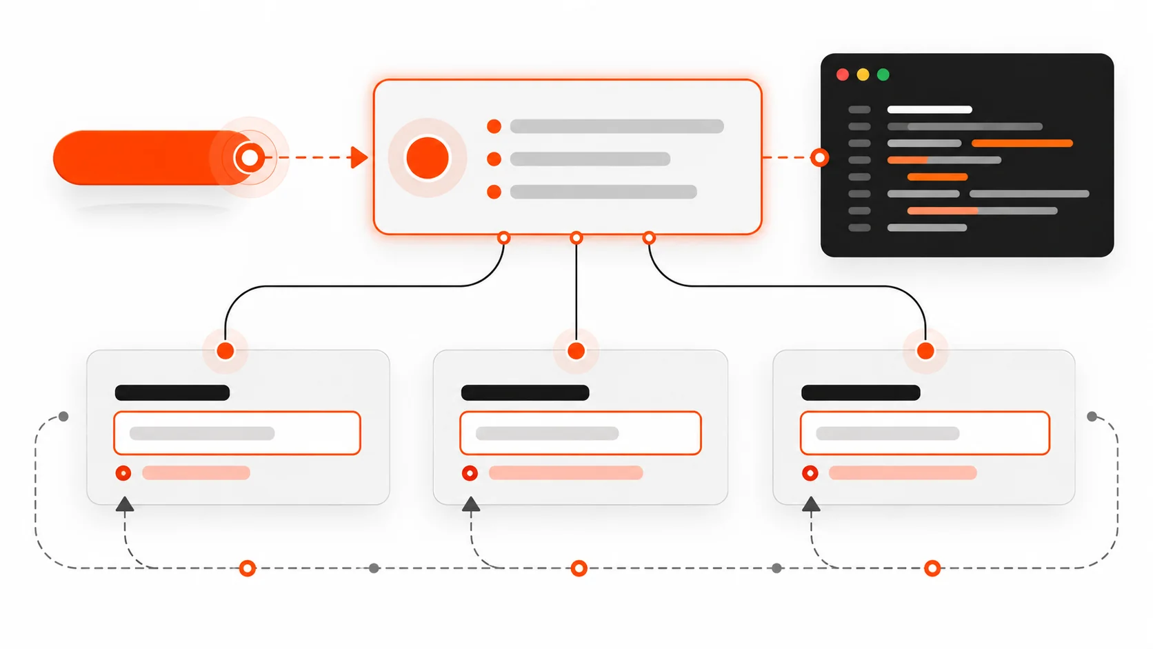
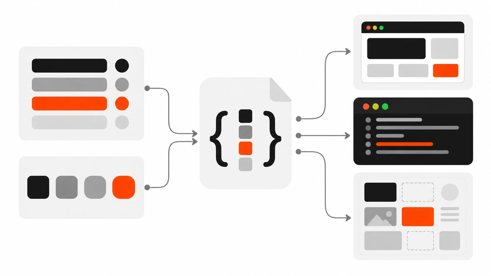
    Flat vector illustration of a central design token file feeding color swatches, spacing blocks and code panels for web, React and WordPress

    Last year I took over a client project where the brand orange existed in 23 slightly different versions. Some were hex, some were rgb(), one was written as a Tailwind arbitrary value, and two lived inside a WordPress block pattern nobody remembered creating. When the client asked for a “small brand refresh”, what should have been a one-hour change turned into three days of search and replace, plus a week of finding the ones I missed.

    That project is the reason I now set up design tokens on almost every build, even small ones. In this guide I will walk you through exactly how I do it as a freelance web developer: how I structure tokens in three tiers, how I write them in the W3C Design Tokens format, how Style Dictionary turns them into CSS custom properties, how dark mode falls out almost for free, and how the same tokens feed Tailwind, React components and a WordPress theme.json file. I will finish with the mistakes I see most often when I review other people’s token setups.

    What design tokens actually are

    Design tokens are named design decisions stored as data. Instead of writing #FF3E00 in forty places, you store it once as a token like color.brand.500, and then every platform reads that value from the same source. Colors are the obvious example, but spacing, font sizes, font weights, line heights, border radius, shadows, durations and easing curves are all good token candidates.

    The important word is decisions. A token is not just a variable. A CSS custom property called --orange is a variable. A token called color.action.primary says what the value is for, and that meaning is what makes a design system survive a rebrand, a dark mode request, or a second developer joining the project.

    The other big benefit is that tokens are platform neutral. They live in JSON, so the same file can generate CSS variables for the website, a JavaScript object for a React Native app, a Tailwind theme, and the palette inside the WordPress editor. Designers and developers stop arguing about which file is the source of truth because there is only one.

    The three tiers: primitive, semantic, component

    Most token setups that go wrong are flat. Someone exports every color from Figma, names them by appearance, and uses them directly in components. It works until the first theme change. The structure I use, and the one most mature design systems settle on, has three tiers.
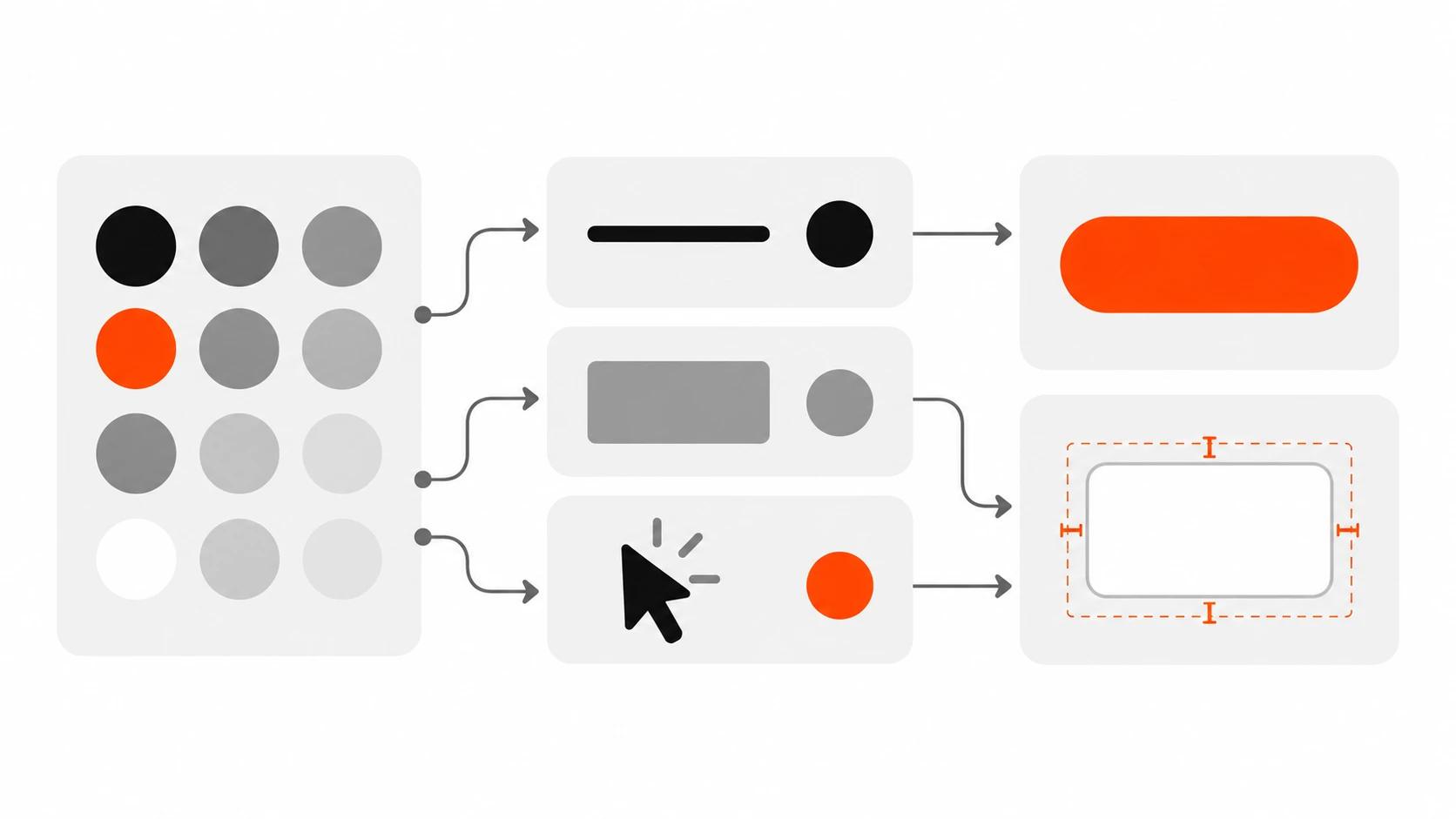
    Diagram of three design token tiers: primitive color swatches flowing into semantic role cards, then into component cards like a button
    Primitive, semantic and component tokens, each pointing to the tier below.

    Tier 1: primitive tokens

    Primitives are the raw palette. They describe what a value looks like, not where it is used: color.orange.500, color.gray.900, space.4, radius.lg. You can have plenty of them. The rule is that components never use primitives directly.

    Tier 2: semantic tokens

    Semantic tokens describe purpose: color.text.default, color.surface.raised, color.action.primary, color.border.subtle. Each one points to a primitive. This is the tier that changes between light and dark mode, or between two brands sharing one codebase. If you only build one tier well, build this one.

    Tier 3: component tokens

    Component tokens are scoped to a single component: button.primary.background, card.padding, input.border.focus. They point to semantic tokens. I only add them when a component genuinely needs to diverge, or when a client wants to tweak one component without touching the whole system. On small marketing sites I often skip this tier completely, and that is fine.

    The chain looks like this: button.primary.background points to color.action.primary, which points to color.orange.500, which is #FF3E00. Change the primitive and the whole site follows. Change the semantic mapping and only the meaning shifts. That separation is the entire point.

    Writing tokens in the W3C Design Tokens format

    For years every tool had its own JSON shape. The W3C Design Tokens Community Group (DTCG) fixed that with a shared format, and it reached its first stable version (2025.10) in October 2025. Style Dictionary, Tokens Studio, and a growing list of design tools now read it, so I use it for every new project.

    The format is simple. Any object with a $value is a token. $type says what kind of value it is (color, dimension, fontFamily, fontWeight, duration, cubicBezier, shadow and so on), and $description is an optional note. The dollar sign prefix keeps those reserved keys separate from your own group names. An alias, meaning a token that points to another token, is written with curly braces around the path.

    // tokens/primitives.json
    {
      "color": {
        "$type": "color",
        "orange": {
          "500": { "$value": "#FF3E00" },
          "600": { "$value": "#D93500" }
        },
        "gray": {
          "50":  { "$value": "#FFFFFF" },
          "100": { "$value": "#F2F2F2" },
          "500": { "$value": "#888888" },
          "900": { "$value": "#1E1E1E" },
          "950": { "$value": "#000000" }
        }
      },
      "space": {
        "$type": "dimension",
        "2": { "$value": "0.5rem" },
        "4": { "$value": "1rem" },
        "6": { "$value": "1.5rem" }
      },
      "radius": {
        "$type": "dimension",
        "lg": { "$value": "12px" }
      }
    }

    Notice that $type sits on the group. Child tokens inherit it, which keeps the file short. In the stable spec, color values can also be written as objects with a color space and components, but plain hex strings are still the most widely supported form across tools today, so I keep hex unless a client needs wide gamut colors. Check what your tool version accepts before you commit to one style.

    Now the semantic layer, built entirely from aliases:

    // tokens/semantic.json
    {
      "color": {
        "$type": "color",
        "text": {
          "default": { "$value": "{color.gray.950}" },
          "muted":   { "$value": "{color.gray.500}" }
        },
        "surface": {
          "page":   { "$value": "{color.gray.50}" },
          "raised": { "$value": "{color.gray.100}" }
        },
        "action": {
          "primary":       { "$value": "{color.orange.500}" },
          "primary-hover": { "$value": "{color.orange.600}" }
        }
      }
    }

    Not a single hex code in that file. If you ever see a raw value in your semantic tokens, treat it as a bug.

    Turning tokens into CSS custom properties with Style Dictionary

    JSON on its own does nothing in a browser. Style Dictionary is the tool I use to transform tokens into whatever each platform needs. Version 4 and later support the DTCG format directly, and the config is a plain JavaScript file.

    npm install -D style-dictionary
    // sd.config.mjs
    import StyleDictionary from 'style-dictionary';
    
    const sd = new StyleDictionary({
      source: ['tokens/primitives.json', 'tokens/semantic.json'],
      platforms: {
        css: {
          transformGroup: 'css',
          buildPath: 'dist/tokens/',
          files: [
            {
              destination: 'variables.css',
              format: 'css/variables',
              options: { outputReferences: true }
            }
          ]
        },
        js: {
          transformGroup: 'js',
          buildPath: 'dist/tokens/',
          files: [{ destination: 'tokens.js', format: 'javascript/es6' }]
        }
      }
    });
    
    await sd.buildAllPlatforms();

    Run node sd.config.mjs and you get a variables.css file that looks roughly like this:

    :root {
      --color-orange-500: #ff3e00;
      --color-gray-950: #000000;
      --color-text-default: var(--color-gray-950);
      --color-action-primary: var(--color-orange-500);
      --space-4: 1rem;
      --radius-lg: 12px;
    }

    The outputReferences: true option is the one I always turn on. Without it, Style Dictionary resolves every alias to its final value, so --color-action-primary becomes a hard-coded hex. With it, the semantic variable keeps pointing at the primitive variable, which is exactly what you want for theming in the browser and for debugging in DevTools.

    I add the build to my package.json scripts as "tokens": "node sd.config.mjs" and run it before the main build, so generated files never drift from the JSON. I also commit the generated CSS on WordPress projects, because many hosts will not run a Node build step on deploy.

    Dark mode theming with semantic tokens

    This is where the three tiers pay for themselves. Dark mode does not need new primitives and it should not need new component code. It only needs a different semantic mapping.
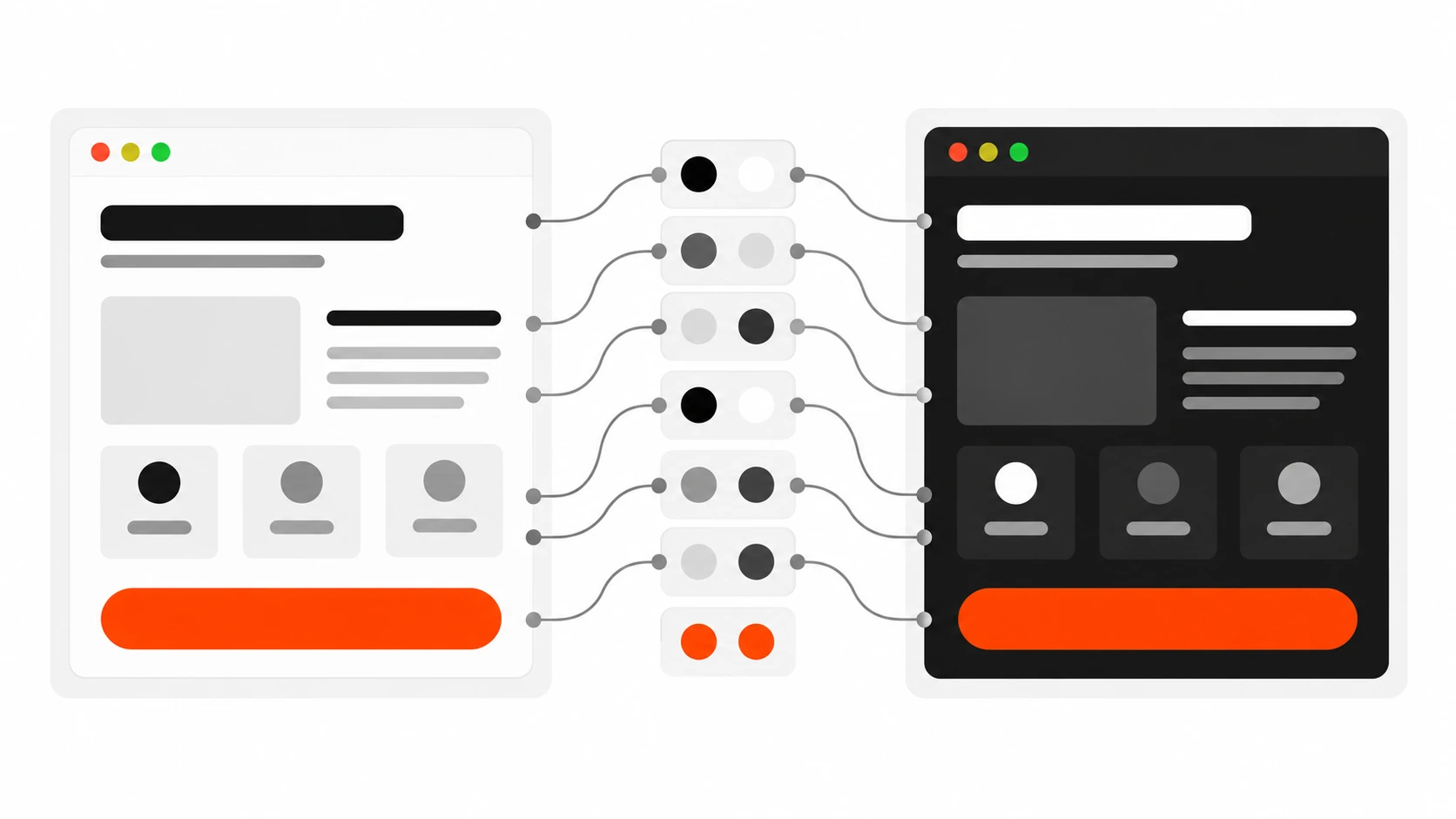
    Light and dark interface cards sharing the same semantic tokens mapped to different primitive colors
    Dark mode only changes the semantic mapping, not the components.

    I keep a second semantic file, tokens/semantic-dark.json, with the same token names pointing to different primitives. Then I add a second CSS file in the Style Dictionary config, wrapped in a different selector. In recent versions, the css/variables format accepts a selector option, and a filter lets you output only the semantic tokens for the dark file.

    {
      destination: 'dark.css',
      format: 'css/variables',
      filter: (token) => token.filePath.includes('semantic-dark'),
      options: { selector: '[data-theme="dark"]', outputReferences: true }
    }

    Because the dark file redefines names that already exist, you need a separate Style Dictionary build (or instance) for the dark theme so the two sets do not collide in one dictionary. I usually create one instance per theme in a small loop. The output is clean:

    [data-theme="dark"] {
      --color-text-default: var(--color-gray-50);
      --color-surface-page: var(--color-gray-900);
      --color-surface-raised: #2a2a2a;
    }

    Every component that uses var(--color-surface-page) switches theme automatically when you set data-theme="dark" on the html element. If you want to follow the operating system setting, wrap the same block in @media (prefers-color-scheme: dark) and let the data attribute override it when the user picks a theme manually. One practical tip: check contrast for both themes at the semantic level, not component by component. If color.text.muted passes on color.surface.page in both themes, every component using that pair passes too.

    Using tokens in Tailwind and React

    Tokens should not force a styling approach. On React projects I use them three ways, depending on the stack.

    Tailwind CSS v4

    Tailwind v4 is configured in CSS with the @theme directive, and theme values are exposed as CSS variables. That makes token integration straightforward: point Tailwind’s theme variables at your semantic variables.

    /* app.css */
    @import "tailwindcss";
    @import "./dist/tokens/variables.css";
    @import "./dist/tokens/dark.css";
    
    @theme inline {
      --color-text: var(--color-text-default);
      --color-muted: var(--color-text-muted);
      --color-surface: var(--color-surface-page);
      --color-primary: var(--color-action-primary);
      --radius-card: var(--radius-lg);
    }

    Now bg-primary, text-muted and rounded-card exist as utilities, and they follow dark mode because they reference variables instead of fixed values. The inline keyword tells Tailwind to use the variable reference inside the utility instead of resolving it at build time. If you are still on Tailwind v3, the same idea works in tailwind.config.js with colors: { primary: 'var(--color-action-primary)' }.

    The key habit: only expose semantic tokens to Tailwind, not the whole primitive palette. If bg-orange-500 is available, someone will use it, and you are back to the 23-oranges problem.

    Plain React components

    With CSS Modules or plain CSS, components just use the variables. For component tokens, I define them at the component level so they are easy to override:

    /* Button.module.css */
    .button {
      --button-bg: var(--color-action-primary);
      --button-bg-hover: var(--color-action-primary-hover);
      background: var(--button-bg);
      padding: var(--space-2) var(--space-4);
      border-radius: var(--radius-lg);
    }
    .button:hover { background: var(--button-bg-hover); }

    When I need values in JavaScript, for example for a chart library or a canvas animation, I import the generated tokens.js file instead of copying hex codes into the component. The values still come from the same JSON.

    Mapping design tokens to WordPress theme.json

    A lot of my client work is WordPress, and block themes have their own token system: theme.json. Colors in settings.color.palette, sizes in settings.typography.fontSizes and spacing in settings.spacing.spacingSizes become presets that WordPress outputs as CSS variables like --wp--preset--color--primary, and they show up in the editor UI for content editors.
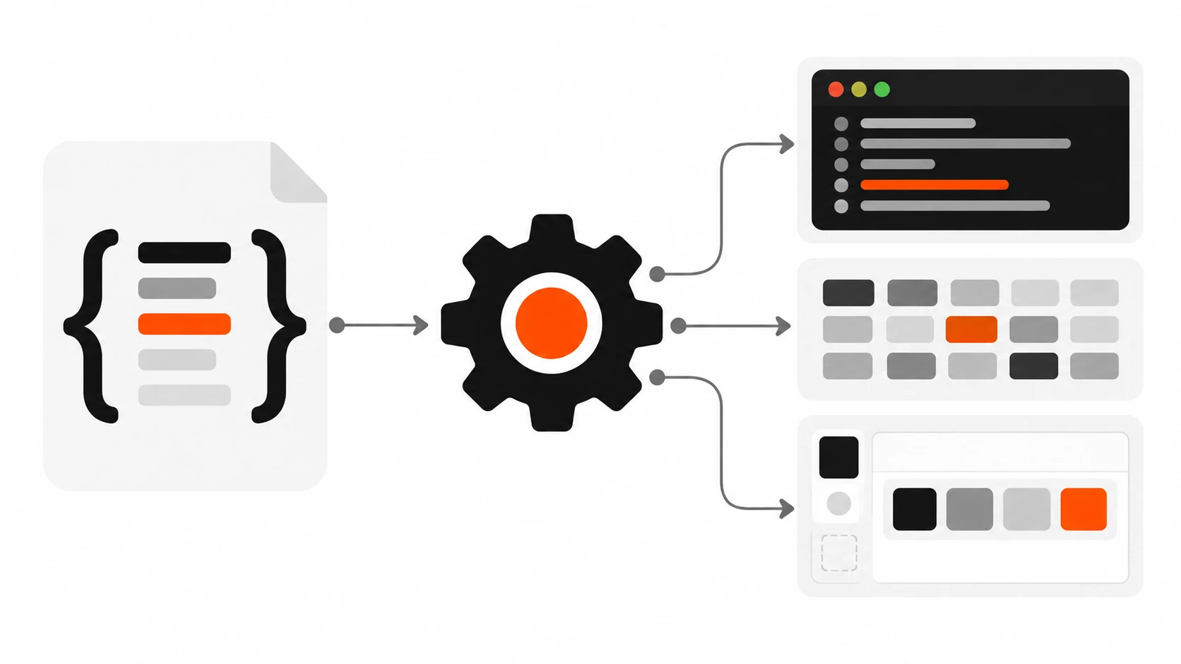
    Pipeline from a JSON token file through a build gear into CSS variables, a Tailwind theme and a WordPress theme.json file
    Style Dictionary turns one token source into CSS, Tailwind and theme.json.

    The mistake is maintaining theme.json by hand next to a separate token file. Instead I generate the relevant parts of theme.json from the same tokens. Style Dictionary lets you register a custom format, so a small function can write the palette:

    StyleDictionary.registerFormat({
      name: 'wp/theme-json-palette',
      format: ({ dictionary }) => {
        const palette = dictionary.allTokens
          .filter((t) => t.path[0] === 'color' &&
            ['text', 'surface', 'action'].includes(t.path[1]))
          .map((t) => ({
            slug: t.path.slice(1).join('-'),
            name: t.path.slice(1).join(' '),
            color: t.$value
          }));
        return JSON.stringify({ settings: { color: { palette } } }, null, 2);
      }
    });

    I merge that output into the theme’s theme.json with a tiny Node script during the tokens build. Editors get a short palette of named, purposeful colors (“action primary”, “surface raised”) instead of fifteen shades of gray, and the theme CSS can use either the WordPress preset variables or the Style Dictionary variables because they come from the same source.

    Two notes from experience. First, theme.json palette colors need real values, so resolve aliases for this file rather than outputting var() references, which some editor color controls handle poorly. Second, for anything that is not a standard preset, such as radius or shadows on older WordPress versions, use settings.custom, which WordPress outputs as --wp--custom-- variables.

    Common design token mistakes I keep fixing

    These come straight from audits and handovers I have done on client projects.

    • Naming semantic tokens by appearance. color.text.orange is not semantic. When the brand becomes green, the name lies. Name by role: color.text.accent.
    • Components using primitives. If a button uses --color-orange-500 directly, dark mode and rebrands skip it. Lint for it or simply do not expose primitives to component code.
    • Too many tokens too early. A five-page site does not need 400 component tokens. Start with primitives and 15 to 30 semantic tokens, and add component tokens only when there is a real need.
    • Resolving every alias in the CSS output. Without outputReferences, the browser sees fixed values, runtime theming breaks, and DevTools stops telling you where a value came from.
    • Two sources of truth. Tokens in JSON plus hand-edited theme.json, or a Figma file plus a Tailwind config edited separately. Pick one source and generate the rest.
    • Ignoring units and types. A dimension token without a unit, or a font weight stored as the string “bold” in one place and 700 in another, causes subtle bugs across platforms. Use $type consistently.
    • No documentation. Add $description to semantic tokens. Six months later, the difference between surface.raised and surface.overlay will not be obvious to anyone, including you.

    My starter setup for a new project

    If you want a practical starting point, this is what I set up on day one, and it takes about an hour:

    • A tokens/ folder with primitives.json, semantic.json and semantic-dark.json in DTCG format.
    • A Style Dictionary config that outputs variables.css, dark.css and tokens.js, with outputReferences on.
    • A tokens script in package.json that runs before dev and build.
    • Tailwind @theme inline mapped to semantic variables only, or theme.json palette generated from the same tokens on WordPress.
    • A one-page token reference in the README so the client’s next developer knows the rules.

    If the designer works in Figma, I ask them to use variables with the same naming, and sync through a plugin that exports DTCG JSON. Even when they do not, the token files become the contract between design and code.

    Final thoughts

    Design tokens sound like enterprise design system territory, but the biggest wins I have seen were on small and mid-size client sites. The day a client says “can we try a darker orange” or “we need dark mode by Friday”, a token setup turns panic into a two-line change. Start small, keep the three tiers clean, generate every platform from one source, and never let a component touch a primitive.

    If you want help setting up a design token system for your website, React app or WordPress theme, get in touch with me and tell me about your project.

  • Accessible Forms in 2026: Labels, Errors, and Focus That Screen Readers Trust

    Accessible Forms in 2026: Labels, Errors, and Focus That Screen Readers Trust

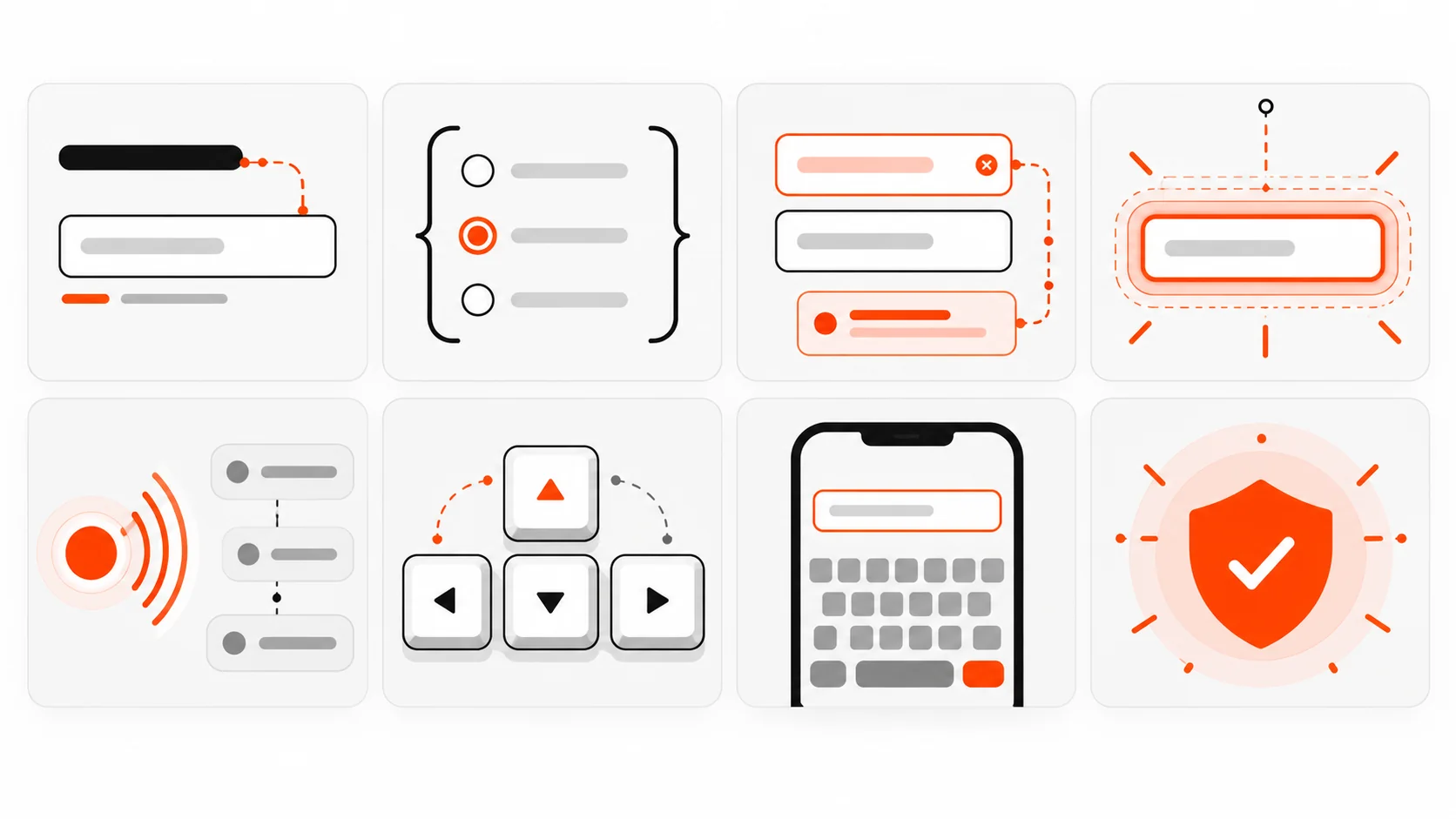
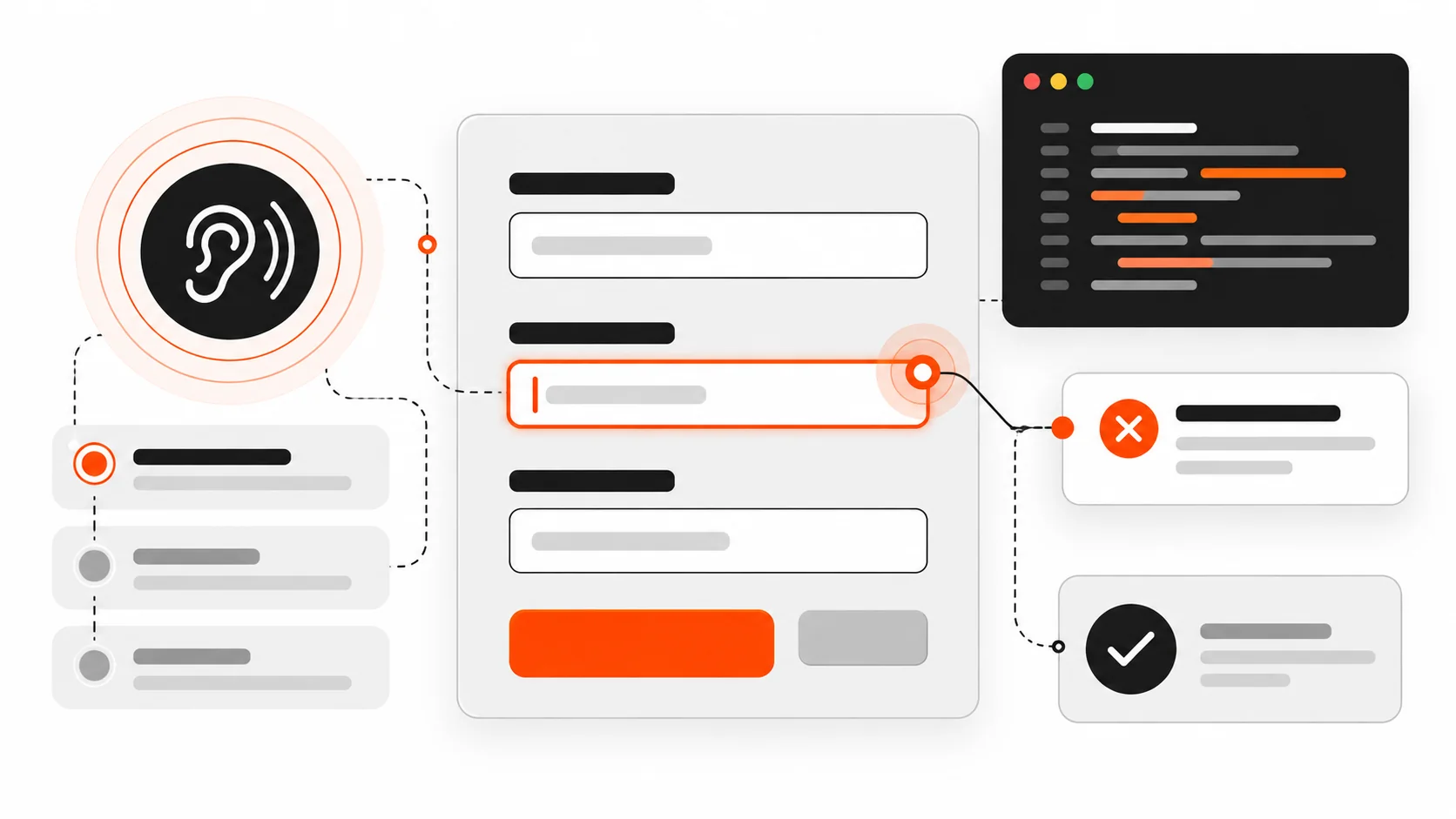
    Vector illustration of an accessible form layout with label lines, focus ring, and error callout in orange-red accent

    I still review forms that look polished and fail the first keyboard pass.

    The submit button is a beautiful orange pill. The inputs have soft shadows. Then a screen reader user tabs in and hears “edit text” with no name. An error toast flashes at the top of the page while focus stays on the button that just failed. Required fields are marked with a red asterisk that never gets announced. On mobile, the email field opens a full keyboard instead of the @-friendly one.

    None of that is a design-system problem. It is an accessibility contract problem.

    In 2026, accessible forms are still built on the same foundations: native labels, honest error identification, predictable focus, and live regions that speak when something changes asynchronously. Frameworks and WordPress builders make it easier to ship a form in an afternoon. They also make it easier to ship one that assistive technology cannot trust.

    This is the practical playbook I use on client sites and my own work: how to associate labels the browser way, how to wire errors with aria-describedby and aria-invalid, how to move focus after submit, how to announce async failures, how to mark required fields clearly, how to use autocomplete and input types for real people on real phones, and how to test with a keyboard and a screen reader before you call it done.

    Infographic comparing placeholder-only fields with properly labeled inputs and a focus ring
    Placeholders vanish on input. A real label stays associated with the control for sighted users and assistive technology.

    Start with a real label, not a placeholder

    Placeholders disappear when someone types. They are not labels. They are hints at best, and they often fail contrast guidelines when they try to be both.

    The reliable pattern is a visible <label> associated with the control:

    <label for="email">Email</label>
    <input id="email" name="email" type="email" autocomplete="email" />

    The for attribute on the label must match the id on the control. That is the native association browsers and assistive tech already understand. Clicking the label focuses the field. The accessible name becomes “Email”.

    You can also wrap the control:

    <label>
      Email
      <input name="email" type="email" autocomplete="email" />
    </label>

    Both are valid. I prefer explicit for/id in larger forms because the DOM gets rearranged by design systems and React fragments, and wrapping is easier to break accidentally.

    What I avoid:

    • Using only aria-label when a visible label exists (now you have two names to keep in sync)
    • Relying on placeholder as the only name
    • Putting the label in a sibling <div> with no programmatic link
    • Icon-only buttons next to fields with no accessible name

    If the visual design wants a floating label, keep a real <label> in the DOM and style it. Do not replace it with a decorative <span>.

    Group related controls with fieldset and legend

    Radio groups and checkbox clusters need a group name. fieldset and legend are still the right tools in 2026.

    <fieldset>
      <legend>Shipping method</legend>
      <label><input type="radio" name="ship" value="standard" /> Standard (3-5 days)</label>
      <label><input type="radio" name="ship" value="express" /> Express (1-2 days)</label>
    </fieldset>

    A screen reader announces the legend with each option so “Express” is not floating without context. Role-based recreations (role="group" + aria-labelledby) can work when you cannot use fieldset, but native elements survive CSS resets and component library upgrades more reliably.

    Use fieldset for:

    • Payment method radios
    • “How should we contact you?” checkbox groups
    • Address type (billing vs shipping) when both are on one screen

    Do not wrap the entire 20-field checkout in one giant fieldset with a vague legend. Group by meaning.

    Required and optional: say it in text, not only in color

    A red asterisk that is not in the accessible name helps sighted users and leaves everyone else guessing. WCAG does not ban asterisks. It bans information that is conveyed by color or shape alone.

    Patterns that work:

    <label for="company">Company <span class="optional">(optional)</span></label>
    <input id="company" name="company" autocomplete="organization" />
    
    <label for="phone">Phone <span aria-hidden="true">*</span><span class="visually-hidden">(required)</span></label>
    <input id="phone" name="phone" type="tel" autocomplete="tel" required aria-required="true" />

    Notes I follow:

    • Prefer marking optional fields in long forms where most fields are required, or mark required fields when most are optional. Pick one convention per form and stick to it.
    • The HTML required attribute enables built-in validation. aria-required="true" exposes the state to AT even when you use custom validation.
    • Do not rely on placeholder text like “Required” — it vanishes on input.

    Infographic of form error summary linked to fields with aria-describedby and focus target
    After a failed submit, focus an error summary with links to each invalid field. Tie messages with aria-describedby and aria-invalid.

    Error identification that screen readers can find

    A red border is not an error message. Users need text that names the field and describes how to fix it, and that text must be programmatically tied to the control.

    The pattern I ship:

    <label for="email">Email</label>
    <input
      id="email"
      name="email"
      type="email"
      autocomplete="email"
      aria-invalid="true"
      aria-describedby="email-hint email-error"
    />
    <p id="email-hint">We will send your receipt here.</p>
    <p id="email-error" class="error">Enter an email like name@example.com.</p>

    Why each piece matters:

    • aria-invalid="true" marks the field as invalid after validation fails. Do not set it on first paint for empty required fields.
    • aria-describedby points at hint and error ids. Multiple ids are space-separated. Order matters for announcement — put the error last if you want it heard after the hint, or first if the error is the priority after submit.
    • The error text should include the field purpose when the message might be read out of visual context (“Enter an email…” beats “Invalid format”).

    On submit failure, also provide a summary:

    <div tabindex="-1" id="form-errors" role="alert">
      <p>We found 2 problems:</p>
      <ul>
        <li><a href="#email">Email: Enter an email like name@example.com.</a></li>
        <li><a href="#phone">Phone: Enter a phone number with country code.</a></li>
      </ul>
    </div>

    Then move focus to #form-errors. Keyboard and screen reader users land on the summary instead of wondering why the page did not change. Each link jumps to the field so fixing is a straight path.

    Focus management after submit (the part teams skip)

    Focus is where the user’s attention is. After a failed submit, leaving focus on the submit button while an error appears above the fold is a common failure. Sighted mouse users may notice the red text. Keyboard and AT users often do not.

    Rules I use:

    1. Client-side validation fails: focus the error summary, or if there is only one error, focus that field.
    2. Server returns field errors: same pattern after the DOM updates.
    3. Success replaces the form with a confirmation: focus the confirmation heading (tabindex="-1" on the heading, then .focus()).
    4. Success navigates to a new page: the new page’s <h1> or main landmark should be first in the reading order; avoid autofocusing a random marketing modal.
    function showErrors(summaryEl) {
      summaryEl.hidden = false;
      summaryEl.focus();
    }

    Avoid autofocus on the first field of a multi-step form when an error summary needs priority. Autofocus can yank screen reader users past instructions.

    Live regions for async errors and saving states

    Modern forms save drafts, validate emails against an API, and submit with fetch. Visual spinners are not enough. Use live regions so status changes get announced without moving focus.

    <div id="form-status" class="visually-hidden" aria-live="polite" aria-atomic="true"></div>
    function setStatus(message) {
      const el = document.getElementById("form-status");
      el.textContent = "";
      // Some AT ignore identical updates; clear then set on next frame.
      requestAnimationFrame(() => {
        el.textContent = message;
      });
    }
    
    setStatus("Saving draft…");
    // later
    setStatus("Draft saved.");

    Guidance:

    • aria-live="polite" for non-urgent status (saved, checking availability).
    • role="alert" or aria-live="assertive" for errors that need immediate attention — use sparingly so you do not interrupt every keystroke.
    • Do not put aria-live on a region that updates on every character typed.
    • When an inline field error appears asynchronously, update the error node’s text and keep aria-describedby pointed at it. Changing aria-invalid to true at the same time helps.

    Autocomplete tokens that actually help

    Browsers and password managers need real autocomplete tokens, not autocomplete="off" sprayed on everything. For address and account forms, tokens reduce typos and reduce cognitive load.

    Common tokens I use:

    • name, given-name, family-name
    • email
    • tel, tel-national, tel-country-code
    • street-address, address-line1, address-line2, address-level2 (city), address-level1 (state), postal-code, country
    • organization
    • username, new-password, current-password
    • cc-name, cc-number, cc-csc, cc-exp

    Example:

    <label for="given-name">First name</label>
    <input id="given-name" name="given-name" autocomplete="given-name" />
    
    <label for="family-name">Last name</label>
    <input id="family-name" name="family-name" autocomplete="family-name" />
    
    <label for="addr1">Address</label>
    <input id="addr1" name="addr1" autocomplete="address-line1" />

    Turning off autocomplete to “force cleaner data” usually creates worse data and locked-out users. If a one-time code field must avoid password managers filling the wrong value, use a specific token like one-time-code where supported, not a blanket off switch on the whole form.

    Input types and mobile keyboards

    type="email", type="tel", type="url", type="number" (carefully), and inputmode change the keyboard on phones. That is accessibility and conversion.

    <input type="email" inputmode="email" autocomplete="email" />
    <input type="tel" inputmode="tel" autocomplete="tel" />
    <input inputmode="numeric" pattern="[0-9]*" autocomplete="one-time-code" />

    Caveats:

    • type="number" is often wrong for OTP, postal codes, and credit cards because of spinner UI and localization. Prefer inputmode="numeric" with a text input when you need digits without number semantics.
    • Do not block paste on password or OTP fields. Paste is an accessibility feature for password managers and people who use external authenticators.
    • maxlength can help, but announce constraints in the visible hint when truncation would confuse.

    Keyboard operability checklist for every form

    Before I open a screen reader, I do this with only the keyboard:

    1. Tab order follows visual order. No traps inside custom selects.
    2. Every control shows a visible focus style (do not remove outline without a stronger replacement).
    3. Custom dropdowns open with Enter/Space, move with arrows, close with Escape, and return focus to the trigger.
    4. Date pickers are usable as plain text inputs with a clear format hint, not calendar-only widgets.
    5. File inputs have a named label and keyboard-reachable trigger.
    6. Disabled submit buttons either are not used (prefer allowing click + error summary) or are explained with nearby text. A disabled button that never explains why is a dead end.

    Native controls get you most of this for free. Custom components are where budgets go to die — budget time for keyboard behavior when you replace a select.

    Screen reader smoke test (short, real, repeatable)

    You do not need a full audit every PR. You need a smoke test that catches the failures users hit first.

    With VoiceOver (macOS/iOS), NVDA or JAWS (Windows), or TalkBack (Android):

    1. Land on the form. Is there a heading or clear form purpose?
    2. Tab through fields. Does each announce a name, role, and value?
    3. Required fields: is required state announced?
    4. Submit empty. Is the error summary focused? Are errors listed with links?
    5. Fix one field. Does its invalid state clear without lying?
    6. Trigger an async error (offline, 422). Is the status announced?
    7. Successful submit: is the confirmation announced or focused?

    If your team only tests in Chrome with a mouse, you will ship the pretty failure mode forever.

    React form pitfalls I keep seeing

    React does not make forms inaccessible. Patterns around it do.

    Missing htmlFor. Using <label> without htmlFor and with an input as sibling, not child, breaks the name.

    Clickable divs as inputs. Rebuilding checkboxes with div + onClick loses space-to-toggle, roles, and form participation unless you reimplement everything. Prefer native <input type="checkbox"> styled with CSS.

    Conditional fields unmounted without explanation. Showing “Company name” only after “Business” is selected is fine — use a clear radio group and move focus into the new field when it appears if the flow is a wizard step. For simple progressive disclosure, ensure the new fields are after the triggering control in DOM order.

    Errors in state but not in the accessibility tree. Rendering {error && <span>{error}</span>} next to the field without aria-describedby tying it to the input means sighted users see it and AT users may not when focused on the field.

    Client routers swallowing focus. After client-side navigation to a success route, focus often stays on the body or the old button. Explicitly focus the success heading.

    Library defaults. Some form libraries set aria-invalid on mount or generate ids that change every render, breaking label association. Stabilize ids with useId() (React 18+) and only flip aria-invalid after a submit attempt or blur validation, depending on your UX rules.

    Example sketch:

    const emailId = useId();
    const errorId = useId();
    const showError = submitted && !isValidEmail(email);
    
    return (
      <>
        <label htmlFor={emailId}>Email</label>
        <input
          id={emailId}
          name="email"
          type="email"
          autoComplete="email"
          aria-invalid={showError || undefined}
          aria-describedby={showError ? errorId : undefined}
          value={email}
          onChange={(e) => setEmail(e.target.value)}
        />
        {showError ? (
          <p id={errorId} role="alert">
            Enter an email like name@example.com.
          </p>
        ) : null}
      </>
    );

    WordPress form pitfalls

    Contact Form 7, Gravity Forms, WPForms, and custom ACF front-end forms can all be fine — or not — depending on theme markup.

    Watch for:

    • Themes that hide labels with display: none (removed from accessibility tree) instead of a visually-hidden class that stays available to AT
    • AJAX submit that injects a response message without a live region or focus move
    • reCAPTCHA challenges with no keyboard alternative or no warning before submit
    • Multi-column layouts that reorder fields visually with CSS grid so tab order jumps around — fix with DOM order, not tabindex soup
    • Placeholder-only fields in page-builder kits

    When I ship a WordPress form theme override, I keep labels visible, ensure the validation container has tabindex="-1" and receives focus on error, and test the AJAX path with NVDA or VoiceOver once before handoff.

    A concrete accessible contact form skeleton

    Putting the pieces together:

    <form id="contact" novalidate>
      <div id="form-errors" class="error-summary" tabindex="-1" hidden></div>
      <div id="form-status" class="visually-hidden" aria-live="polite"></div>
    
      <p>
        <label for="full-name">Full name</label>
        <input id="full-name" name="name" autocomplete="name" required aria-required="true" />
      </p>
    
      <p>
        <label for="email">Email</label>
        <input
          id="email"
          name="email"
          type="email"
          autocomplete="email"
          required
          aria-required="true"
          aria-describedby="email-hint"
        />
        <span id="email-hint">We reply within one business day.</span>
      </p>
    
      <fieldset>
        <legend>Topic</legend>
        <label><input type="radio" name="topic" value="project" required /> New project</label>
        <label><input type="radio" name="topic" value="support" /> Support</label>
      </fieldset>
    
      <p>
        <label for="message">Message</label>
        <textarea id="message" name="message" required aria-required="true"></textarea>
      </p>
    
      <button type="submit">Send message</button>
    </form>

    On failed validation, unhide #form-errors, fill the list of links, and focus it. On success, either navigate to a thank-you page with a clear <h1> or replace the form contents and focus the confirmation heading.

    Testing matrix I actually write into QA notes

    Check How
    Label association Inspect: label for matches control id, or wrapping label
    Name, Role, Value Browser accessibility pane on each control
    Keyboard only Tab, Shift+Tab, Enter, Escape, arrows in custom widgets
    Error text tied aria-describedby targets exist; aria-invalid toggles after submit
    Focus after submit Failed: summary/field; Success: confirmation heading
    Live status Mute speakers, watch AT speech viewer while saving
    Mobile keyboard Real phone: email/tel/numeric keyboards appear
    Autocomplete Password manager fills name/email/address correctly
    Zoom 200% Fields still usable; no clipped error text
    Reduced motion If you animate errors, respect prefers-reduced-motion

    Infographic checklist for keyboard and screen reader form testing with live region status
    Ship checklist: labels, grouped controls, associated errors, focus after submit, live status, autocomplete, and a real keyboard plus screen reader pass.

    Checklist: ship / no-ship for forms

    Ship only if you can tick these:

    1. Every control has a visible, programmatically associated label (or a legitimate exception with an accessible name).
    2. Related radios/checkboxes are in a fieldset with a legend (or equivalent group name).
    3. Required/optional is clear in text, not color alone.
    4. Errors are text, associated via aria-describedby, and fields use aria-invalid when invalid.
    5. Failed submit moves focus to an error summary or first error.
    6. Async status uses a polite live region; critical errors are announced without trapping focus.
    7. autocomplete tokens match the data you ask for.
    8. Input types / inputmode match mobile keyboards.
    9. Custom widgets are keyboard operable with visible focus.
    10. Keyboard + one screen reader smoke test passed on the staging URL.

    If item 4 or 5 fails, it is a no-ship for me even when the visual design is approved. Pretty forms that strand users are still broken forms.

    Why this still matters in 2026

    Design systems got better. Component libraries ship accessible primitives. AI tools generate form markup in seconds. And yet production sites still strip labels, announce nothing on AJAX failure, and bury errors in toast libraries that never receive focus.

    Accessible forms are not a separate premium tier. They are how you know the form works for people who do not use a mouse, cannot see the red border, or complete the flow on a bus with a screen reader and a foldable keyboard.

    Ship labels that name things. Ship errors that explain things. Ship focus that follows the work. Screen readers do not need a different product. They need the same product built with the attributes and native elements that were documented for this exact job.

    If you want a deeper performance angle after you fix the form semantics, look at how validation scripts and third-party captchas affect Interaction to Next Paint — but fix the accessibility contract first. A fast form that cannot be completed is still a dead end.

  • CSS Anchor Positioning in 2026: Tooltips and Menus Without JS Math

    CSS Anchor Positioning in 2026: Tooltips and Menus Without JS Math

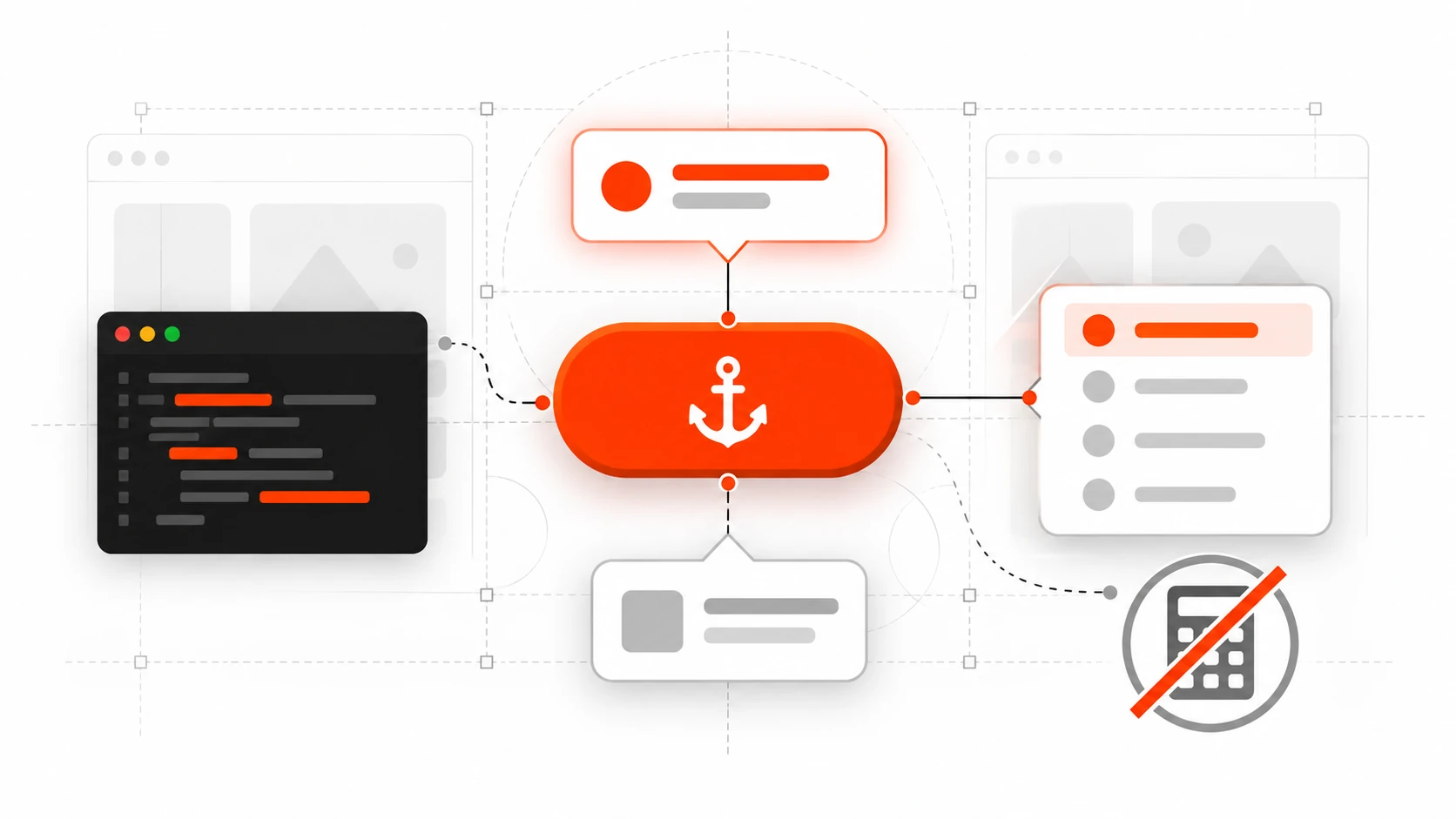
    A button acting as an anchor with a tooltip and dropdown menu tethered to its edges

    I used to measure dropdowns with getBoundingClientRect(), glue them with position: fixed, and pray the user did not scroll. Tooltips needed a library. Context menus needed more JavaScript. Every “simple” overlay turned into a positioning bug report.

    In 2026 that habit is optional for a lot of UI work. CSS anchor positioning lets you tether a floating element to another element in pure CSS. Pair it with the Popover API and you get light-dismiss, top-layer stacking, and a trigger that already knows its anchor – without a positioning library for many menus, tooltips, and teaching callouts.

    This is the practical guide I wish I had when I first tried it: what anchor positioning actually does, how it differs from absolute offsets, real patterns for tooltips and dropdowns, overflow fallbacks with position-try-fallbacks, accessibility, progressive enhancement, and the mistakes that waste an afternoon. Distinct from scroll-driven animation tricks – this is about where UI lives relative to a trigger, not how it moves with the page scroll.


    What CSS anchor positioning actually is

    Absolute positioning places an element relative to a positioned ancestor. That ancestor is rarely the button the user just clicked. So we invent wrappers, portals, and JS math.

    Anchor positioning adds a different relationship: an element can declare another element as its anchor, then place itself against that anchor’s edges. The browser keeps that tether as layout and scroll update (within the rules of the feature), which is exactly what tooltips and menus need.

    At a high level you do three things:

    1. Name an anchor with anchor-name: --something; (or rely on an implicit anchor from a popover trigger).
    2. Take the floating UI out of normal flow with position: absolute or position: fixed.
    3. Point at the anchor with position-anchor and place it with position-area and/or the anchor() function.
    .trigger {
      anchor-name: --help-btn;
    }
    
    .tooltip {
      position: absolute;
      position-anchor: --help-btn;
      position-area: block-end;
      margin: 0;
    }
    

    That is the mental model. Everything else – fallbacks, sizing, scopes – builds on it.


    Why this belongs in web development tutorials in 2026

    Interop 2026 keeps anchor positioning and dialogs/popovers in the browser collaboration focus areas. That is a strong signal: vendors are still aligning edge cases, and developers keep ranking these APIs as high-priority. For shipping products, the useful question is not “is the blog post shiny?” but “can I use this as progressive enhancement this quarter?”

    On current evergreen browsers, CSS anchor positioning is in a much healthier place than the early experimental demos. MDN now treats core anchor() usage as newly available Baseline in early 2026 on recent versions. Cross-browser polish continues (Interop tracks remaining tests), so I still wrap advanced fallbacks and treat unsupported browsers as “centered popover or static help text” rather than “hard dependency.”

    The product win is boring and valuable:

    • Fewer layout thrash loops from measuring on every scroll/resize.
    • Less custom code fighting the visual viewport on mobile.
    • Menus that flip when they would overflow, using browser-owned fallbacks instead of your own collision solver.

    If your design system still depends on Floating UI / Popper for complex cases, keep it. Use native anchoring where the pattern is simple and the budget for JS is tight – marketing sites, docs UIs, admin panels with a handful of menus.


    Popover API + implicit anchors (the pattern I ship first)

    The Popover API gives you a top-layer overlay with light dismiss and focus behavior that is closer to platform norms than a random div with z-index: 9999. When you open a popover from a control with popovertarget (or showPopover({ source })), that popover already has an implicit anchor pointing at the trigger.

    That means for many tooltips and menus you can skip inventing anchor-name at all:

    <button type="button" popovertarget="acct-menu">Account</button>
    <div id="acct-menu" popover>
      <a href="/profile">Profile</a>
      <a href="/billing">Billing</a>
      <button type="button" popovertarget="acct-menu" popovertargetaction="hide">Close</button>
    </div>
    
    #acct-menu {
      /* popovers are position: fixed by default */
      margin: 0;          /* critical: default margin:auto fights anchoring */
      inset: auto;        /* reset default inset centering */
      position-area: block-end span-inline-end;
      position-try-fallbacks: flip-block, flip-inline;
    }
    

    Two resets matter more than people expect. Default popover styles often center the panel with margin: auto and inset values. If your menu “ignores” position-area, check those first before blaming browser support.

    popover=”hint” for nested tooltips

    Interop 2026 calls out popover="hint" for subordinate overlays – the classic “tooltip attached to something inside an open auto popover” case. Hint popovers are designed so they do not dismiss the parent auto popover the way another auto popover might. If you have been writing awkward JS to keep a menu open while a tip appears, this attribute is the direction the platform is going. Feature-detect and progressive-enhance; do not assume every browser in your analytics matrix has identical hint behavior yet.


    position-area vs the anchor() function

    Start with position-area. It places the floating element on a conceptual grid around the anchor using keywords like block-end, inline-start, top, bottom span-all, and combinations such as block-end span-inline-end (a common dropdown placement).

    Logical keywords respect writing mode. That matters for multilingual products and RTL layouts. Prefer block-* / inline-* in design-system tokens unless you truly need physical top/left.

    Reach for anchor() when you need fine-grained insets, calculations, or different sides tied in custom ways:

    .panel {
      position: absolute;
      position-anchor: --trigger;
      top: anchor(bottom);
      left: anchor(left);
      width: anchor-size(width);
      margin: 0;
    }
    

    anchor() returns a length usable in calc(), min(), and max(). anchor-size() lets the floating UI match the trigger’s width – perfect for select-like menus that should share the control’s footprint.

    Remember: anchor() is valid on inset properties. Putting it on transform or random non-inset properties is a common footgun copied from older absolute-position recipes.


    Overflow: position-try-fallbacks (stop writing collision JS)

    The moment your menu sits near the bottom of the viewport, fixed “always below” placement fails. Native fallbacks handle the common flips:

    .menu {
      position-area: block-end span-inline-end;
      position-try-fallbacks: flip-block, flip-inline, flip-block flip-inline;
    }
    

    Or name custom tries with @position-try when margins and alignment must change together:

    @position-try --menu-above {
      position-area: block-start span-inline-end;
      margin-bottom: 0.5rem;
    }
    
    .menu {
      position-area: block-end span-inline-end;
      margin-top: 0.5rem;
      position-try-fallbacks: --menu-above, flip-inline;
    }
    

    You can also ask the browser to prefer the option with the most available space via position-try-order (for example most-block-size). I use that for dense dashboards where “most room” beats a fixed preference order.

    When the anchor scrolls away, decide whether the floating UI should vanish. position-visibility: anchors-visible hides the positioned element when its anchor is not visible – useful for sticky-ish callouts that should not orphan themselves on the screen.


    Reusable components: anchor-scope

    If every card in a list uses anchor-name: --card-menu, which anchor wins? Without scoping, matching rules can surprise you (often the last laid-out match). Put anchor-scope on the component root so each instance only sees its own names:

    .card {
      anchor-scope: --card-menu;
    }
    
    .card__btn {
      anchor-name: --card-menu;
    }
    

    This is the CSS equivalent of unique IDs without sprinkling generated IDs through markup. For design systems, treat anchor-scope as part of the component contract.


    A complete tooltip pattern (progressive enhancement)

    Here is a pattern I use on docs and settings screens:

    <button type="button" class="info" popovertarget="tip-billing" aria-label="About billing cycle">?</button>
    <div id="tip-billing" class="tip" popover="manual" role="tooltip">
      Invoices renew on the first of each month in your account timezone.
    </div>
    
    .tip {
      margin: 0;
      inset: auto;
      max-width: 18rem;
      padding: 0.75rem 1rem;
      border: 1px solid #d0d7de;
      border-radius: 0.5rem;
      background: #fff;
      box-shadow: 0 8px 24px rgb(0 0 0 / 12%);
      position-area: block-start;
      position-try-fallbacks: flip-block, flip-inline;
    }
    
    @supports not (anchor-name: --x) {
      .tip {
        /* fallback: browser default popover centering is acceptable for help text */
        max-width: 20rem;
      }
    }
    
    @media (prefers-reduced-motion: reduce) {
      .tip {
        transition: none;
      }
    }
    

    For hover/focus tooltips you may still wire a tiny bit of JS to show/hide a manual popover, or use CSS interest triggers where available. The positioning, though, stays in CSS. That split – behavior in a few lines of JS, geometry in CSS – is the architecture I want in 2026 components.


    Dropdown menus without the usual bugs

    Checklist I run before calling a menu “done”:

    • Keyboard: open with Enter/Space on the trigger; Arrow keys move options; Escape closes; focus returns to the trigger.
    • Light dismiss: click outside closes (auto popovers help here).
    • Scroll containers: test the menu inside overflow panels, not only on the document root.
    • RTL: verify inline-start/inline-end placements.
    • Long labels: force a very long trigger string and confirm fallbacks still keep content on-screen.
    • Mobile: confirm the visual viewport and on-screen keyboard do not bury the menu; sometimes a full-screen sheet is better UX than a tiny anchored panel.

    Native anchoring does not replace accessibility. It replaces a chunk of measurement code. You still own semantics (menu/menuitem patterns or disclosed navigation links), focus traps where appropriate, and clear labels.


    When I still reach for a JavaScript positioning library

    Be honest with the team:

    • Multi-anchor choreography that the current CSS model cannot express cleanly.
    • Virtualized lists where DOM nodes mount/unmount faster than you want to debug native edge cases.
    • Legacy browser matrices that must look identical, not progressively enhanced.
    • Canvas/WebGL overlays that are not CSS boxes.

    Floating UI remains excellent. The goal is not dogma. The goal is deleting code when the platform already solved 80% of the problem.


    Performance and Core Web Vitals notes

    Measuring on every scroll to keep a menu glued to a button is a classic way to hurt responsiveness. Moving that responsibility to the browser reduces main-thread work during interaction – good for INP when overlays are common (admin UIs, dense data tables).

    Still avoid animating expensive properties on the floating UI. Prefer opacity/transform for enter/exit. Keep popover content lean. Do not load a chart library inside every closed menu “just in case.”


    Debugging tips that save hours

    1. If placement seems ignored on a popover, reset margin and inset.
    2. Confirm the positioned element uses absolute or fixed.
    3. Check whether the anchor is laid out before the positioned element; ordering and layering matter for which anchor can be found.
    4. Duplicate anchor-name values? Add anchor-scope.
    5. Test with DevTools zoom and forced colors; overflow fallbacks interact with real viewport chrome.
    6. Feature-detect with @supports (anchor-name: --x) or a small script checking CSS.supports before relying on advanced tries.

    How this connects to Interop 2026 (without the hype)

    Anchor positioning continuing in Interop means fewer “works in Chrome, weird in Safari” weekends over time. Dialog/popover work around closedby, :open, and popover="hint" aims at the same family of UI. If you are planning a design-system overhaul this year, aligning menu/tooltip primitives to these platform APIs is a reasonable bet – with progressive enhancement, not a hard cutover on day one.


    Practical migration plan for an existing design system

    1. Inventory overlays: tooltip, dropdown, combobox, teach-spots, context menus.
    2. Pick the simplest two (usually tooltip + action menu) for a native pilot.
    3. Ship behind a flag or in an internal app first.
    4. Keep the JS library as fallback when @supports fails.
    5. Document the resets (margin/inset) in the component README so future you does not “fix” them back.
    6. Add visual regression screenshots at viewport edges (top, bottom, RTL).

    That plan beats a big-bang rewrite and gives you real data on support and UX.


    Code Q&A: common questions I get in reviews

    Q: Can I anchor to an element inside a different scroll container?
    Often yes for tethering, but the positioned element typically tracks scrolling for its default anchor. Read the scrolling rules before promising parallax-like multi-scroller magic.

    Q: Does this replace <dialog>?
    No. Use <dialog> for modal flows that need inert background and stronger modal semantics. Use popover + anchor for non-modal overlays tied to a control.

    Q: What about WordPress admin screens or legacy CSS?
    You can use these APIs in modern themes and block editor experiments, but many admin UIs still need broad support. Progressive enhancement applies there too – this post is not a WordPress-only recipe.


    Wrap-up

    CSS anchor positioning plus the Popover API is one of the clearest “delete a dependency” opportunities in frontend UI right now. Name an anchor (or use the implicit popover tether), place with position-area or anchor(), add position-try-fallbacks for edges, scope names in reusable components, and keep accessibility in your court.

    If you have been postponing a tooltip rewrite because Floating UI felt heavy for a docs site, try the native path on one component this week. Ship it as enhancement, measure the simplification, then decide what else can move.

    I am Darshan Panchasara – I write about practical web development, web design details, and the platform features that actually change how I build. If this helped, share it with a teammate still measuring dropdowns by hand.

  • CSS Scroll-Driven Animations in 2026: Build Scroll Effects Without JavaScript

    CSS Scroll-Driven Animations in 2026: Build Scroll Effects Without JavaScript

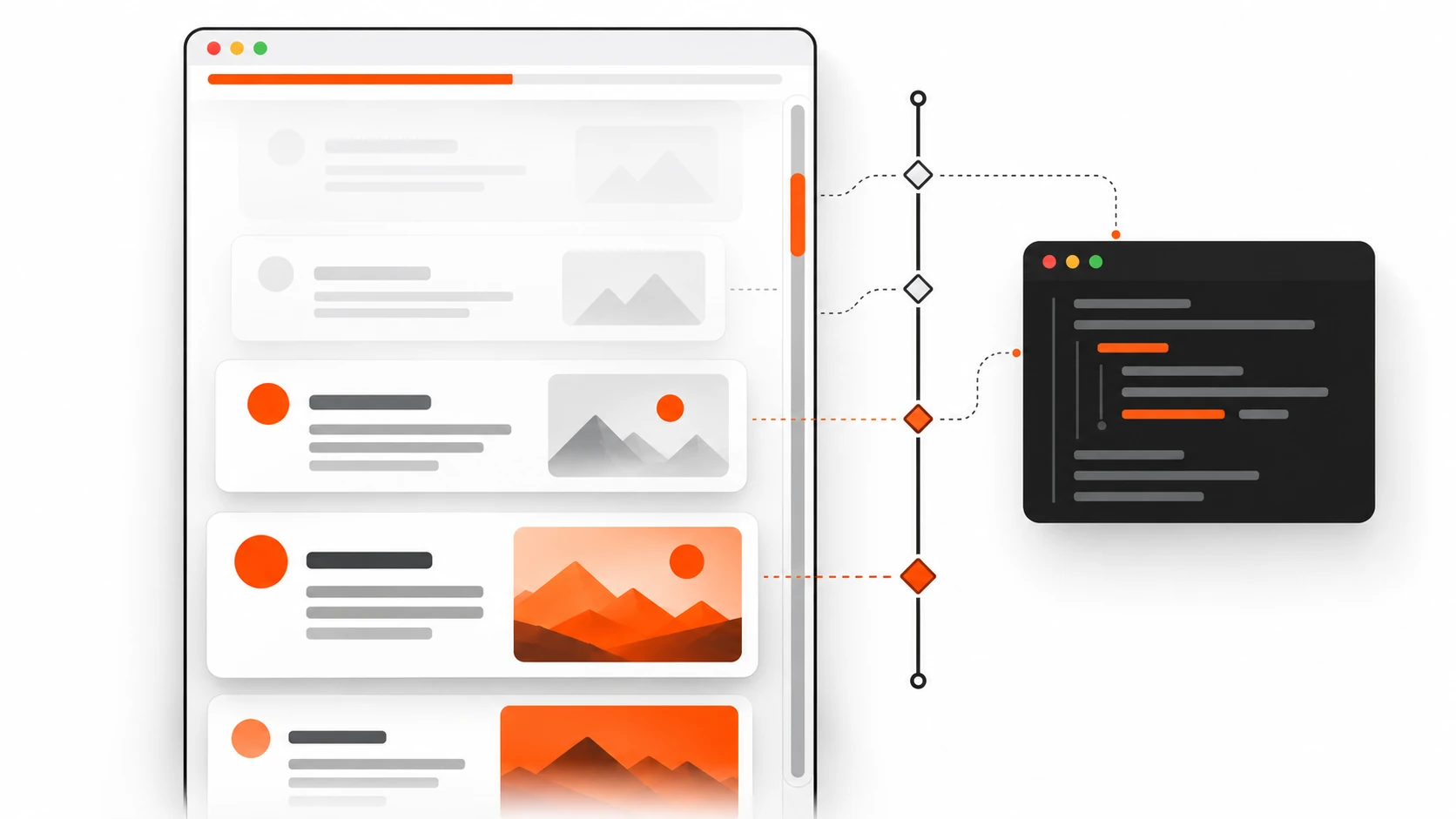
    Content cards revealing progressively as a page scrolls, linked to a scroll timeline with keyframes

    Why I stopped shipping IntersectionObserver for half my scroll effects

    I used to reach for IntersectionObserver the moment a client asked for “cards that fade in as you scroll.” A year later I was still wiring up GSAP ScrollTrigger for a reading progress bar and a mild parallax hero. Both tools are excellent. Both also meant JavaScript on the critical path, layout thrashing if I got careless, and one more thing to babysit when Core Web Vitals complained about INP.

    In 2026 that habit feels outdated for a big chunk of common scroll UX. CSS scroll-driven animations — animation-timeline, scroll(), view(), and animation-range — let the browser drive animations from scroll position instead of wall-clock time. No scroll listeners. No requestAnimationFrame loops. No library bundle for a progress bar.

    This post is the practical version: what the feature actually is, when I ditch JS for it, real code you can paste, browser reality (Chromium strong, Safari recent, Firefox catching up), accessibility, progressive enhancement, and the mistakes that waste an afternoon.


    What CSS scroll-driven animations actually are

    Normal CSS animations run on a time timeline. You say animation: fade 800ms ease, and the browser advances keyframes over 800 milliseconds.

    Scroll-driven animations swap that clock for a scroll clock. Progress of the animation is tied to:

    1. How far a scroll container has scrolled (scroll() — scroll progress timeline), or 2. How an element moves through a scrollport (view() — view progress timeline).

    You still write ordinary @keyframes. You still use transform, opacity, and friends. The only conceptual change: the playhead follows scroll, not milliseconds.

    That is why a scroll progress bar CSS pattern is three lines of intent instead of a scroll event handler. That is also why parallax CSS no JavaScript is finally realistic for marketing pages without fighting the main thread.

    The core properties you will use

    • animation-timeline — attaches an animation to scroll(...) or view(...) (or a named timeline).
    • animation-range — clips which portion of that timeline maps to 0%–100% of your keyframes (entry, exit, cover, contain, percentages, lengths).
    • scroll-timeline / view-timeline — named timelines when anonymous scroll() / view() are not enough (nested scrollers, shared progress, timeline-scope).
    • animation-fill-mode: both (or forwards / backwards as needed) — without fill, scroll-linked states often “snap away” between ranges.

    Order matters in practice: declare the animation shorthand first, then override with animation-timeline and animation-range. If you put timeline first and then a shorthand that resets it, you will wonder why nothing moves.


    Why 2026 matters for web design trends and frontend performance

    CSS scroll-driven animations shipped in Chromium years ago (Chrome/Edge 115+). Safari caught up in the 17.4 era and, by current 2026 tables, is solid on modern releases. Firefox spent a long stretch behind a preference flag (layout.css.scroll-driven-animations.enabled); by mid-to-late 2026 it has moved into real shipping support on current versions, which is exactly why this topic belongs in web design trends 2026 conversations instead of “experimental demos only.”

    Global support sits in the mid-80% range depending on your audience mix. That is not “everyone.” It is “enough to ship as progressive enhancement today.”

    The performance story is the part that sold me:

    • Scroll position is sampled where the browser already understands scrolling.
    • Compositor-friendly properties (transform, opacity, to a degree filter) stay off the main thread more often than a naive JS scroll handler.
    • You avoid main-thread work that fights Core Web Vitals INP — especially those “harmless” scroll listeners that fire while the user is still interacting.

    Myth to bust: “CSS animations are always cheaper than GSAP.” Not automatically. Animate height, top, or box-shadow heavily and you still pay. The win is architectural: for common scroll effects, CSS removes your script from the equation when the effect is decorative.


    scroll() vs view() — pick the right timeline

    This is where most tutorials blur things. They are not interchangeable.

    Use scroll() when progress belongs to the scroller

    scroll() tracks how far a scroll container has moved along an axis. Classic jobs:

    • Reading progress bar at the top of an article
    • Scroll-linked page indicator
    • Background that shifts with overall document scroll
    • Any UI that should answer: “What percent of this scroller have I consumed?”

    Anonymous form:

    animation-timeline: scroll();
    /* more explicit — prefer this in real projects */
    animation-timeline: scroll(root block);

    Parameters (conceptually):

    • Scroller: root (document), nearest (closest ancestor scroller), self
    • Axis: block, inline, x, y

    If your page scrolls inside a custom div with overflow: auto, scroll(root) will not see that movement. Use nearest or a named scroll-timeline on the actual scroller. I have lost hours to that mismatch.

    Use view() when progress belongs to an element entering/leaving view

    view() is the IntersectionObserver replacement for many reveal and parallax patterns. Progress is based on the subject element’s position relative to the scrollport.

    animation-timeline: view();
    animation-timeline: view(block);
    animation-timeline: view(block 10% 10%); /* optional insets */

    Typical jobs:

    • Reveal-on-scroll cards
    • Sticky section storytelling
    • Element-local parallax layers
    • Anything that used to be IntersectionObserver + class toggle for “in view”

    Rule of thumb I use on client work: progress bars and global chrome → scroll(). Per-section motion → view().


    Pattern 1: Reading progress bar with CSS (no JavaScript)

    This is the demo that converts skeptics. A thin bar that fills as the reader scrolls the article.

    <div class="reading-progress" aria-hidden="true"></div>
    <article class="post">…long content…</article>
    .reading-progress {
      position: fixed;
      inset-block-start: 0;
      inset-inline: 0;
      height: 3px;
      background: linear-gradient(90deg, #0ea5e9, #6366f1);
      transform-origin: inline-start;
      transform: scaleX(0);
      z-index: 1000;
      pointer-events: none;
    }
    
    @supports (animation-timeline: scroll()) {
      .reading-progress {
        animation: progress-grow linear;
        animation-timeline: scroll(root block);
        animation-range: 0% 100%;
      }
    }
    
    @keyframes progress-grow {
      from { transform: scaleX(0); }
      to   { transform: scaleX(1); }
    }

    Notes from shipping this:

    • scaleX keeps you on the compositor better than animating width.
    • Mark it aria-hidden if it is decorative; if it is meaningful progress for assistive tech, expose a proper live region or skip the visual-only bar.
    • Prefer @supports (animation-timeline: scroll()) so unsupported browsers simply show no bar (or a static fallback), not a broken half-animation.

    That is a complete scroll progress bar CSS implementation without a single line of JS.


    Pattern 2: Reveal-on-scroll without IntersectionObserver

    Old muscle memory:

    const io = new IntersectionObserver((entries) => {
      entries.forEach((e) => {
        if (e.isIntersecting) e.target.classList.add("is-visible");
      });
    });

    New default for many marketing sites:

    .card {
      opacity: 1; /* readable fallback */
      transform: none;
    }
    
    @supports (animation-timeline: view()) {
      .card {
        animation: reveal linear both;
        animation-timeline: view(block);
        animation-range: entry 0% entry 80%;
      }
    }
    
    @keyframes reveal {
      from {
        opacity: 0;
        transform: translateY(1.25rem);
      }
      to {
        opacity: 1;
        transform: translateY(0);
      }
    }
    
    @media (prefers-reduced-motion: reduce) {
      .card {
        animation: none !important;
        opacity: 1;
        transform: none;
      }
    }

    Why animation-range: entry 0% entry 80%? Because “start fading as it enters, finish before it is fully in” feels intentional. Full cover often makes reveals finish too late or feel sluggish on tall cards.

    When I still use IntersectionObserver:

    • I need to lazy-load data, fire analytics, or start a video — side effects, not paint.
    • I need one-shot “has been seen” logic that must run once in JS for business rules.
    • The motion must orchestrate with a complex JS timeline (ScrollTrigger still wins for cinematic sequences).

    For “fade up when visible,” CSS view timelines are enough in 2026.


    Pattern 3: Parallax CSS with no JavaScript

    Parallax got a bad reputation because old implementations listened to scroll on the main thread and janked phones. CSS scroll-driven parallax is calmer when you keep layers on transform.

    <section class="hero">
      <img class="hero__bg" src="sky.webp" alt="" />
      <div class="hero__copy">
        <h2>Ship motion that respects the main thread</h2>
      </div>
    </section>
    .hero {
      position: relative;
      min-block-size: 70vh;
      overflow: clip;
    }
    
    .hero__bg {
      position: absolute;
      inset: -10% 0;
      inline-size: 100%;
      block-size: 120%;
      object-fit: cover;
    }
    
    @supports (animation-timeline: view()) {
      .hero__bg {
        animation: parallax-y linear both;
        animation-timeline: view(block);
        animation-range: cover;
      }
    }
    
    @keyframes parallax-y {
      from { transform: translateY(-8%); }
      to   { transform: translateY(8%); }
    }

    Keep the travel distance modest. Big parallax still causes motion sickness for some users — which is why prefers-reduced-motion is not optional.


    animation-range without the fog

    animation-range is where designs either feel polished or broken.

    Useful keywords on view timelines:

    • entry — element moving from just touching the scrollport to fully inside
    • exit — leaving until fully gone
    • cover — any part visible through fully covered then leaving (full visibility journey)
    • contain — while the element is fully contained in the scrollport

    You can mix keywords with percentages:

    animation-range: entry 0% cover 50%;
    animation-range: contain 0% contain 100%;
    animation-range: 10% 90%; /* of the full timeline */

    Practical tips:

    1. Start with entry 0% entry 100% for reveals; tighten to entry 0% entry 60% if cards feel late. 2. For sticky storytelling, contain often maps better than cover. 3. If the animation “jumps” at the edges, you probably need animation-fill-mode: both and a clearer range.

    Named timelines help when multiple elements must share one progress source:

    .scroller {
      scroll-timeline-name: --page;
      scroll-timeline-axis: block;
    }
    
    .indicator {
      animation: tick linear;
      animation-timeline: --page;
    }

    If a child cannot see a named timeline, check timeline-scope on an ancestor. Scope bugs look like “animation finished instantly” because the browser fell back to a time timeline.


    Accessibility: prefers-reduced-motion is non-negotiable

    Scroll-linked motion can be worse than timed motion for vestibular disorders because the user cannot “wait it out” — every scroll re-triggers movement.

    Minimum bar I ship:

    @media (prefers-reduced-motion: reduce) {
      *,
      *::before,
      *::after {
        animation-duration: 0.01ms !important;
        animation-iteration-count: 1 !important;
        transition-duration: 0.01ms !important;
        scroll-timeline: none !important;
        animation-timeline: auto !important;
      }
    }

    For component-level control, kill only the scroll-driven pieces and leave essential UI transitions if they are subtle. Never hide content behind motion. Fallback styles should be the readable end state (opacity: 1, no offset), not the “before reveal” state.

    Also: decorative progress bars and parallax layers should not steal focus or announce constantly.


    Progressive enhancement and @supports fallback

    Do not make the page depend on scroll-driven animations to be usable. Frame them as enhancement.

    Feature query I use most:

    @supports (animation-timeline: view()) {
      /* enhanced motion */
    }

    Or more narrowly:

    @supports (animation-timeline: scroll()) {
      /* progress bar only */
    }

    Browser reality in plain language for stakeholders (2026):

    • Chromium (Chrome, Edge, Opera, Samsung Internet recent): strong, production-ready for years.
    • Safari (recent releases): supported; test on real iOS devices because overflow/scrollport quirks still bite.
    • Firefox: historically flag-gated; current versions have been catching up into default support — still verify on your target ESR / release channel before promising parity.

    Fallback strategy that works:

    1. Static, readable layout always. 2. Optional CSS enhancement inside @supports. 3. Only if product insists on identical motion everywhere, load a small JS polyfill or keep ScrollTrigger for that one sequence — not for every fade-in on the site.

    That is progressive enhancement, not “detect browser and give up.”


    Performance: when to ditch IntersectionObserver / GSAP ScrollTrigger

    I still install GSAP. I still use IntersectionObserver. I just stop using them as the default hammer.

    Prefer CSS scroll-driven animations when

    • Effect is visual only (reveal, progress, light parallax, scrubbed opacity)
    • Keyframes can be expressed in CSS
    • You care about frontend performance and reducing main-thread work tied to scroll
    • You want fewer moving parts for a brochure / content / marketing page

    Keep IntersectionObserver when

    • Visibility should trigger logic: fetch, analytics, pause/play media, hydrate a widget
    • You need precise once-only callbacks with application state

    Keep GSAP ScrollTrigger (or similar) when

    • Pinning + scrubbing + multi-scene orchestration
    • Complex sequencing across many elements with shared controls
    • Editors / designers need a timeline UI and runtime tweaking
    • You must match motion 1:1 on browsers that still lack the CSS feature for a campaign microsite

    Honest comparison for INP and jank:

    Approach Typical cost Best fit
    CSS scroll() / view() Low JS; compositor-friendly if transforms/opacity Common scroll UX
    IntersectionObserver Small JS; callback cost Logic on visibility
    Scroll listeners + rAF Easy to misuse; INP risk Rarely justified now
    GSAP ScrollTrigger Bundle + runtime; excellent control Cinematic / complex

    Myth: “CSS cannot scrub.” It can — that is literally what linking keyframes to a scroll timeline is. Myth: “GSAP is always slower.” A well-built ScrollTrigger scene can be smoother than bad CSS that animates layout properties. Choose based on the effect, not tribal loyalty.


    Common mistakes (the ones I still make when rushing)

    1. Animating layout properties (top, height, margin) on a scroll timeline — you throw away the performance reason you switched to CSS. 2. Wrong scroller — scroll(root) while the overflowing element is a nested container. 3. Missing animation-fill-mode — states flicker outside the active range. 4. Shorthand order bugs — animation reset wiping animation-timeline. 5. Invisible fallback — setting opacity: 0 outside @supports, so Firefox/old Safari users never see content. 6. Ignoring reduced motion — legal and human cost; also an easy Lighthouse / a11y audit fail. 7. Over-parallax — 40% travel looks cool in a Dribbble shot and nauseating on a phone in a rickshaw in Ahmedabad traffic. Ask me how I know. 8. Named timeline out of scope — animation completes on the time timeline instantly; looks “broken.” 9. Fighting sticky + view timelines without re-testing scrollports — sticky changes how you perceive progress; re-tune animation-range. 10. Shipping identical motion to every section — motion fatigue is real; reserve scroll effects for hierarchy, not decoration spam.


    FAQ / code Q&A

    Can I replace all ScrollTrigger usage with CSS in 2026?

    No. You can replace a surprising amount of common effects: progress bars, reveals, simple parallax, scrubbed opacity/transform. Keep ScrollTrigger for pinning epics, timeline orchestration, and cross-browser campaign work that must look identical everywhere.

    Does this help Core Web Vitals INP?

    It can, indirectly. Removing scroll handlers and heavy observer churn reduces main-thread contention during interaction. It will not fix INP if your INP problem is a 200 KB hydration spike. Measure before/after on real pages.

    scroll() or view() for a footer that fades in?

    view() on the footer (or its wrapper). You care about the element’s journey, not document percent.

    How do I feature-detect in JavaScript if I need a polyfill path?

    const supported = CSS.supports("animation-timeline: scroll()");
    if (!supported) {
      // progressive path: static UI, or load a polyfill / small JS fallback
    }

    Mirror the same condition in CSS with @supports so you do not maintain two sources of truth for styling.

    Why is my animation stuck at the end?

    Often: timeline not found (scope), wrong axis, or range already completed on load (element starts mid-view). Try animation-range adjustments and confirm the scroll container.

    Can I use this inside Shadow DOM / web components?

    Yes with care. Named timelines and scope across shadow boundaries can be tricky; anonymous view() on the animated element inside the shadow tree is the safer starting point.

    What about horizontal scroll sections?

    Specify the axis explicitly: scroll(nearest inline) or view(inline). Horizontal scrollports are where defaults surprise you.


    Implementation checklist (copy into your PR)

    Use this before you merge scroll-driven work:

    • Content is fully readable with animations disabled
    • Base styles use the end (visible) state, not the hidden state
    • Motion wrapped in @supports (animation-timeline: …)
    • prefers-reduced-motion: reduce disables or flattens effects
    • Only transform / opacity (and careful filter) on the timeline
    • Correct timeline type: scroll() for scroller progress, view() for element progress
    • Explicit scroller/axis where nested overflow exists
    • animation-range tuned on mobile and desktop heights
    • animation-fill-mode set so frames do not snap
    • No competing JS scroll listeners on the same effect
    • Tested in current Chrome/Edge, Safari iOS, and Firefox release you care about
    • Decorative UI marked appropriately for accessibility
    • Lighthouse / Web Vitals spot-check: no INP regression on scroll-heavy pages
    • Stakeholders understand unsupported browsers get a static but polished UI