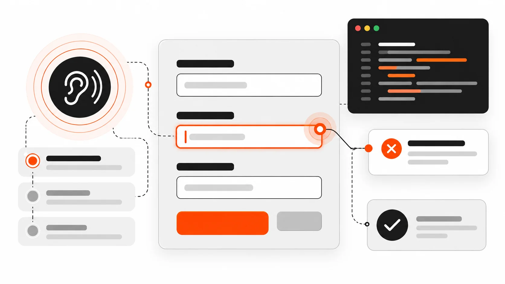
I still review forms that look polished and fail the first keyboard pass.
The submit button is a beautiful orange pill. The inputs have soft shadows. Then a screen reader user tabs in and hears “edit text” with no name. An error toast flashes at the top of the page while focus stays on the button that just failed. Required fields are marked with a red asterisk that never gets announced. On mobile, the email field opens a full keyboard instead of the @-friendly one.
None of that is a design-system problem. It is an accessibility contract problem.
In 2026, accessible forms are still built on the same foundations: native labels, honest error identification, predictable focus, and live regions that speak when something changes asynchronously. Frameworks and WordPress builders make it easier to ship a form in an afternoon. They also make it easier to ship one that assistive technology cannot trust.
This is the practical playbook I use on client sites and my own work: how to associate labels the browser way, how to wire errors with aria-describedby and aria-invalid, how to move focus after submit, how to announce async failures, how to mark required fields clearly, how to use autocomplete and input types for real people on real phones, and how to test with a keyboard and a screen reader before you call it done.

Start with a real label, not a placeholder
Placeholders disappear when someone types. They are not labels. They are hints at best, and they often fail contrast guidelines when they try to be both.
The reliable pattern is a visible <label> associated with the control:
<label for="email">Email</label>
<input id="email" name="email" type="email" autocomplete="email" />
The for attribute on the label must match the id on the control. That is the native association browsers and assistive tech already understand. Clicking the label focuses the field. The accessible name becomes “Email”.
You can also wrap the control:
<label>
  Email
  <input name="email" type="email" autocomplete="email" />
</label>
Both are valid. I prefer explicit for/id in larger forms because the DOM gets rearranged by design systems and React fragments, and wrapping is easier to break accidentally.
What I avoid:
- Using only
aria-labelwhen a visible label exists (now you have two names to keep in sync) - Relying on placeholder as the only name
- Putting the label in a sibling
<div>with no programmatic link - Icon-only buttons next to fields with no accessible name
If the visual design wants a floating label, keep a real <label> in the DOM and style it. Do not replace it with a decorative <span>.
Group related controls with fieldset and legend
Radio groups and checkbox clusters need a group name. fieldset and legend are still the right tools in 2026.
<fieldset>
  <legend>Shipping method</legend>
  <label><input type="radio" name="ship" value="standard" /> Standard (3-5 days)</label>
  <label><input type="radio" name="ship" value="express" /> Express (1-2 days)</label>
</fieldset>
A screen reader announces the legend with each option so “Express” is not floating without context. Role-based recreations (role="group" + aria-labelledby) can work when you cannot use fieldset, but native elements survive CSS resets and component library upgrades more reliably.
Use fieldset for:
- Payment method radios
- “How should we contact you?” checkbox groups
- Address type (billing vs shipping) when both are on one screen
Do not wrap the entire 20-field checkout in one giant fieldset with a vague legend. Group by meaning.
Required and optional: say it in text, not only in color
A red asterisk that is not in the accessible name helps sighted users and leaves everyone else guessing. WCAG does not ban asterisks. It bans information that is conveyed by color or shape alone.
Patterns that work:
<label for="company">Company <span class="optional">(optional)</span></label>
<input id="company" name="company" autocomplete="organization" />

<label for="phone">Phone <span aria-hidden="true">*</span><span class="visually-hidden">(required)</span></label>
<input id="phone" name="phone" type="tel" autocomplete="tel" required aria-required="true" />
Notes I follow:
- Prefer marking optional fields in long forms where most fields are required, or mark required fields when most are optional. Pick one convention per form and stick to it.
- The HTML
requiredattribute enables built-in validation.aria-required="true"exposes the state to AT even when you use custom validation. - Do not rely on placeholder text like “Required” — it vanishes on input.
Error identification that screen readers can find
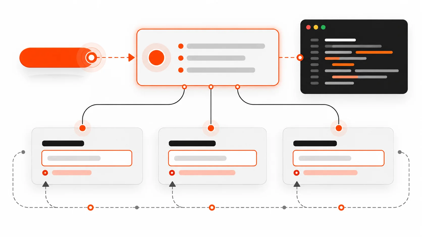
A red border is not an error message. Users need text that names the field and describes how to fix it, and that text must be programmatically tied to the control.
The pattern I ship:
<label for="email">Email</label>
<input
  id="email"
  name="email"
  type="email"
  autocomplete="email"
  aria-invalid="true"
  aria-describedby="email-hint email-error"
/>
<p id="email-hint">We will send your receipt here.</p>
<p id="email-error" class="error">Enter an email like name@example.com.</p>
Why each piece matters:
aria-invalid="true"marks the field as invalid after validation fails. Do not set it on first paint for empty required fields.aria-describedbypoints at hint and error ids. Multiple ids are space-separated. Order matters for announcement — put the error last if you want it heard after the hint, or first if the error is the priority after submit.- The error text should include the field purpose when the message might be read out of visual context (“Enter an email…” beats “Invalid format”).
On submit failure, also provide a summary:
<div tabindex="-1" id="form-errors" role="alert">
  <p>We found 2 problems:</p>
  <ul>
    <li><a href="#email">Email: Enter an email like name@example.com.</a></li>
    <li><a href="#phone">Phone: Enter a phone number with country code.</a></li>
  </ul>
</div>
Then move focus to #form-errors. Keyboard and screen reader users land on the summary instead of wondering why the page did not change. Each link jumps to the field so fixing is a straight path.
Focus management after submit (the part teams skip)
Focus is where the user’s attention is. After a failed submit, leaving focus on the submit button while an error appears above the fold is a common failure. Sighted mouse users may notice the red text. Keyboard and AT users often do not.
Rules I use:
- Client-side validation fails: focus the error summary, or if there is only one error, focus that field.
- Server returns field errors: same pattern after the DOM updates.
- Success replaces the form with a confirmation: focus the confirmation heading (
tabindex="-1"on the heading, then.focus()). - Success navigates to a new page: the new page’s
<h1>or main landmark should be first in the reading order; avoid autofocusing a random marketing modal.
function showErrors(summaryEl) {
  summaryEl.hidden = false;
  summaryEl.focus();
}
Avoid autofocus on the first field of a multi-step form when an error summary needs priority. Autofocus can yank screen reader users past instructions.
Live regions for async errors and saving states
Modern forms save drafts, validate emails against an API, and submit with fetch. Visual spinners are not enough. Use live regions so status changes get announced without moving focus.
<div id="form-status" class="visually-hidden" aria-live="polite" aria-atomic="true"></div>function setStatus(message) {
const el = document.getElementById("form-status");
el.textContent = "";
// Some AT ignore identical updates; clear then set on next frame.
requestAnimationFrame(() => {
el.textContent = message;
});
}
setStatus("Saving draft…");
// later
setStatus("Draft saved.");Guidance:
aria-live="polite"for non-urgent status (saved, checking availability).role="alert"oraria-live="assertive"for errors that need immediate attention — use sparingly so you do not interrupt every keystroke.- Do not put
aria-liveon a region that updates on every character typed. - When an inline field error appears asynchronously, update the error node’s text and keep
aria-describedbypointed at it. Changingaria-invalidtotrueat the same time helps.
Autocomplete tokens that actually help
Browsers and password managers need real autocomplete tokens, not autocomplete="off" sprayed on everything. For address and account forms, tokens reduce typos and reduce cognitive load.
Common tokens I use:
name,given-name,family-nameemailtel,tel-national,tel-country-codestreet-address,address-line1,address-line2,address-level2(city),address-level1(state),postal-code,countryorganizationusername,new-password,current-passwordcc-name,cc-number,cc-csc,cc-exp
Example:
<label for="given-name">First name</label>
<input id="given-name" name="given-name" autocomplete="given-name" />

<label for="family-name">Last name</label>
<input id="family-name" name="family-name" autocomplete="family-name" />

<label for="addr1">Address</label>
<input id="addr1" name="addr1" autocomplete="address-line1" />
Turning off autocomplete to “force cleaner data” usually creates worse data and locked-out users. If a one-time code field must avoid password managers filling the wrong value, use a specific token like one-time-code where supported, not a blanket off switch on the whole form.
Input types and mobile keyboards
type="email", type="tel", type="url", type="number" (carefully), and inputmode change the keyboard on phones. That is accessibility and conversion.
<input type="email" inputmode="email" autocomplete="email" />
<input type="tel" inputmode="tel" autocomplete="tel" />
<input inputmode="numeric" pattern="[0-9]*" autocomplete="one-time-code" />
Caveats:
type="number"is often wrong for OTP, postal codes, and credit cards because of spinner UI and localization. Preferinputmode="numeric"with a text input when you need digits without number semantics.- Do not block paste on password or OTP fields. Paste is an accessibility feature for password managers and people who use external authenticators.
maxlengthcan help, but announce constraints in the visible hint when truncation would confuse.
Keyboard operability checklist for every form
Before I open a screen reader, I do this with only the keyboard:
- Tab order follows visual order. No traps inside custom selects.
- Every control shows a visible focus style (do not remove
outlinewithout a stronger replacement). - Custom dropdowns open with Enter/Space, move with arrows, close with Escape, and return focus to the trigger.
- Date pickers are usable as plain text inputs with a clear format hint, not calendar-only widgets.
- File inputs have a named label and keyboard-reachable trigger.
- Disabled submit buttons either are not used (prefer allowing click + error summary) or are explained with nearby text. A disabled button that never explains why is a dead end.
Native controls get you most of this for free. Custom components are where budgets go to die — budget time for keyboard behavior when you replace a select.
Screen reader smoke test (short, real, repeatable)
You do not need a full audit every PR. You need a smoke test that catches the failures users hit first.
With VoiceOver (macOS/iOS), NVDA or JAWS (Windows), or TalkBack (Android):
- Land on the form. Is there a heading or clear form purpose?
- Tab through fields. Does each announce a name, role, and value?
- Required fields: is required state announced?
- Submit empty. Is the error summary focused? Are errors listed with links?
- Fix one field. Does its invalid state clear without lying?
- Trigger an async error (offline, 422). Is the status announced?
- Successful submit: is the confirmation announced or focused?
If your team only tests in Chrome with a mouse, you will ship the pretty failure mode forever.
React form pitfalls I keep seeing
React does not make forms inaccessible. Patterns around it do.
Missing htmlFor. Using <label> without htmlFor and with an input as sibling, not child, breaks the name.
Clickable divs as inputs. Rebuilding checkboxes with div + onClick loses space-to-toggle, roles, and form participation unless you reimplement everything. Prefer native <input type="checkbox"> styled with CSS.
Conditional fields unmounted without explanation. Showing “Company name” only after “Business” is selected is fine — use a clear radio group and move focus into the new field when it appears if the flow is a wizard step. For simple progressive disclosure, ensure the new fields are after the triggering control in DOM order.
Errors in state but not in the accessibility tree. Rendering {error && <span>{error}</span>} next to the field without aria-describedby tying it to the input means sighted users see it and AT users may not when focused on the field.
Client routers swallowing focus. After client-side navigation to a success route, focus often stays on the body or the old button. Explicitly focus the success heading.
Library defaults. Some form libraries set aria-invalid on mount or generate ids that change every render, breaking label association. Stabilize ids with useId() (React 18+) and only flip aria-invalid after a submit attempt or blur validation, depending on your UX rules.
Example sketch:
const emailId = useId();
const errorId = useId();
const showError = submitted && !isValidEmail(email);

return (
  <>
    <label htmlFor={emailId}>Email</label>
    <input
      id={emailId}
      name="email"
      type="email"
      autoComplete="email"
      aria-invalid={showError || undefined}
      aria-describedby={showError ? errorId : undefined}
      value={email}
      onChange={(e) => setEmail(e.target.value)}
    />
    {showError ? (
      <p id={errorId} role="alert">
        Enter an email like name@example.com.
      </p>
    ) : null}
  </>
);
WordPress form pitfalls
Contact Form 7, Gravity Forms, WPForms, and custom ACF front-end forms can all be fine — or not — depending on theme markup.
Watch for:
- Themes that hide labels with
display: none(removed from accessibility tree) instead of a visually-hidden class that stays available to AT - AJAX submit that injects a response message without a live region or focus move
- reCAPTCHA challenges with no keyboard alternative or no warning before submit
- Multi-column layouts that reorder fields visually with CSS grid so tab order jumps around — fix with DOM order, not
tabindexsoup - Placeholder-only fields in page-builder kits
When I ship a WordPress form theme override, I keep labels visible, ensure the validation container has tabindex="-1" and receives focus on error, and test the AJAX path with NVDA or VoiceOver once before handoff.
A concrete accessible contact form skeleton
Putting the pieces together:
<form id="contact" novalidate>
  <div id="form-errors" class="error-summary" tabindex="-1" hidden></div>
  <div id="form-status" class="visually-hidden" aria-live="polite"></div>

  <p>
    <label for="full-name">Full name</label>
    <input id="full-name" name="name" autocomplete="name" required aria-required="true" />
  </p>

  <p>
    <label for="email">Email</label>
    <input
      id="email"
      name="email"
      type="email"
      autocomplete="email"
      required
      aria-required="true"
      aria-describedby="email-hint"
    />
    <span id="email-hint">We reply within one business day.</span>
  </p>

  <fieldset>
    <legend>Topic</legend>
    <label><input type="radio" name="topic" value="project" required /> New project</label>
    <label><input type="radio" name="topic" value="support" /> Support</label>
  </fieldset>

  <p>
    <label for="message">Message</label>
    <textarea id="message" name="message" required aria-required="true"></textarea>
  </p>

  <button type="submit">Send message</button>
</form>
On failed validation, unhide #form-errors, fill the list of links, and focus it. On success, either navigate to a thank-you page with a clear <h1> or replace the form contents and focus the confirmation heading.
Testing matrix I actually write into QA notes
| Check | How |
|---|---|
| Label association | Inspect: label for matches control id, or wrapping label |
| Name, Role, Value | Browser accessibility pane on each control |
| Keyboard only | Tab, Shift+Tab, Enter, Escape, arrows in custom widgets |
| Error text tied | aria-describedby targets exist; aria-invalid toggles after submit |
| Focus after submit | Failed: summary/field; Success: confirmation heading |
| Live status | Mute speakers, watch AT speech viewer while saving |
| Mobile keyboard | Real phone: email/tel/numeric keyboards appear |
| Autocomplete | Password manager fills name/email/address correctly |
| Zoom 200% | Fields still usable; no clipped error text |
| Reduced motion | If you animate errors, respect prefers-reduced-motion |
Checklist: ship / no-ship for forms
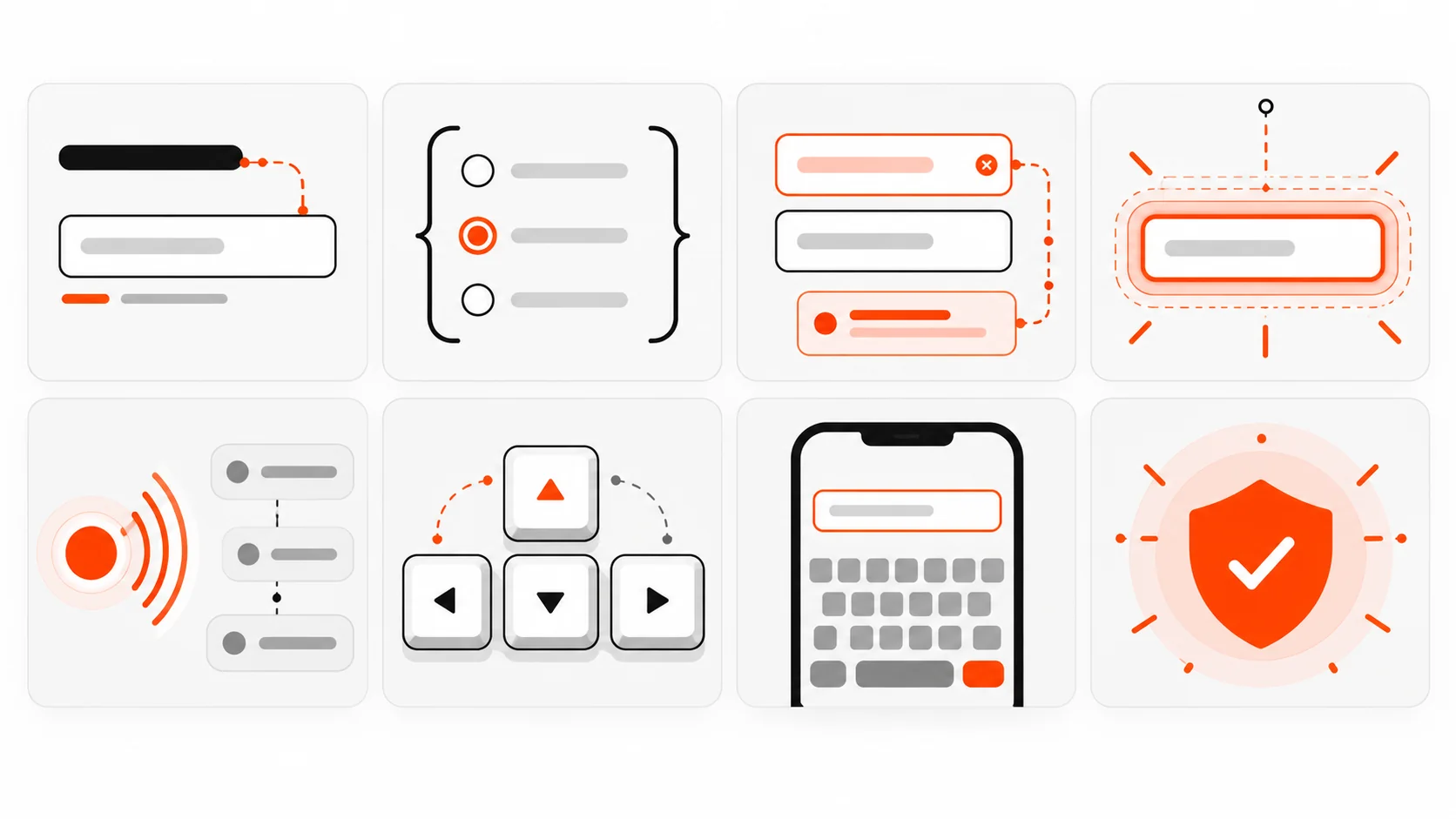
Ship only if you can tick these:
- Every control has a visible, programmatically associated label (or a legitimate exception with an accessible name).
- Related radios/checkboxes are in a fieldset with a legend (or equivalent group name).
- Required/optional is clear in text, not color alone.
- Errors are text, associated via
aria-describedby, and fields usearia-invalidwhen invalid. - Failed submit moves focus to an error summary or first error.
- Async status uses a polite live region; critical errors are announced without trapping focus.
autocompletetokens match the data you ask for.- Input types /
inputmodematch mobile keyboards. - Custom widgets are keyboard operable with visible focus.
- Keyboard + one screen reader smoke test passed on the staging URL.
If item 4 or 5 fails, it is a no-ship for me even when the visual design is approved. Pretty forms that strand users are still broken forms.
Why this still matters in 2026
Design systems got better. Component libraries ship accessible primitives. AI tools generate form markup in seconds. And yet production sites still strip labels, announce nothing on AJAX failure, and bury errors in toast libraries that never receive focus.
Accessible forms are not a separate premium tier. They are how you know the form works for people who do not use a mouse, cannot see the red border, or complete the flow on a bus with a screen reader and a foldable keyboard.
Ship labels that name things. Ship errors that explain things. Ship focus that follows the work. Screen readers do not need a different product. They need the same product built with the attributes and native elements that were documented for this exact job.
If you want a deeper performance angle after you fix the form semantics, look at how validation scripts and third-party captchas affect Interaction to Next Paint — but fix the accessibility contract first. A fast form that cannot be completed is still a dead end.